02 · Field research

Getting outdoors.
A good walk, a big hill and somewhere worth exploring.
01 · Me

02 · Intro
I untangle messy experiences, bring people together, and make complicated things feel ridiculously simple.
03 · Menu
04 · Find me
Say hello. I usually reply within a day.
01 · Me
02 · About
I enjoy untangling complex challenges, spotting opportunities others might miss and creating experiences that feel refreshingly simple.
I connect user insight with commercial thinking, challenge assumptions and care about the details. I work best with curious people who share ideas and want to make things better.
03 · Principles
A few things I’ve picked up along the way. Some learned the hard way.
We only get what we settle for.
I turn complexity into consistency. Token-driven systems connecting foundations, components and experiences across brands and platforms.
01 · Menu
Scroll
Ten studies, each with its easing and duration specified in code.
01 · Me
I’m a designer who’s spent the best part of 25 years figuring out how to make complicated things simpler. But there’s a bit more to me than Figma files, design systems and prompting.
02 · Field research
A good walk, a big hill and somewhere worth exploring.
03 · Hand-made

Always curious, always experimenting. Creativity doesn’t stop at the screen.
04 · Patience testing

A few quiet hours by the water. Sometimes I even catch something.
05 · R&D lab

Exploring new tools, building things and seeing what’s possible with AI.
06 · Connect
Happy to talk design, Man United’s next manager or a decent walk in the Lake District.
07 · Find me
AI-crafted brand identity.
Lucille London is fiction — it exists only as an AI-assembled portfolio work. The goal was to test whether a full luxury brand and storefront could hold credibility when strategy, visuals, narrative, and build all emerge from the same machine-led workflow. The bar stayed high: editorial and intimate on first impression, then consistent across navigation, merchandising, and reassurance (shipping, care, returns) without the spell breaking.
The constraint was deliberate: build the narrative, visual system, and product experience with AI as the primary creative accelerator — Cursor to structure and stress-test the experience end to end, Higgsfield for visual exploration, Claude Code for language architecture — so quality came from iteration, not volume.
Luxury e-commerce is judged in milliseconds: hierarchy, whitespace, and restraint either read as confidence — or as chaos. Every module had to earn its place: hero proposition, collections, edits that behave like a magazine, and product cards that carry craft without doubt.
The stack was the studio: snapshot passes, variants, microcopy generations — all AI-native. Discipline lived in direction — which prompts survived, which routes shipped, what still scans as intentional when you scroll at 2 a.m. on a phone.
The outcome is a coherent fiction on a live URL: one voice ("Lucille London"), a collection story that carries from landing to basket, and interaction patterns that respect hesitation in high-consideration categories — without the site reading as a thin brochure.
Visit the Lucille London website here
See the siteOVERVIEW
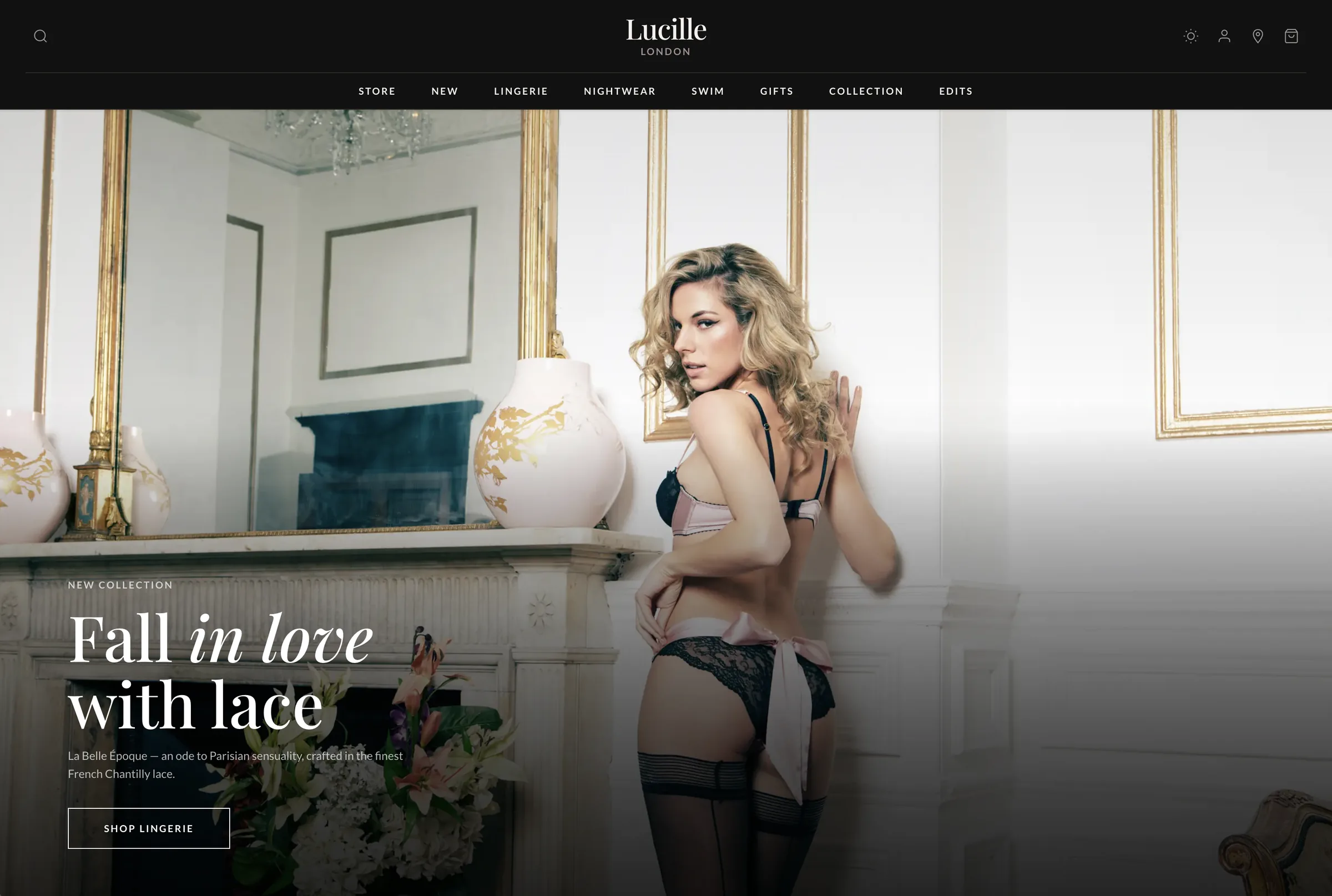
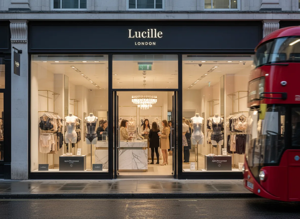
Lucille sits where Parisian romance meets London shopping culture: French lace and silk, a collection spine (La Belle Époque), and a retail story rooted in Kensington's boutique reality. The brief wasn't "make a pretty shop" — it was to make trust and desire occupy the same screen.
Strategy, design, and storytelling were shaped as one system — prompted, critiqued, and refined so the brand could repeat without sounding rehearsed. The goal was cohesion across every touchpoint: the promise in the hero, proof in product detail, and calm confidence through policy and care. Nothing ornamental. Everything accountable.
THE CHALLENGE
AI can generate abundance fast. Luxury reads as decision: what you omit, how you pace a page, the words you choose when the garment is tactile but the interface is glass. The challenge: anchor iteration in Cursor (IA, flows, build quality); use Higgsfield for visual direction and exploration; lean on Claude Code for narrative and UI microcopy — and keep the polish human-tight so nothing reads synthetic.
Every pass moved toward a single identity: editorial typography, warm minimal layout, and shopping paths that reward browsing (New Arrivals, Edits, collections, swim and nightwear) while keeping orientation obvious. Cohesion isn't repetition — it's a recognisable voice that scales from campaign headline to size and care.
BOUTIQUE EXPERIENCE
Luxury lingerie is bought with emotion first — confidence, intimacy, occasion — and justified with facts second: fabric, fit, service. The experience needed to evoke a refined, intimate space: unhurried, tactile language, and cues that mirror the Kensington boutique promise without pretending the screen is a fitting room.
I treated atmosphere as UX: spacious rhythm, restrained merchandising blocks, and a voice that whispers rather than sells. The outcome reads as effortless — even though the system underneath is deliberately structured for scan, compare, and return visits.
THE LAUNCH
Launch is where brand meets behaviour. Navigation and collection architecture were built to answer real journeys: discovering what's just arrived, moving between lingerie and nightwear, stepping into swim as a sibling category, and finding gift moments without breaking narrative flow.
Secondary reassurance — shipping, gift wrapping, returns — was placed to reduce cognitive load at decision time, not buried as legal footnotes at the end. The UI pattern is simple: elevate the collection story, make product evaluation calm, and let service proof support the leap to cart.
COLOUR PALETTE
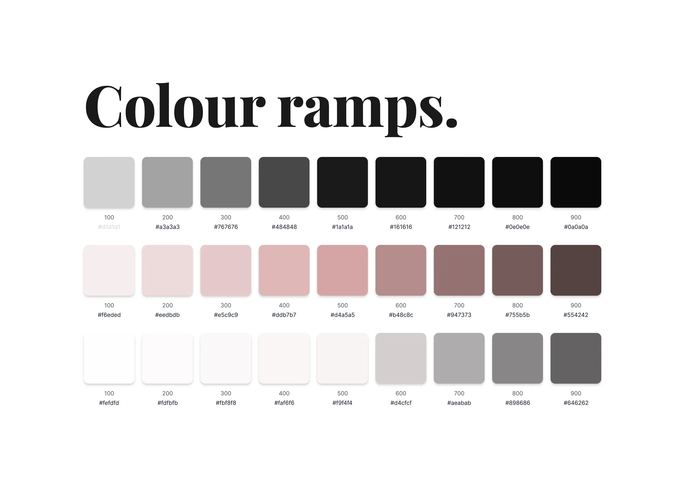
The palette follows luxury digital conventions, tightened for clarity: deep base tones for drama and focus, off-white surfaces for textile and product truth, and restrained accent used sparingly so promotion and urgency never cheapen craft.
Colour hierarchy maps to intent — storytelling zones stay quiet so photography carries emotion; interactive states stay legible for accessibility and confidence at checkout. Every swatch earned its place on the page.
WORDMARK
The visual system leans on wordmark discipline — Lucille and LONDON in a composed lockup — rather than an illustrated logo zoo. Supporting iconography stays minimal and functional: wayfinding and service cues that disappear until needed.
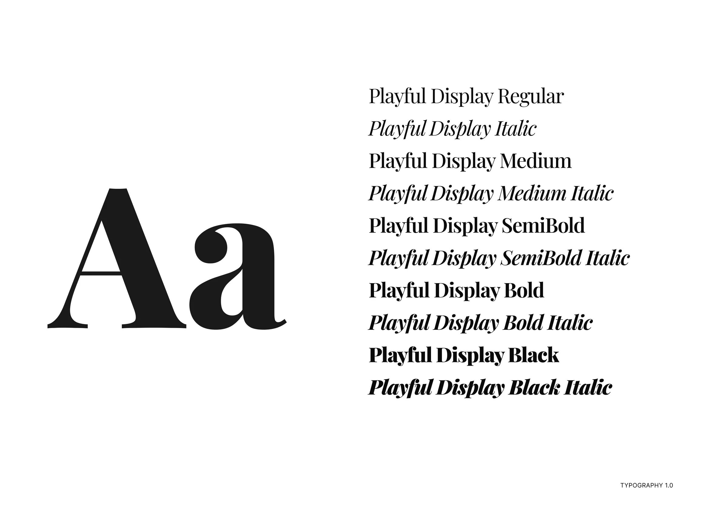
The direction favours serif-forward headlines for editorial romance, paired with a clean sans-serif workhorse for wayfinding, pricing, and product metadata — so emotion lives in storytelling, and clarity lives in shopping.
CAMPAIGN
Campaign moments ("Fall in love with lace", "The art of doing nothing") function as chapter titles: they set tone for a collection and invite scroll without shouting discounts. The same voice carries into editorial Edits — culture, style, gifting — so content reads as part of the product world, not a bolt-on blog.
AI-assisted drafting produced breadth fast; curation produced the brand. The final lines were chosen for memorability, fit, and a house that sells intimacy with dignity.
BRAND PACKAGING
Packaging thinking surfaces where shoppers need reassurance: complimentary gift wrapping, clean delivery expectations, and a premium unboxing story implied by the brand language. Digital "packaging" is the order journey — confirmation, clarity, care instructions — so the experience feels complete when the box arrives.
The aim is continuity: the same quiet confidence on the PDP should carry through every post-purchase touchpoint, so the brand feels intact from first impression to hanger.
CONCLUSION
AI can accelerate the messy middle — options, variations, microcopy drafts, visual references — but design is still the arbiter of taste, truth, and friction. Lucille London is a case in disciplined iteration: fewer loud claims, more consistent signals, and a store that earns return visits because it feels considered.
The live site is the artifact — browse La Belle Époque, move through nightwear and swim, and watch how restraint does the selling.
( Services )
A luxury lingerie brand I invented, then took from first idea to a live storefront on my own.
01 · Quick links
Scroll
Lucille London
Fiction. Handle with care.
Lucille London doesn’t exist. I invented it to answer a question every design team is now asking: can AI take a brand from strategy to a live storefront without the work looking machine-made?
I set a luxury bar on purpose, because luxury punishes shortcuts. It had to feel editorial and intimate at first glance, then hold together through navigation, product pages and the small print on shipping, care and returns.
See the live siteI used AI as the studio, not the designer. It generated options at speed; I set the direction, critiqued every pass and chose what shipped. Quality came from iteration, not volume.
Information architecture, user flows and the build, stress-tested end to end.
Visual direction and image exploration.
Brand narrative and UI microcopy.
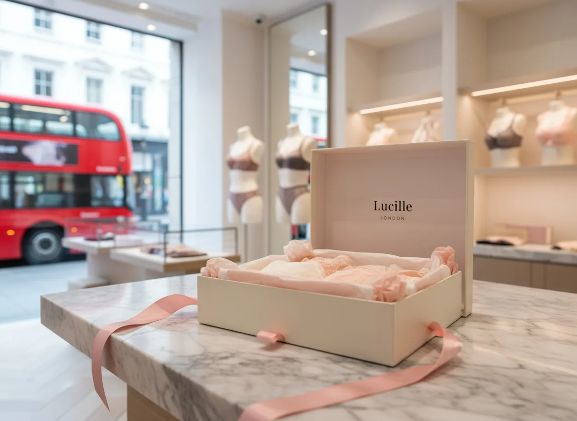
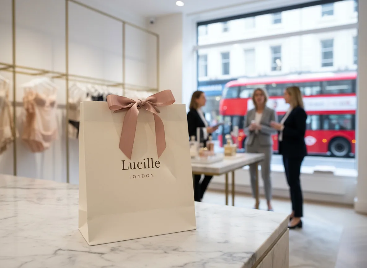
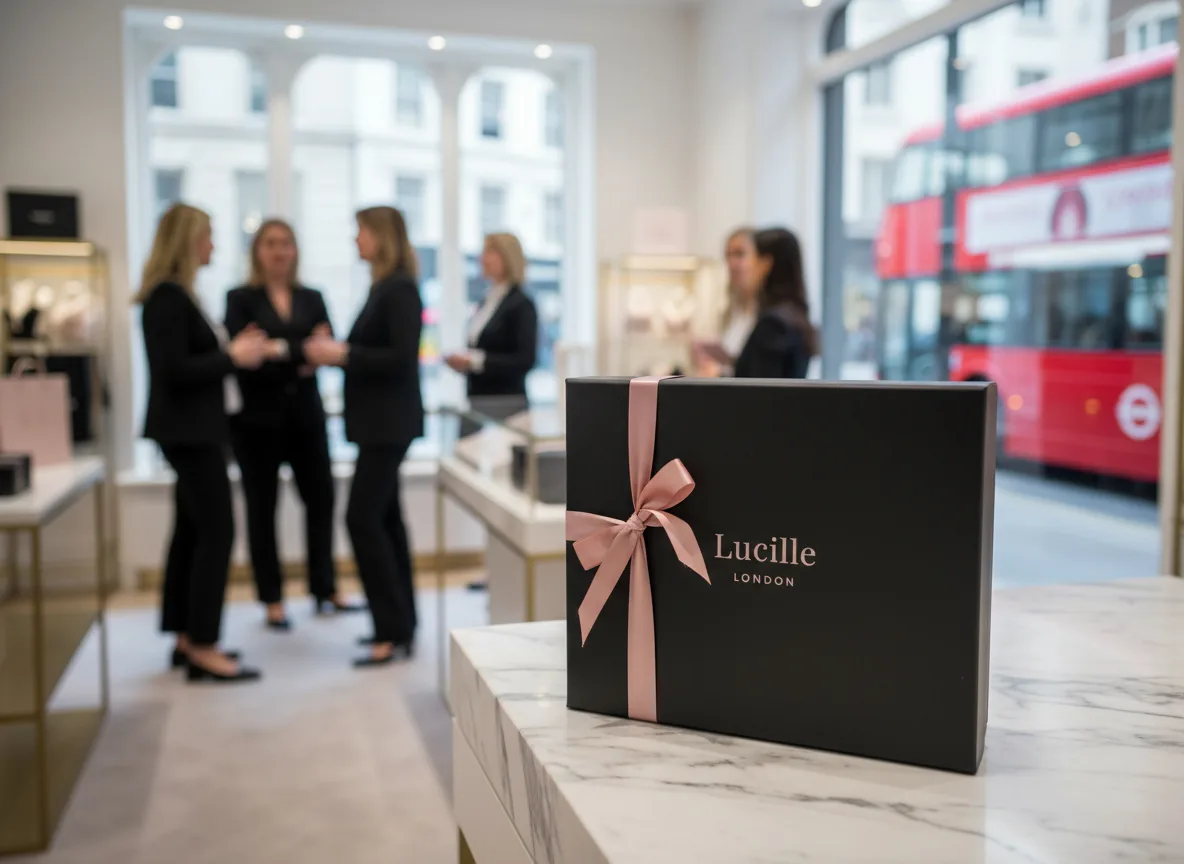
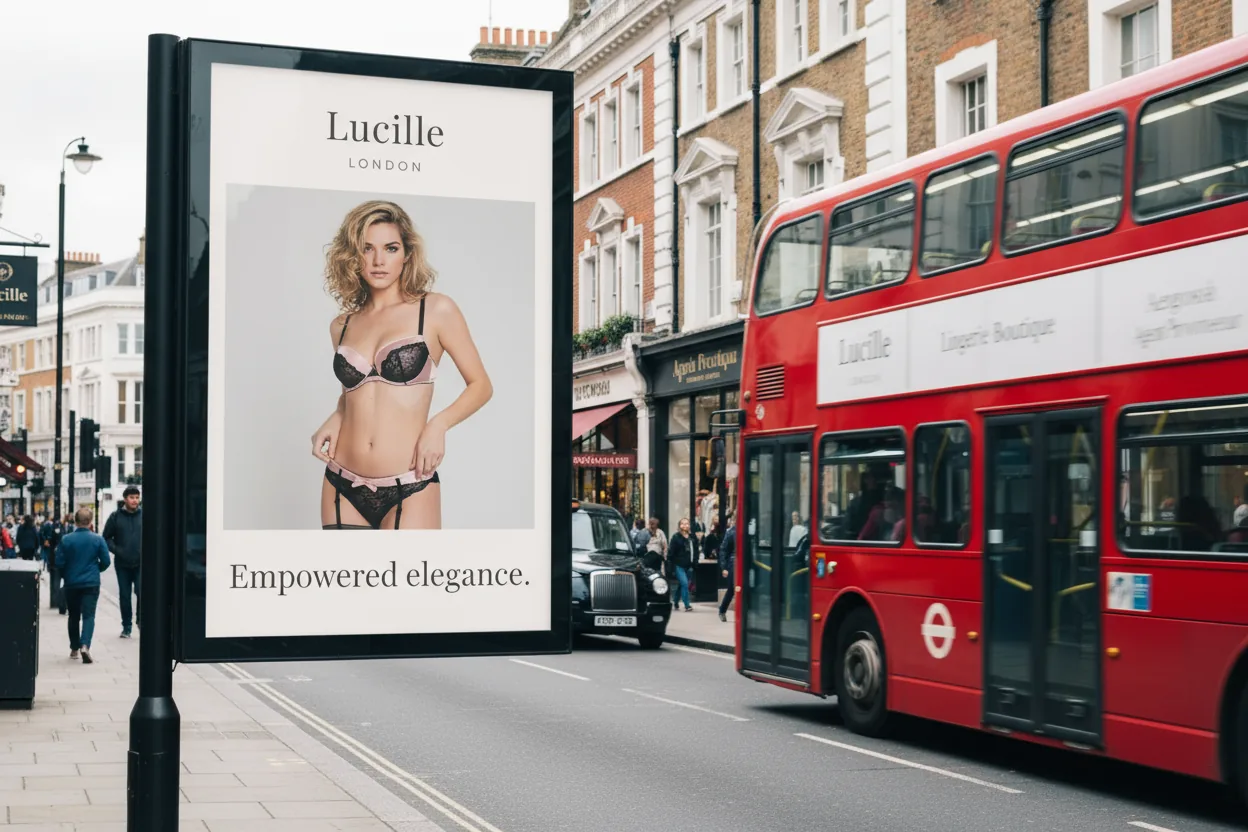
Lucille sits where Parisian romance meets London shopping: French lace and silk, a signature collection called La Belle Époque, and a story rooted in a Kensington boutique.
The brief wasn’t “make a pretty shop”. Strategy, design and storytelling had to work as one system, so the brand could repeat itself across every touchpoint without sounding rehearsed.
Nothing ornamental.
Everything accountable.
AI can generate a hundred options in minutes. Luxury is defined by what you leave out: how a page is paced, and which words sell a garment the customer can’t touch. Shoppers judge that in milliseconds, so every module had to earn its place.
One clear promise per screen, so the eye knows where to land.
Room to breathe, so the product carries the page.
Calm reads as confidence. Clutter reads as cheap.
Lingerie is bought on emotion and justified with facts: fabric, fit, service. I treated atmosphere as UX, with spacious rhythm, restrained merchandising and a voice that whispers rather than sells. It feels effortless, but the structure underneath is built for scanning, comparing and coming back.
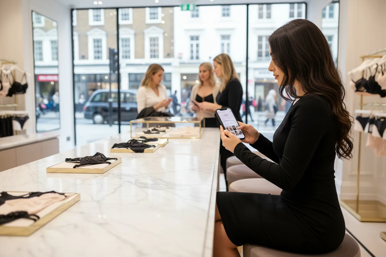
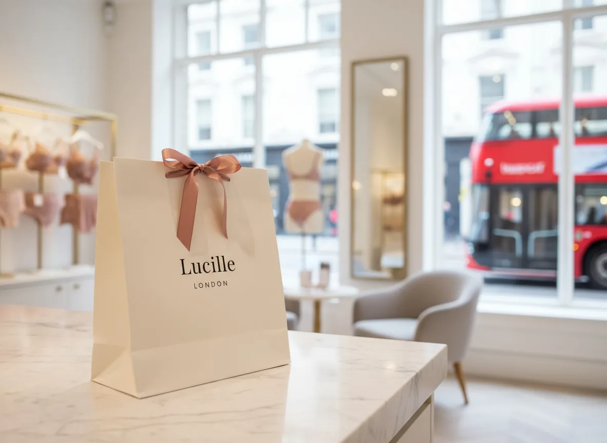
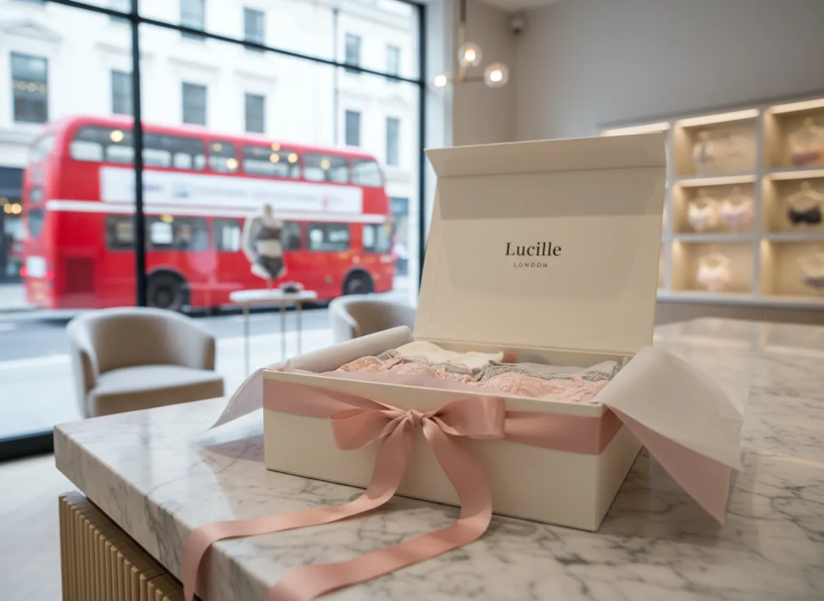
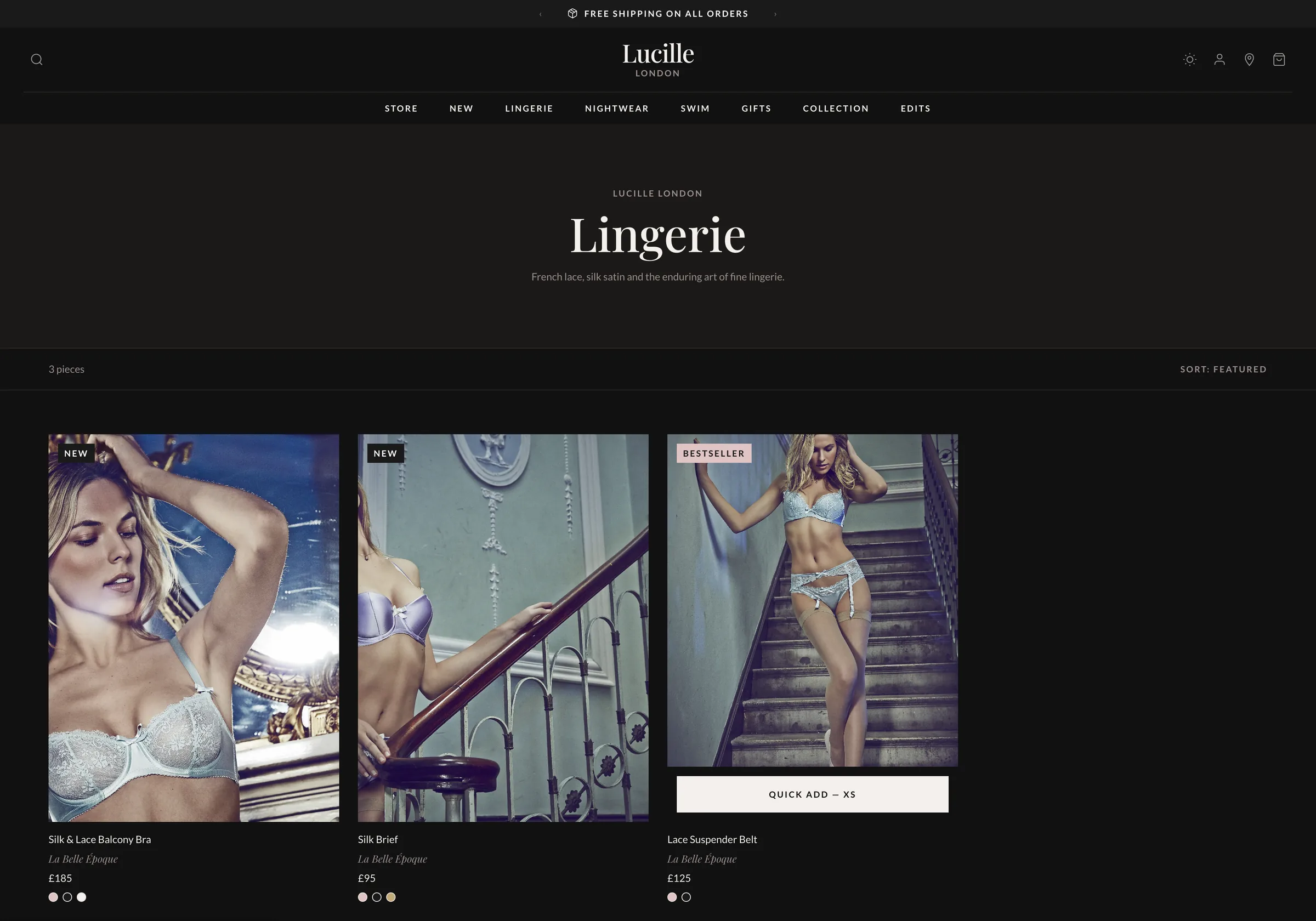
Launch is where brand meets behaviour. I shaped the navigation around how people actually shop: checking what’s new, moving between lingerie and nightwear, finding swim as a sibling category and buying gifts without breaking the story.
Shipping, gift wrap and returns sit at the point of decision, not buried in the footer.
A composed Lucille / LONDON wordmark instead of an illustrated logo. Serif headlines carry the romance; a clean sans-serif handles navigation, prices and product details. Emotion lives in the story, clarity in the shopping.
#d1d1d1#a3a3a3#767676#484848#1a1a1a#161616#121212#0e0e0e#0a0a0a#f6eded#eedbdb#e5c9c9#ddb7b7#d4a5a5#b48c8c#947373#755b5b#554242#fefdfd#fdfbfb#fbf8f8#faf6f6#f9f4f4#d4cfcf#aeabab#898686#646262A near-noir base for drama, off-white surfaces so product colours stay true, and a blush accent used sparingly, so promotions never cheapen the craft. Interactive states stay legible from browse to checkout.
Lines such as “Fall in love with lace” and “The art of doing nothing” work as chapter titles: they set the tone for a collection without shouting about discounts. The same voice runs through the Edits, so editorial content feels part of the shop rather than a blog bolted on.
AI drafted the breadth.
Curation made the brand.
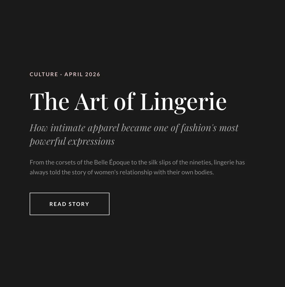
Lingerie is often a gift, so the experience has to stay premium after the click. Complimentary gift wrap, clear delivery promises and an order journey written in the brand’s voice carry the same quiet confidence from first click to the box on the doorstep.
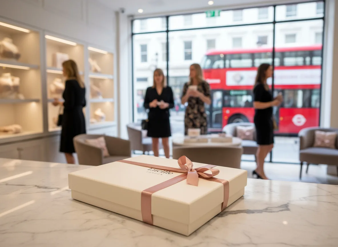
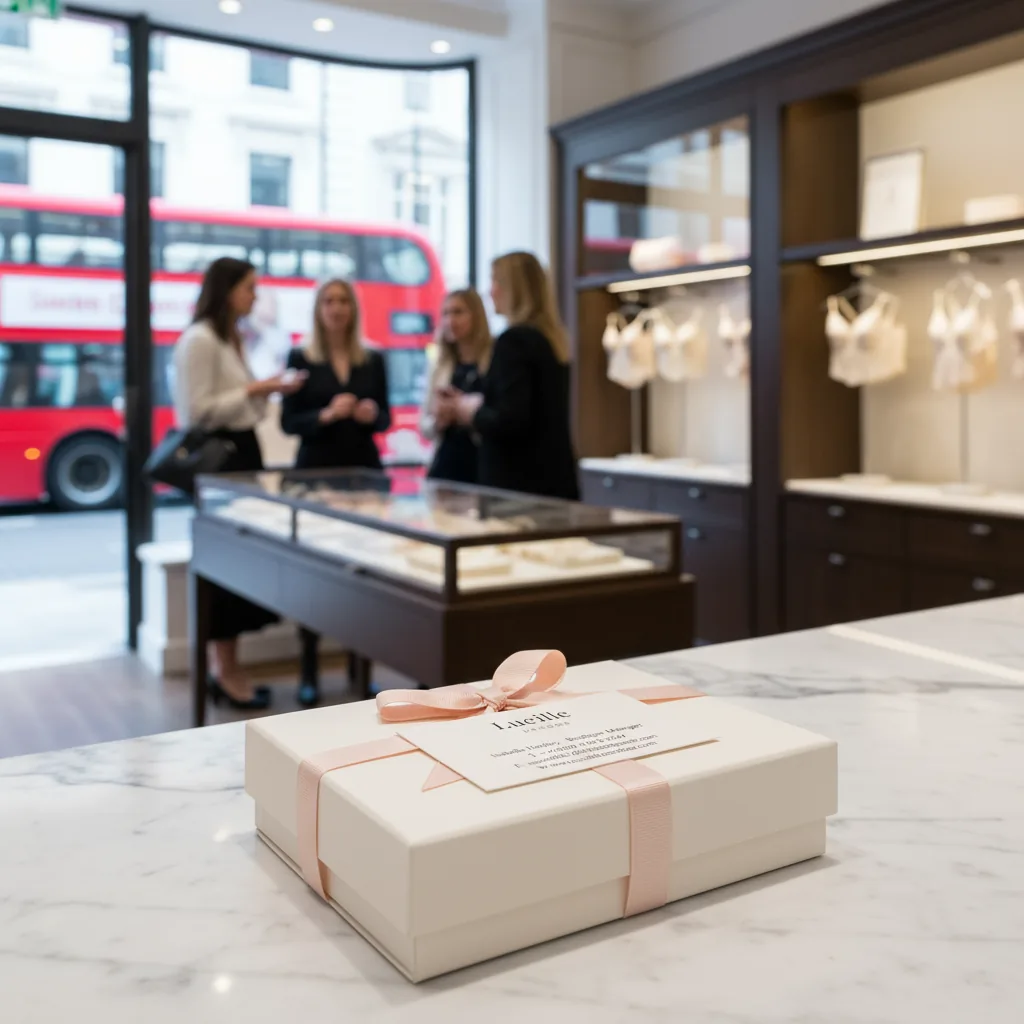
Lucille London is live: a complete brand and storefront with one consistent voice, from the homepage campaign to the basket.
It showed me exactly where AI earns its place in my workflow: options, variations, microcopy and visual references. Taste, truth and friction stay with the designer.
See the live site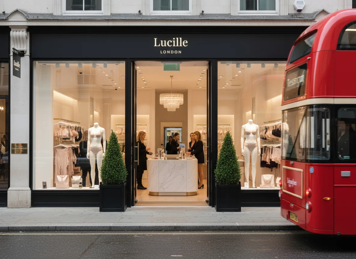
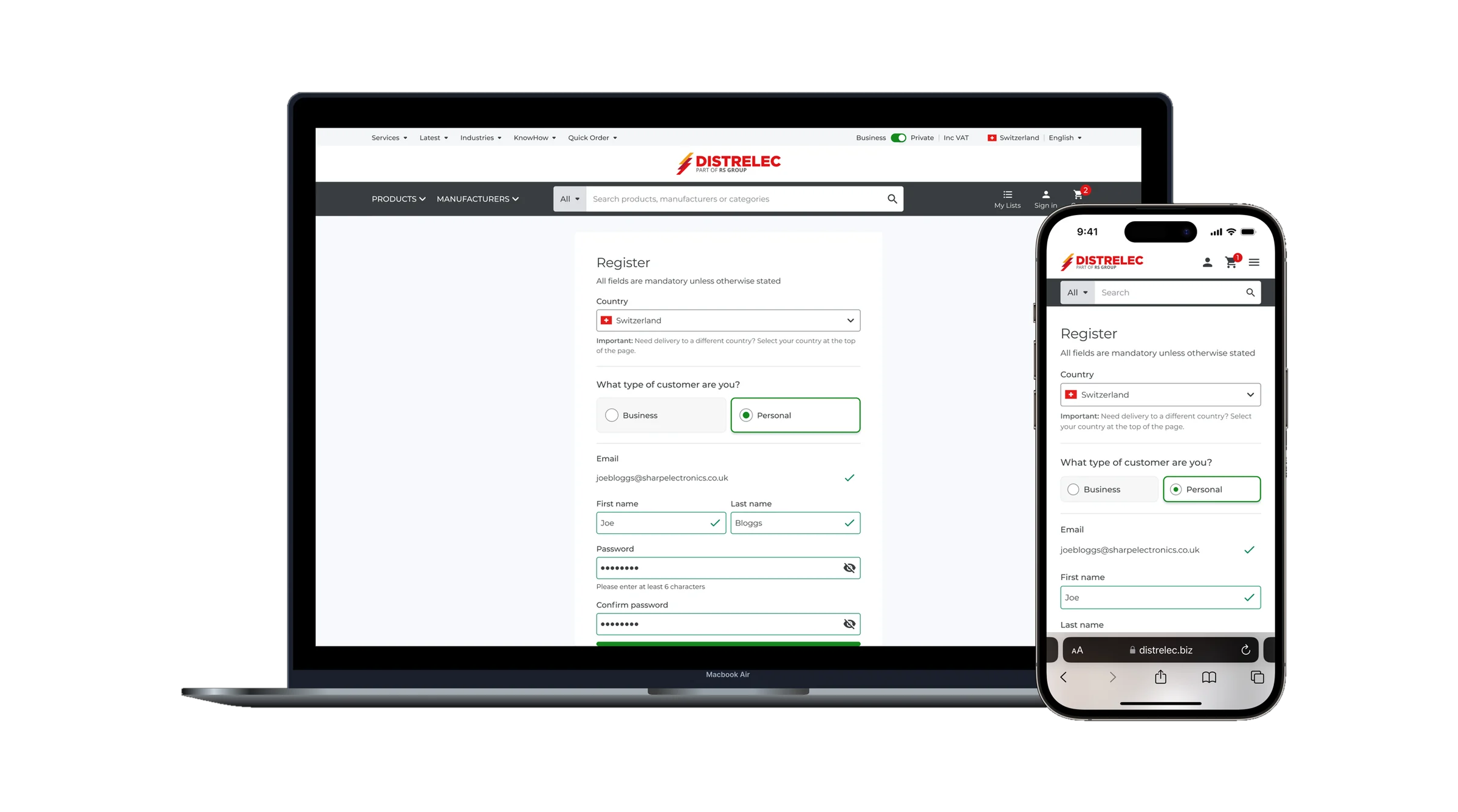
79% of visits to Distrelec failed to complete registration. I led the UX to find out why, then redesigned the journey around the evidence.
01 · Quick links
Scroll
DISTRELECPart of RS Group
Electronic components, tools and industrial supplies
Distrelec sells electronic components, tools and industrial supplies to engineers and buyers across six EMEA regions. In 2023, 79% of unique visits failed to complete registration.
Duplicate accounts were splitting order histories and driving up support requests. My brief was to find out why registration was failing and fix it, using evidence rather than opinion, before anything was committed to the roadmap.
GA4 showed me where people were leaving. Over 12 months, 127,286 users began the journey and 59,217 reached the end. On desktop, 51% made it through. On mobile, just 27%.
of unique visits failed to complete registration in 2023
completion on desktop
completion on mobile
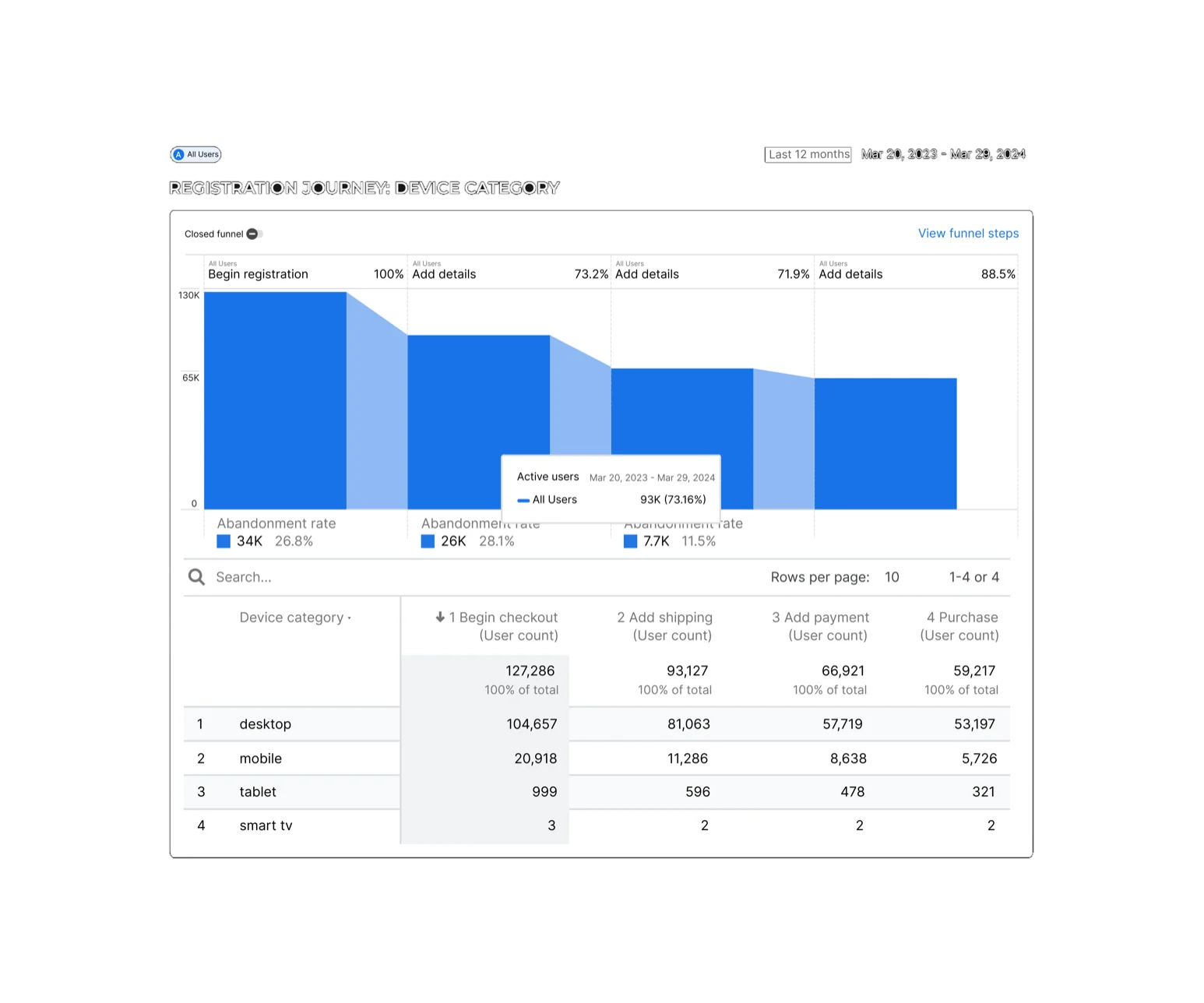
The numbers said where. Hotjar recordings, rage taps and form analytics said why. Three problems kept repeating.
Failed email validation was the single biggest trigger for abandonment.
Country and email sat too far down the form, so people hit problems after they’d already invested effort.
A disabled purchase button gave no reason why, and people kept tapping payment logos that did nothing.
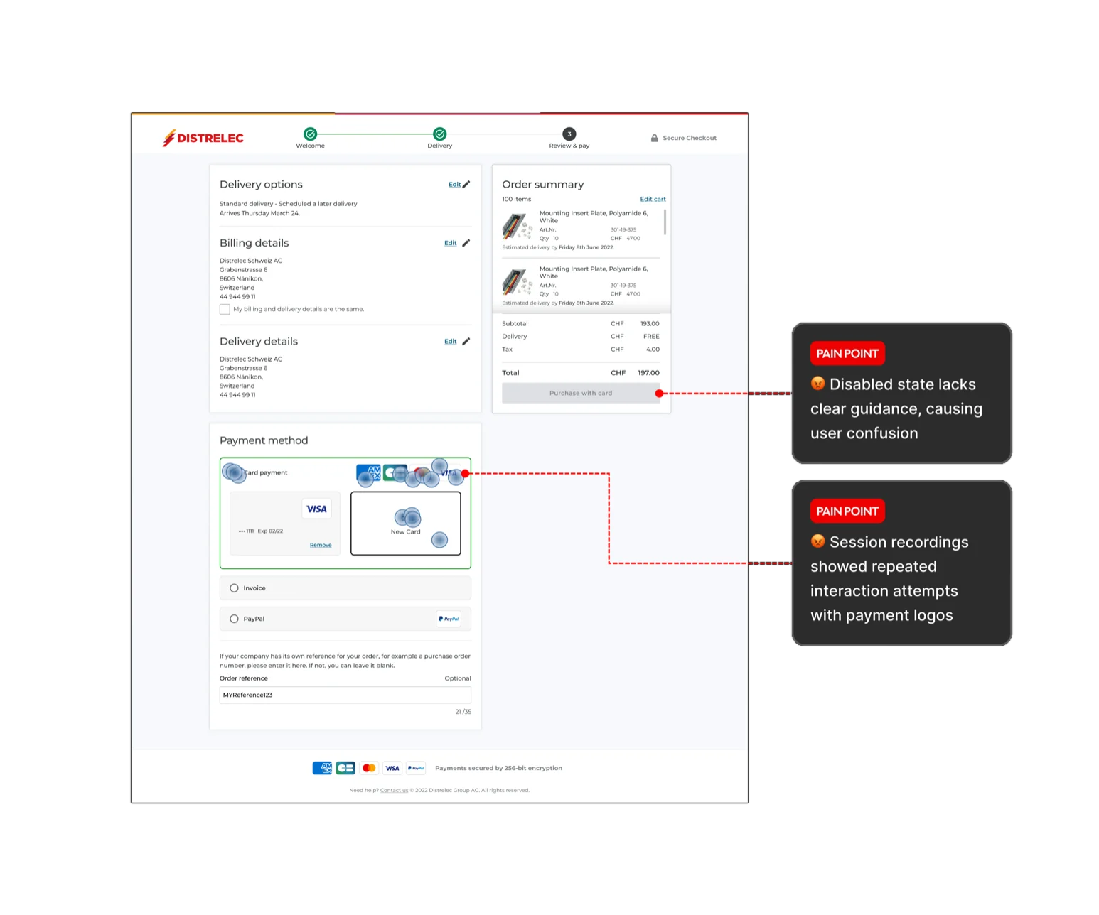
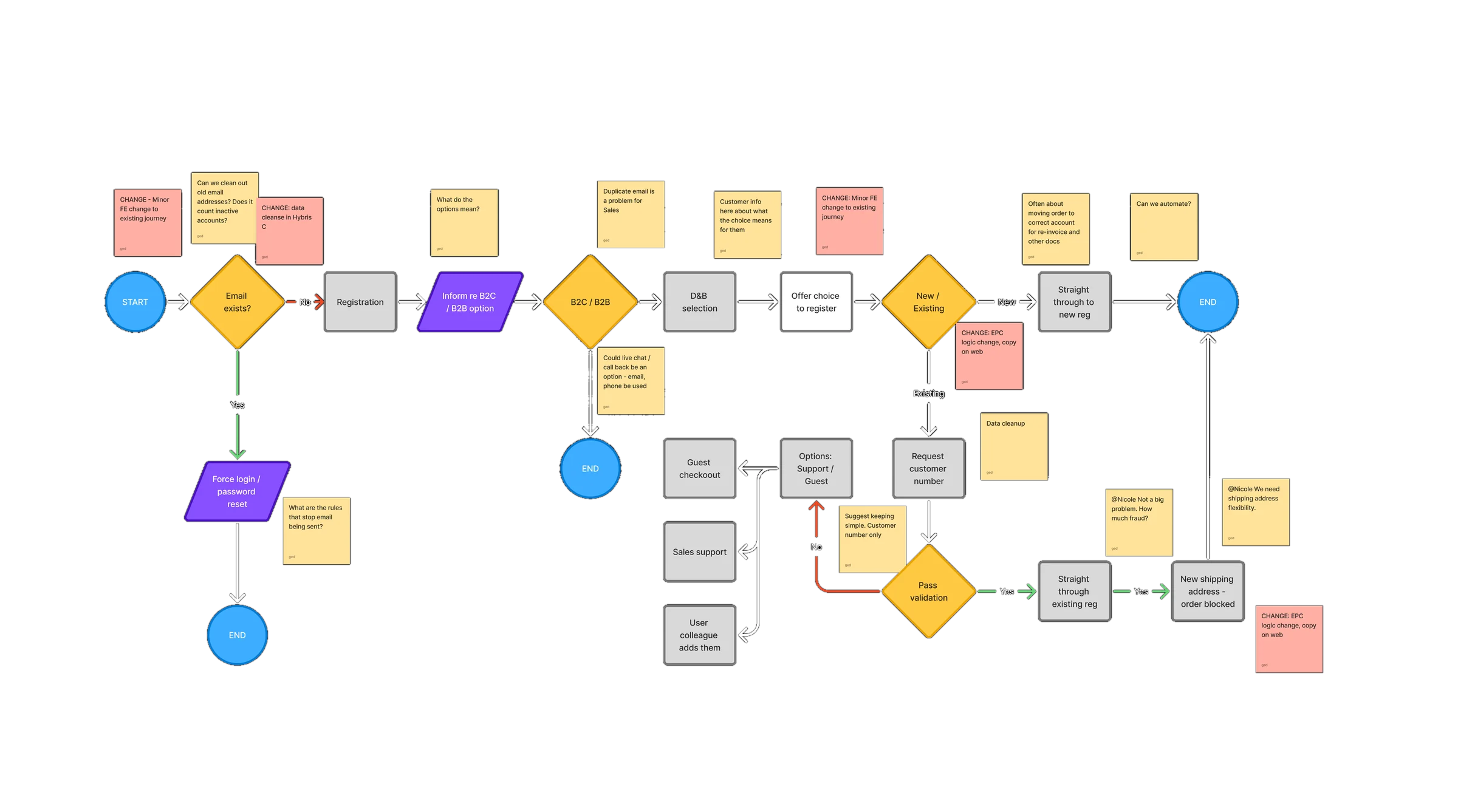
Before touching the UI, I mapped the whole journey: email lookup, separate B2B and B2C paths, validation and every possible account outcome. Edge cases were designed up front, not discovered in production.
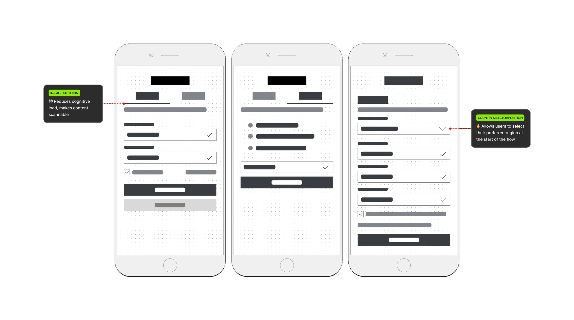
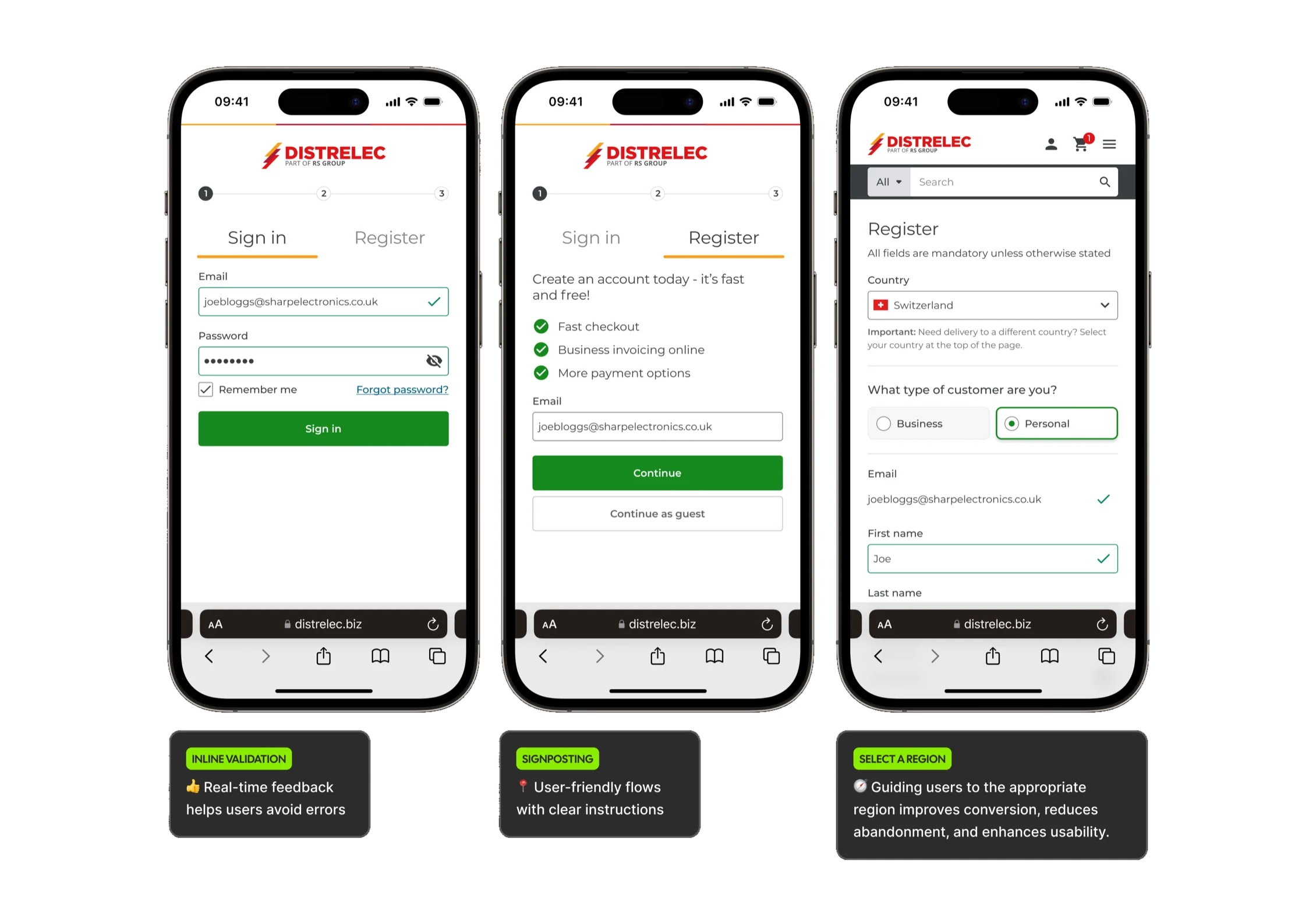
I rebuilt the form around what the research showed. Country and email now come first, so the checks most likely to fail happen before people invest effort. Sign in and Register sit as tabs on one page, which removes a step and makes the choice obvious.
Real-time feedback, so errors are fixed as they happen, not after submit.
Plain instructions at every step, written the way support explains it on the phone.
Sending people to the right region up front, so tax, invoicing and terms are right from the start.
The payment logos looked tappable, so we moved them into the footer, where they reassure without inviting a click. The disabled button now comes with helper text asking people to choose a payment option, and it switches to the primary style the moment they do.
No option selected
Select a payment option to continue
Option selected
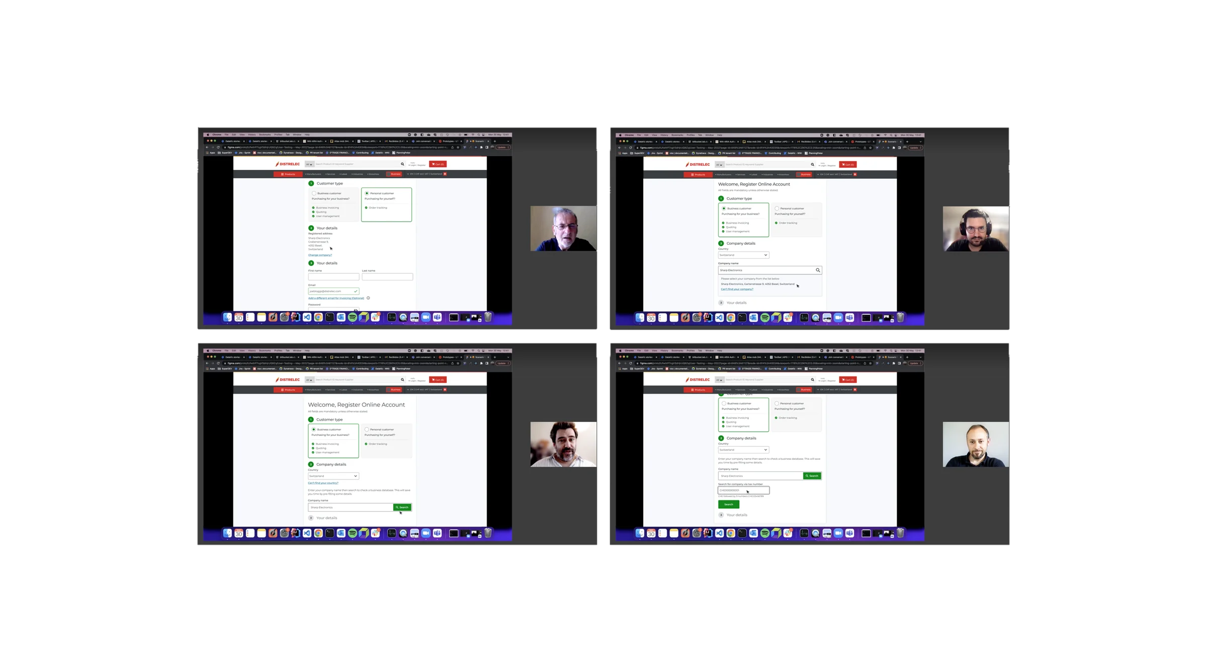
I ran four moderated usability sessions on desktop and two on mobile, alongside unmoderated flow tests in Useberry. The mobile sessions focused on the hardest B2B steps: finding your company by name and looking up a tax number.
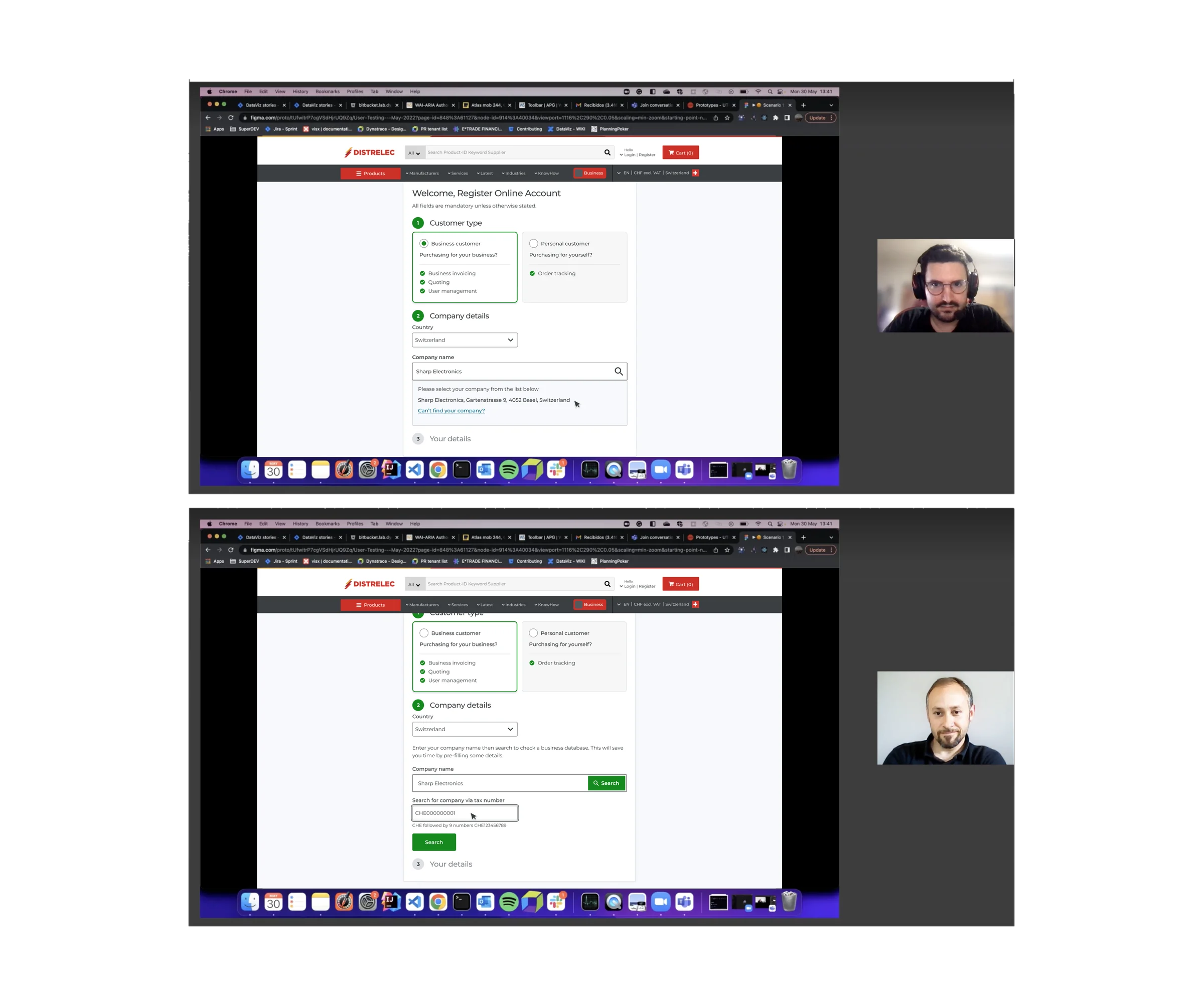
Every label and error message uses the voice support uses on the phone: plain, specific and calm. A buyer who checks everything before they approve should never have to guess what a message means.
I worked within Distrelec’s existing system: Montserrat, a dark shell, off-white fields, and colour reserved for error, success and urgency. Success and error carry equal visual weight, so nobody has to hunt for feedback.
Distrelec colour
Six ramps, 50 to 950. Tap a swatch to copy its hex.
Primary
#DF14174.9:1 on white · AA#AA19367.2:1 on white · AAA#F69F1D9.9:1 on black · AAAAccent
#393E4110.8:1 on white · AAA#16891F4.6:1 on black · AA#81858A5.7:1 on black · AA
The new registration went live across all six regions, on desktop and mobile. It asks the hard questions first, catches errors as people type and explains every step in plain language.

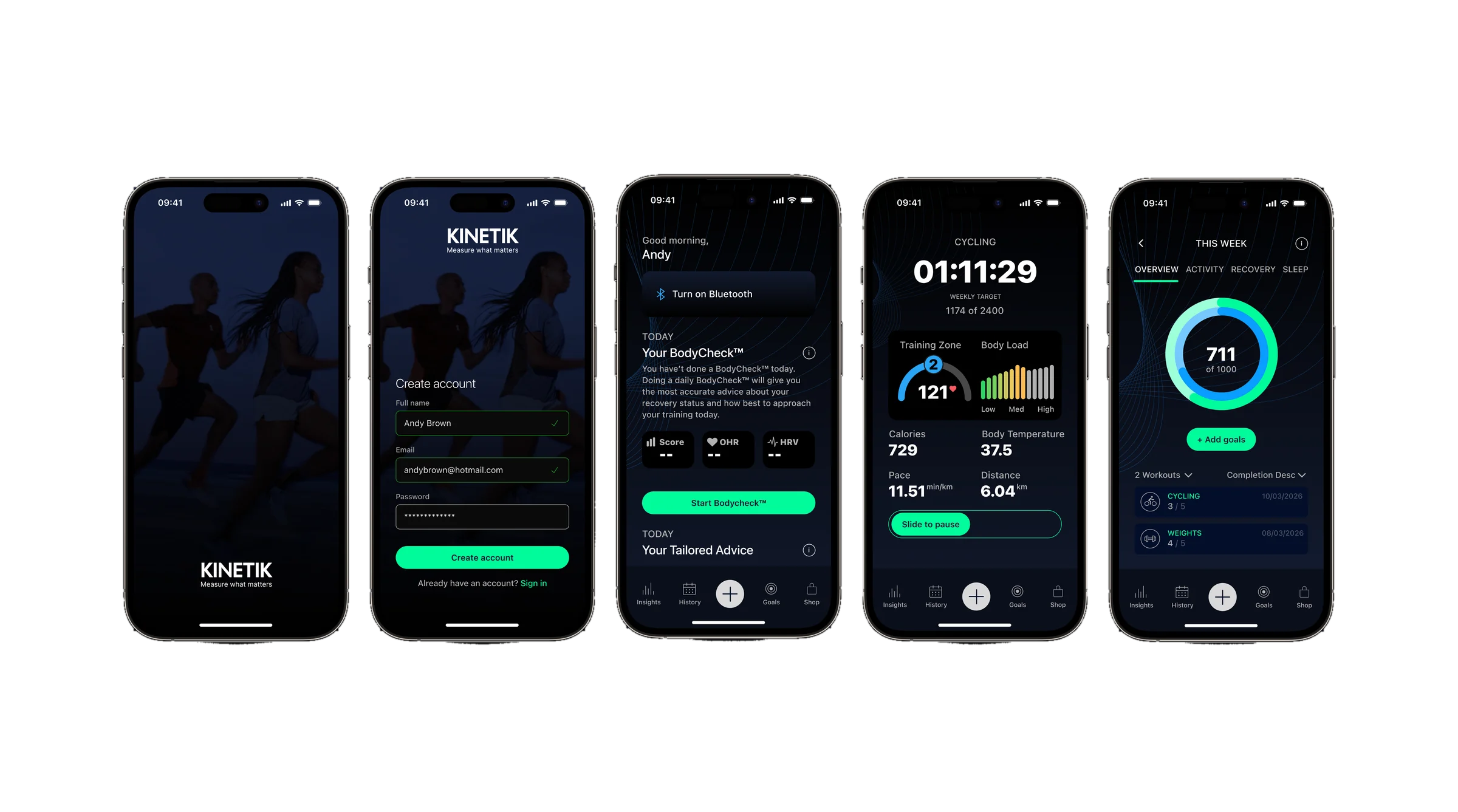
A fitness app and website for seasoned athletes and first-timers alike. In the three months after launch, completed workouts rose by 168%.
01 · Quick links
Scroll
Kinetik serves two audiences in one product: athletes fluent in pace, splits and heart rate, and newcomers who feel the effort long before they can read a chart. Most fitness apps design for one and lose the other.
The brief was to give both the same confidence: a clear promise on the website, proof in the numbers inside the app, and calm guidance through onboarding, device pairing and recovery.
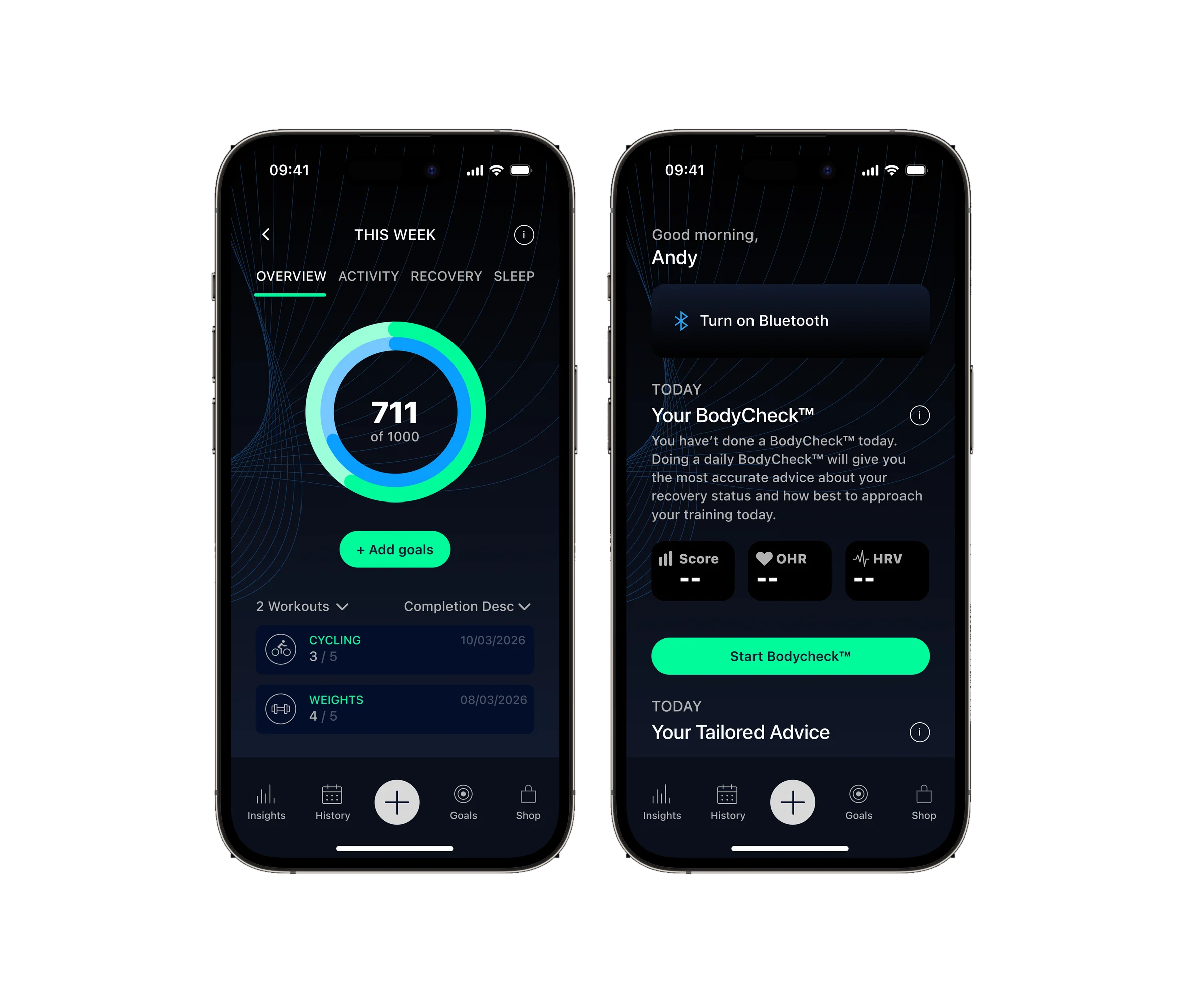
This was never a dashboard template. Discovery defined the brief: what people need to see, when they need it and how fast they can act mid-session. Pride, rivalry and doubt come first; pace, splits and anomalies come second. Three principles came out of it.
Progress you can take in between sets, or half awake before the first rep.
Terms that sound like a coach talking, not a line lifted from a datasheet.
Dense analytics stay one tap away, so newcomers are never buried in data.
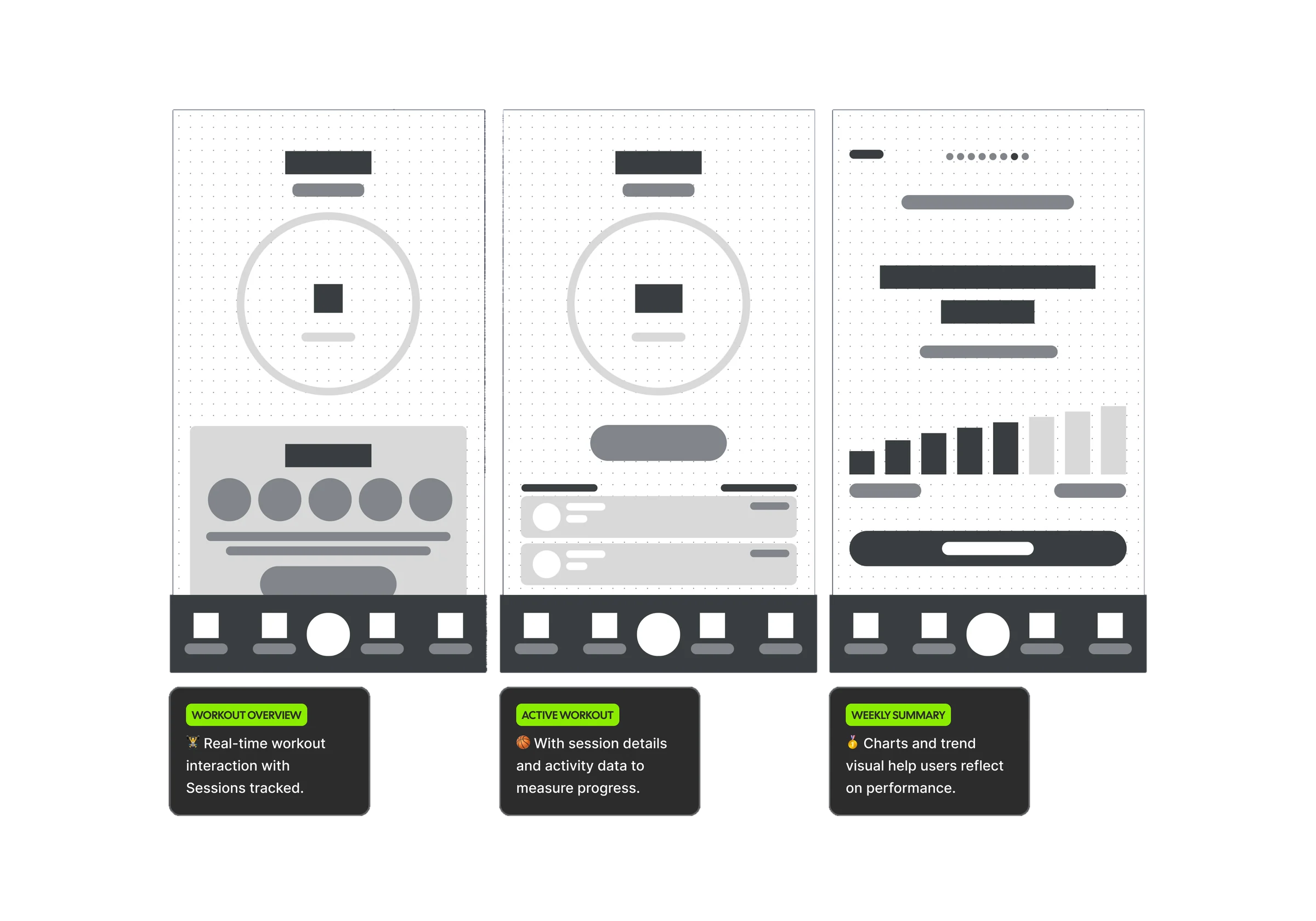
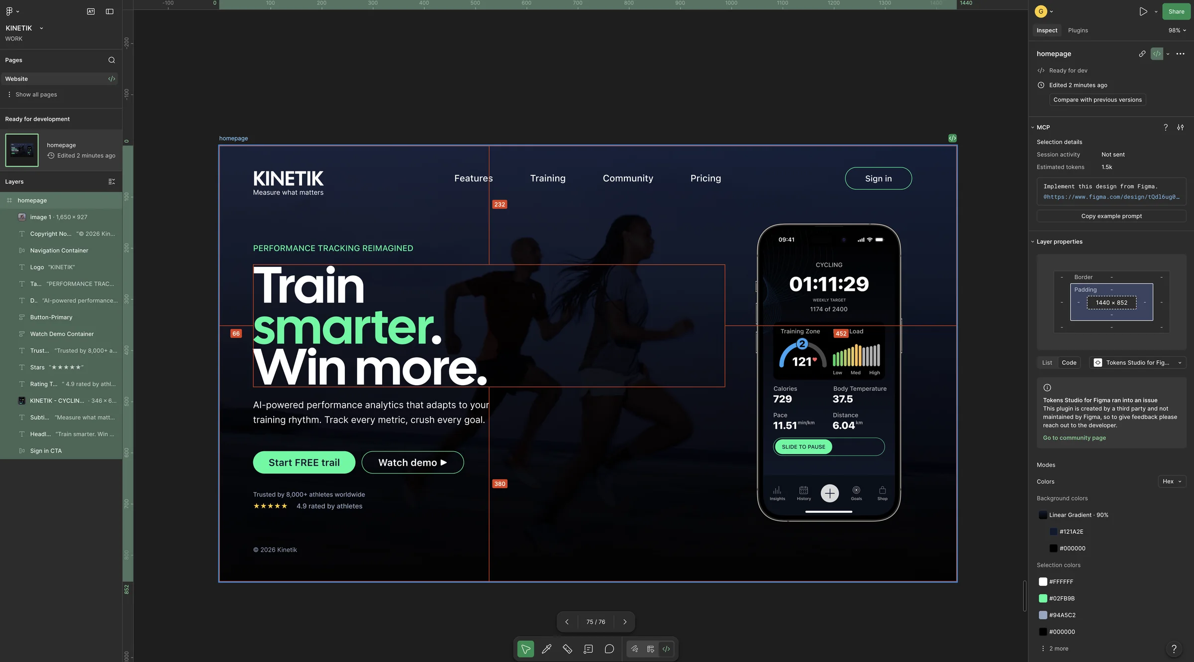
I worked Figma-first: information architecture and a component kit, then wireframes for the dashboard, live workouts, goals and notifications. Only once the structure held did I bring in Cursor and Claude Code, to tighten the flows and microcopy.
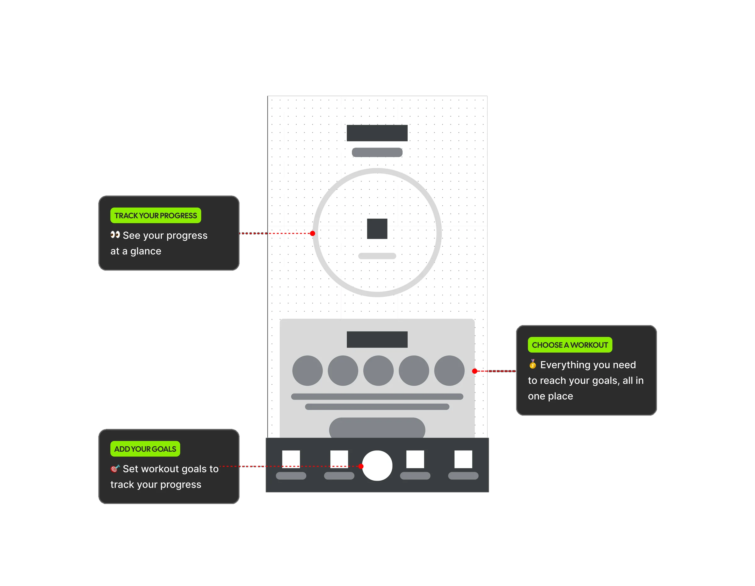
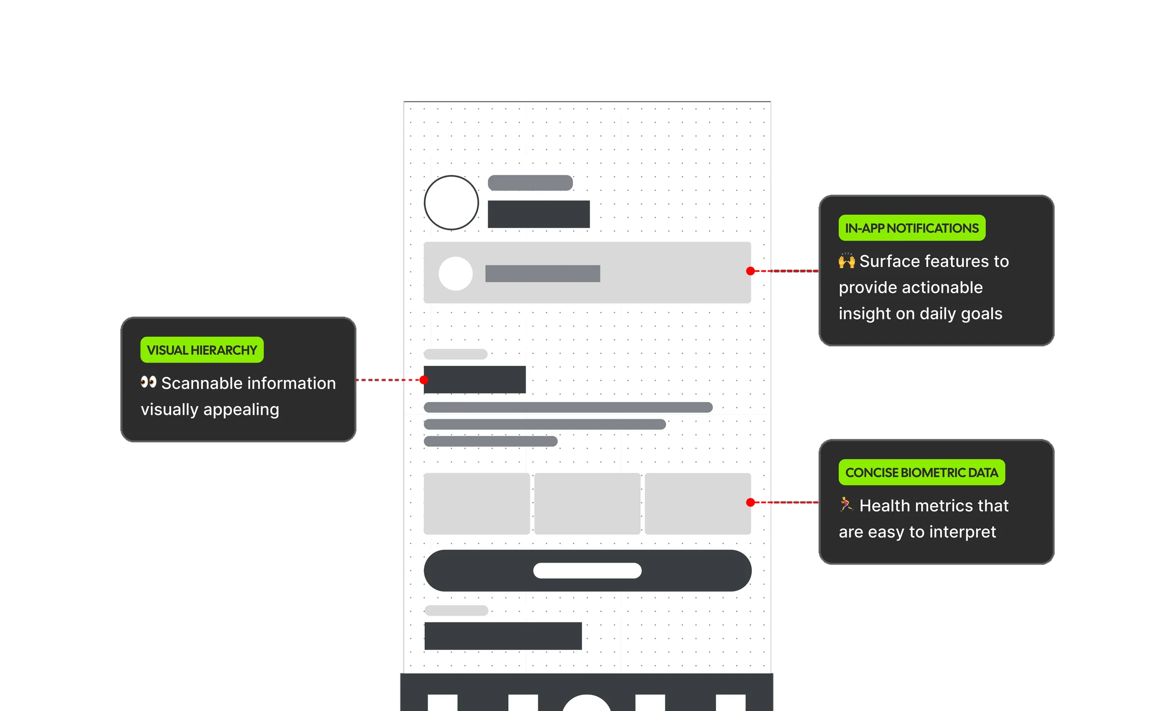
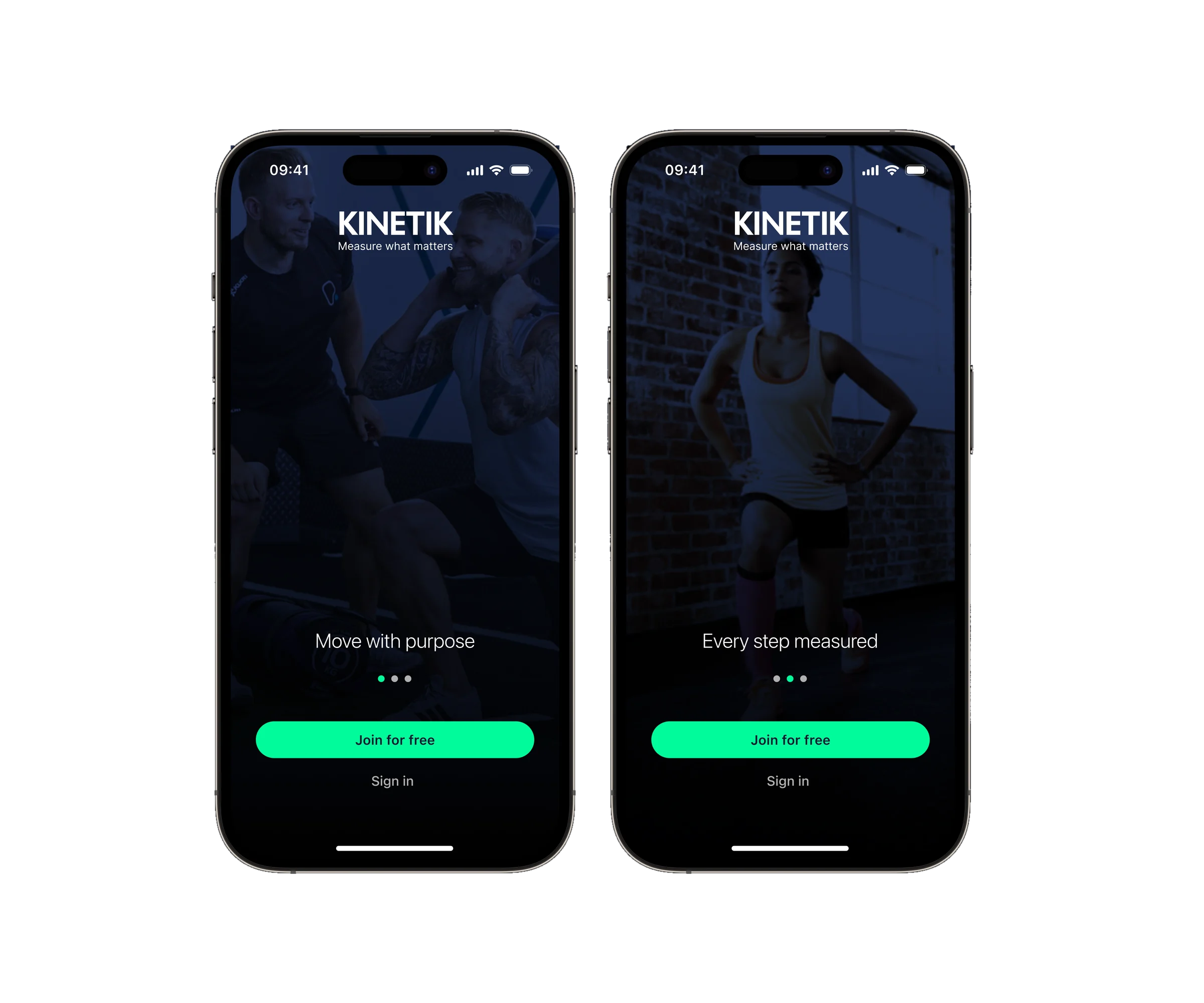
Launch is where ambition meets the real world. I designed for a first week of onboarding, people coming back after time off, and leaderboard checks at thumb speed. Reassurance sits exactly where confidence dips: permissions, retries and restores. Onboarding ended up more than 22 seconds shorter.
Bluetooth will fail. The design plans for it.
The marketing site speaks in the same voice as the app, so the promise on the homepage matches what people see after their first session. Features, training, the community leaderboard and pricing all lead with the real product, not stock claims.
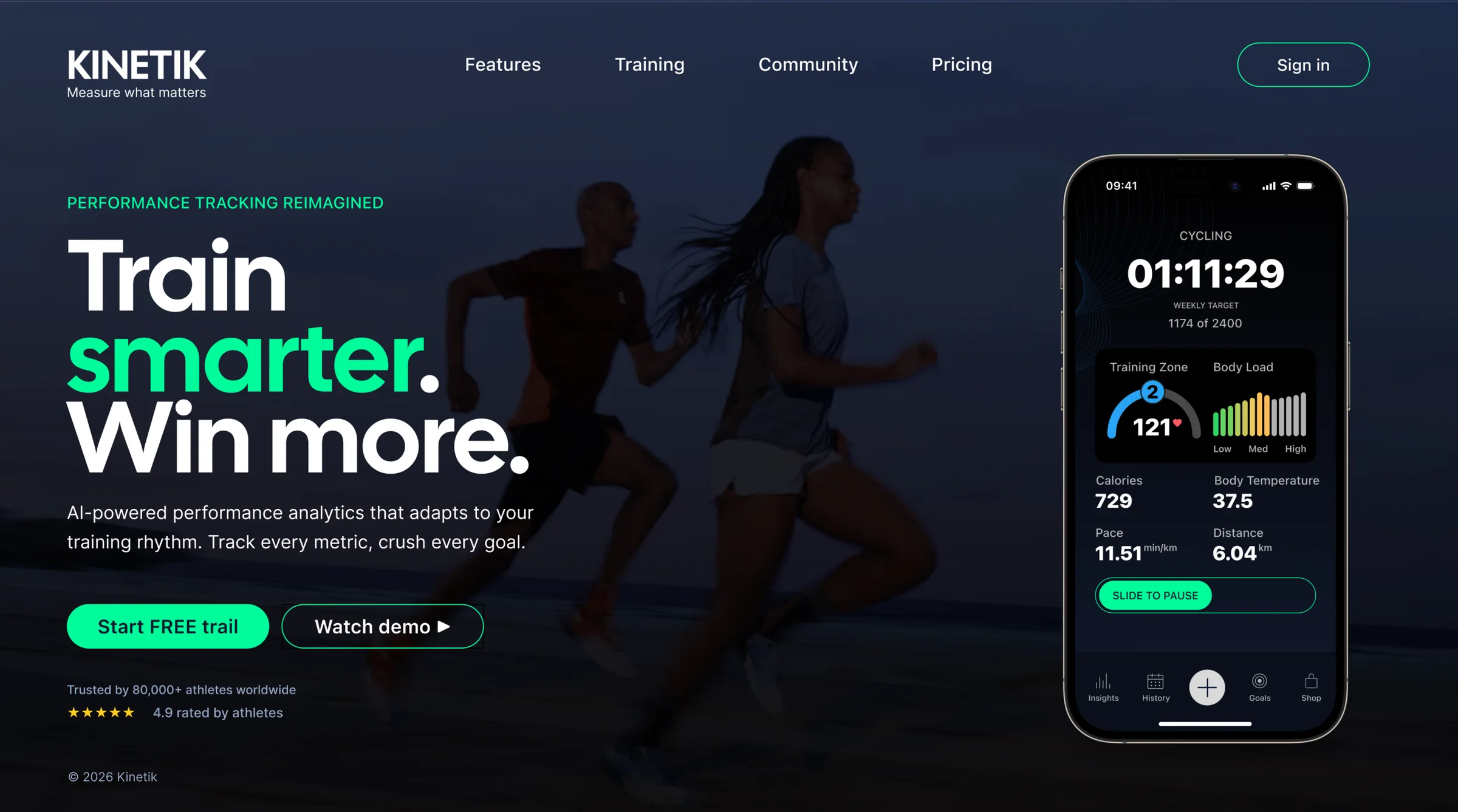
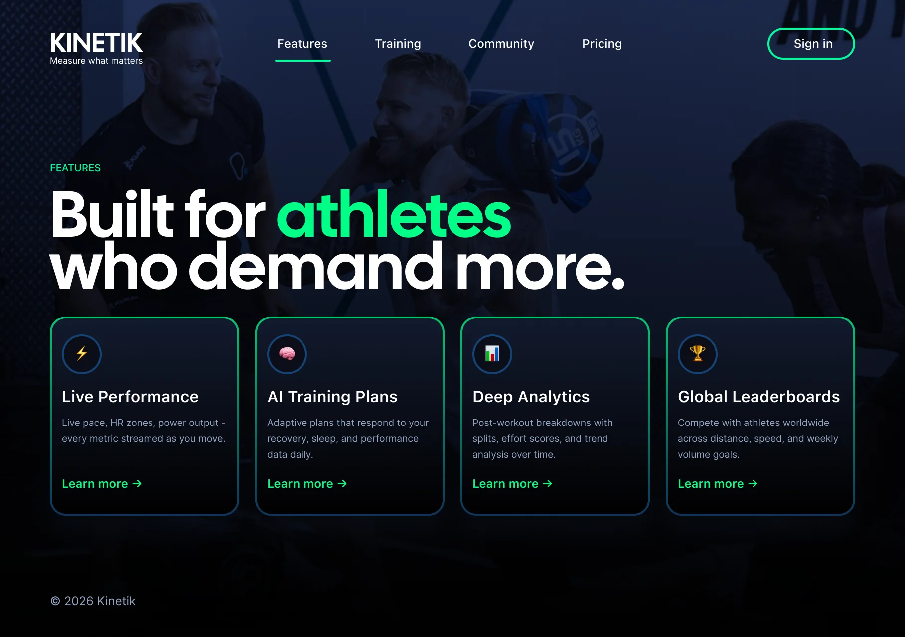
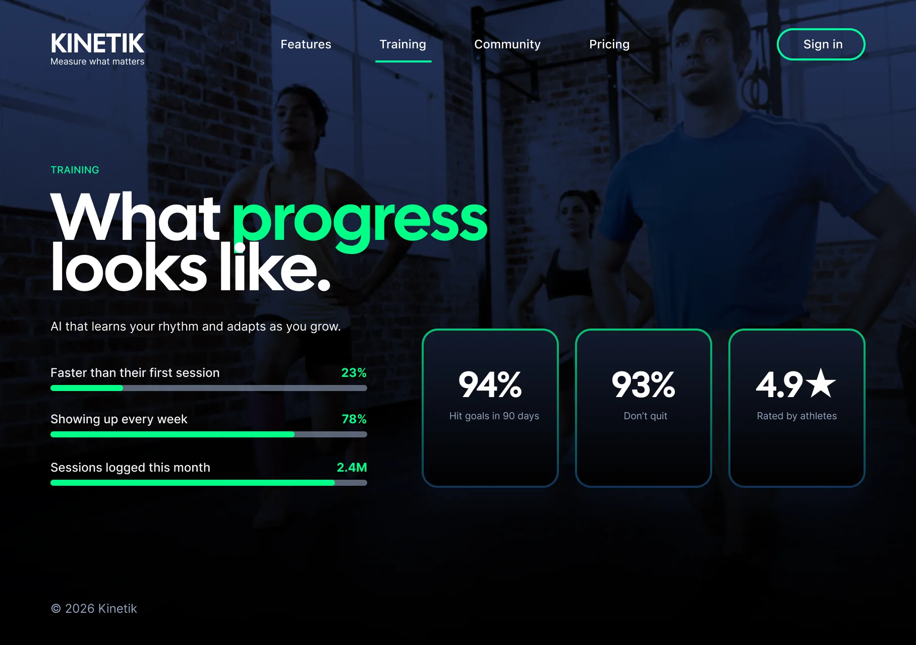
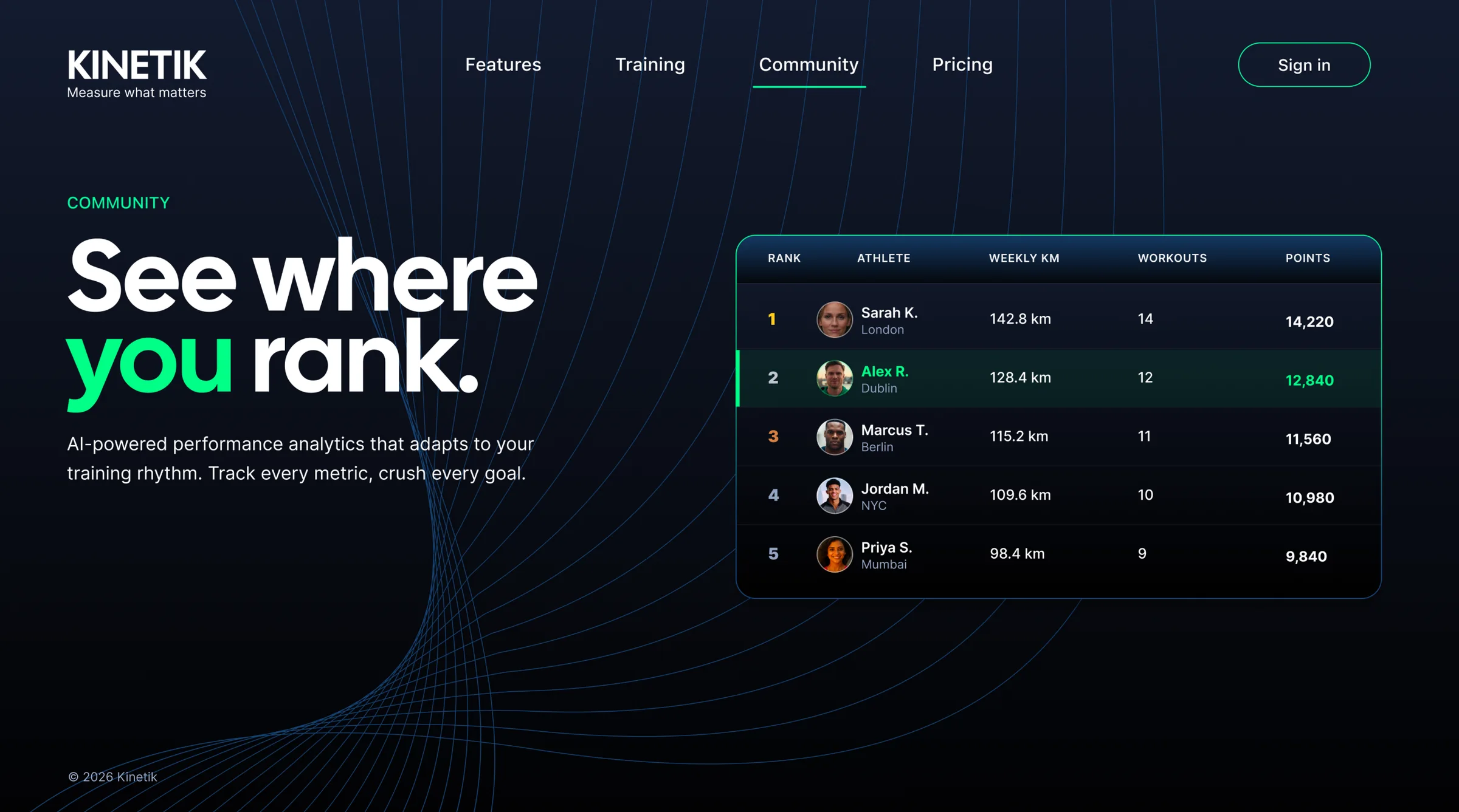
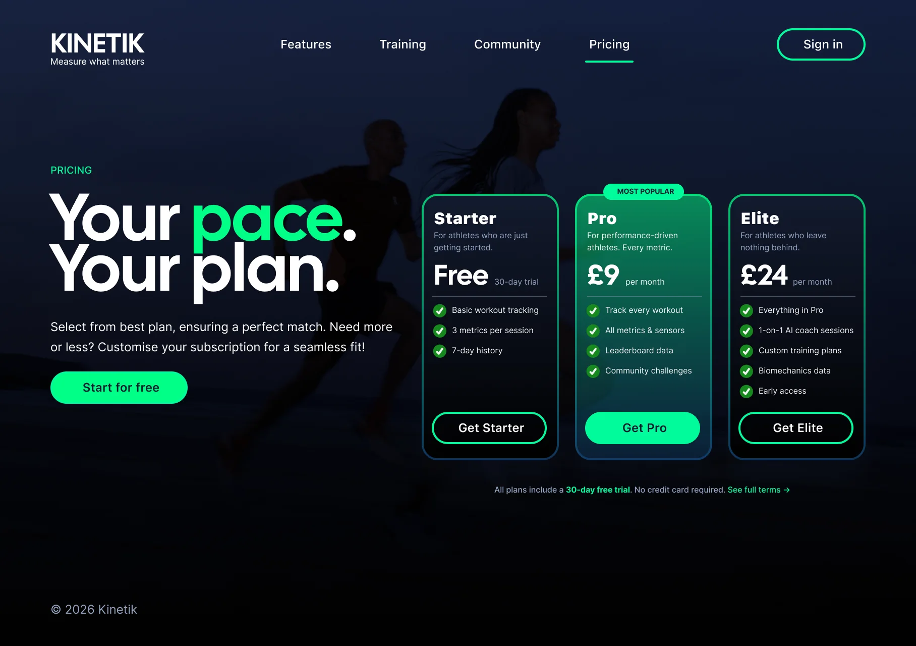
Emerald marks wins and progress. Navy anchors type and dashboards. Nickel greys carry dense data without washing out the numbers. Sky, Sunrise and Pulse are held back for alerts, rivalry and the moments that need a nudge: controlled voltage, never confetti.
Kinetik colour
Six ramps, 50 to 950. Tap a swatch to copy its hex.
Primary
#02FB9B15.3:1 on black · AAA#12142E18.0:1 on white · AAA#B1B1B19.8:1 on black · AAAAccent
#29A4F87.8:1 on black · AAA#F5A62310.4:1 on black · AAA#FC38625.9:1 on black · AADecisions lived in critiques, pairing sessions and written specs, not surprise files. Every component was annotated in Figma Dev Mode with clear boundaries and documented edge cases, so engineers could build it without reverse-engineering the intent.
completed workouts, July to September 2024
new users over the same three months
Kinetik went from discovery to handover as one product story, from the first scroll of the website to the daily dashboard. Product and engineering left with the same picture of what ships next, and the people using it trained more.
Clear hierarchy, plain language and honest states aren’t decoration. They’re why people come back tomorrow.
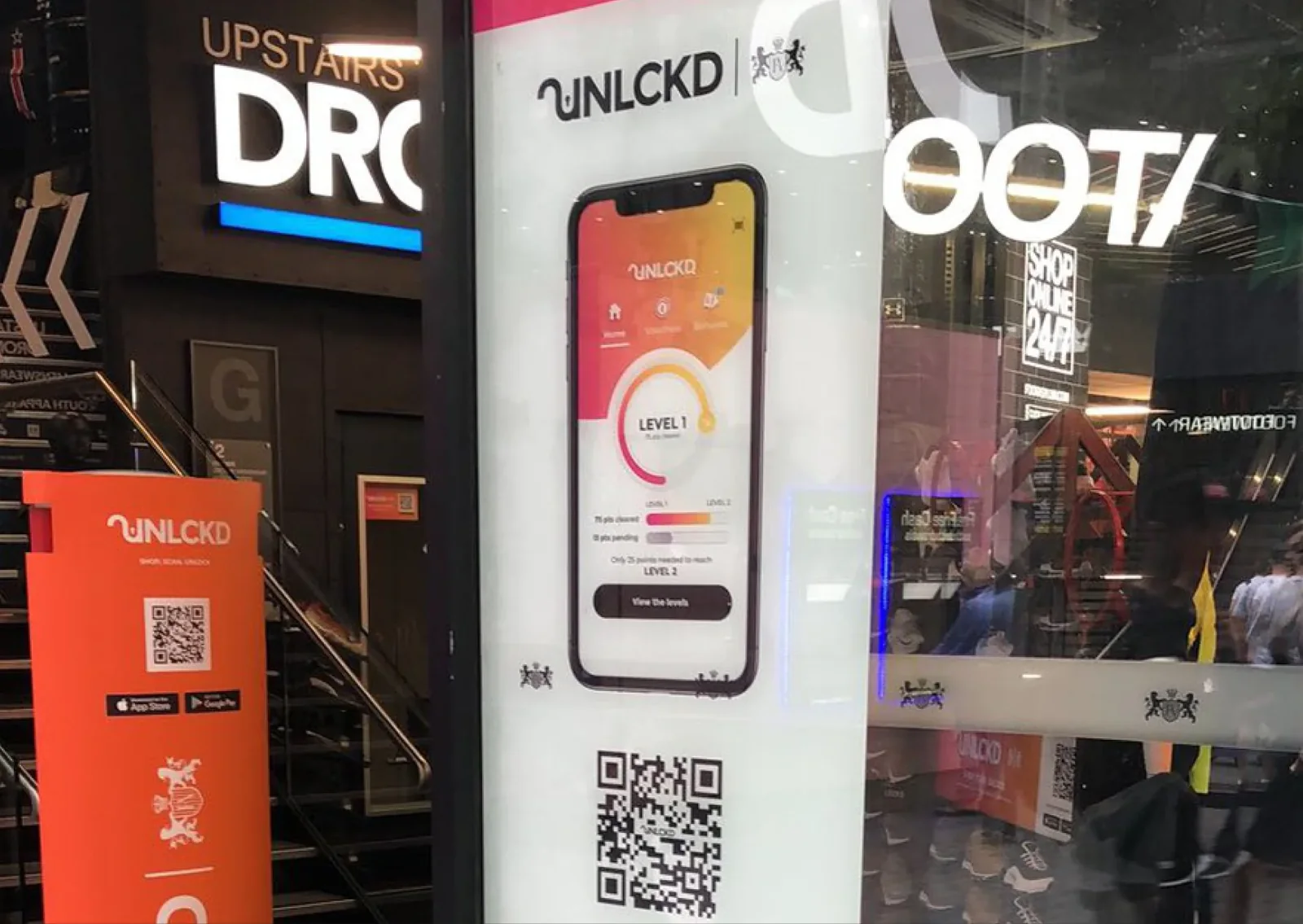
UNLCKD, a loyalty programme across store, web and app. After launch, App Store downloads rose by 174%.
01 · Quick links
Scroll
I joined Footasylum as a UX designer and sat down with three directors and the marketing manager. GDPR had just arrived, customers were more aware of their data than ever, and fewer were willing to share it.
The brief was to win that trust back: give people a genuine reason to share their details, then keep them coming back, in store, online and in the app.
I spent two weeks in the Manchester Arndale store asking customers one question: what would make you happy to share your details? The answer was loyalty. They already valued rewards from the likes of Greggs, Boots and Nando’s, so loyalty wasn’t new to them. Ours had to be better.
42 of the 45 customers I interviewed responded positively to a rewards scheme and the concept prototypes.
I synthesised the research into a customer loyalty experience and presented it to the board. It was approved.
I invited every employee to the conference room over three days to dot-vote on their preferred colourways.
I sketched the app flow and the gamification ideas, then mapped the journey from homepage to order summary, so rewards worked inside the existing web and app framework rather than around it. Usability lab sessions with customers tested the design and shaped the final revisions.
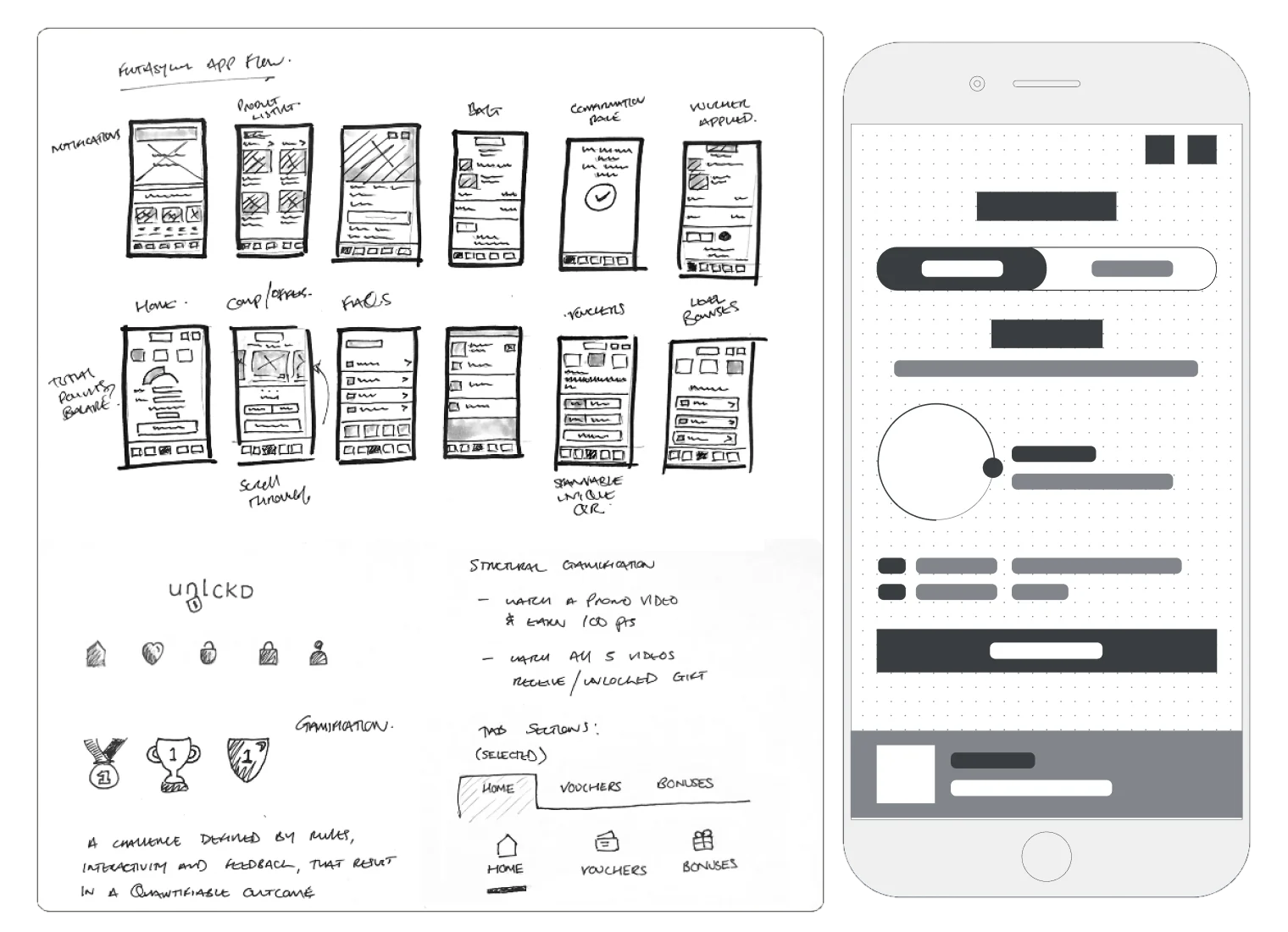
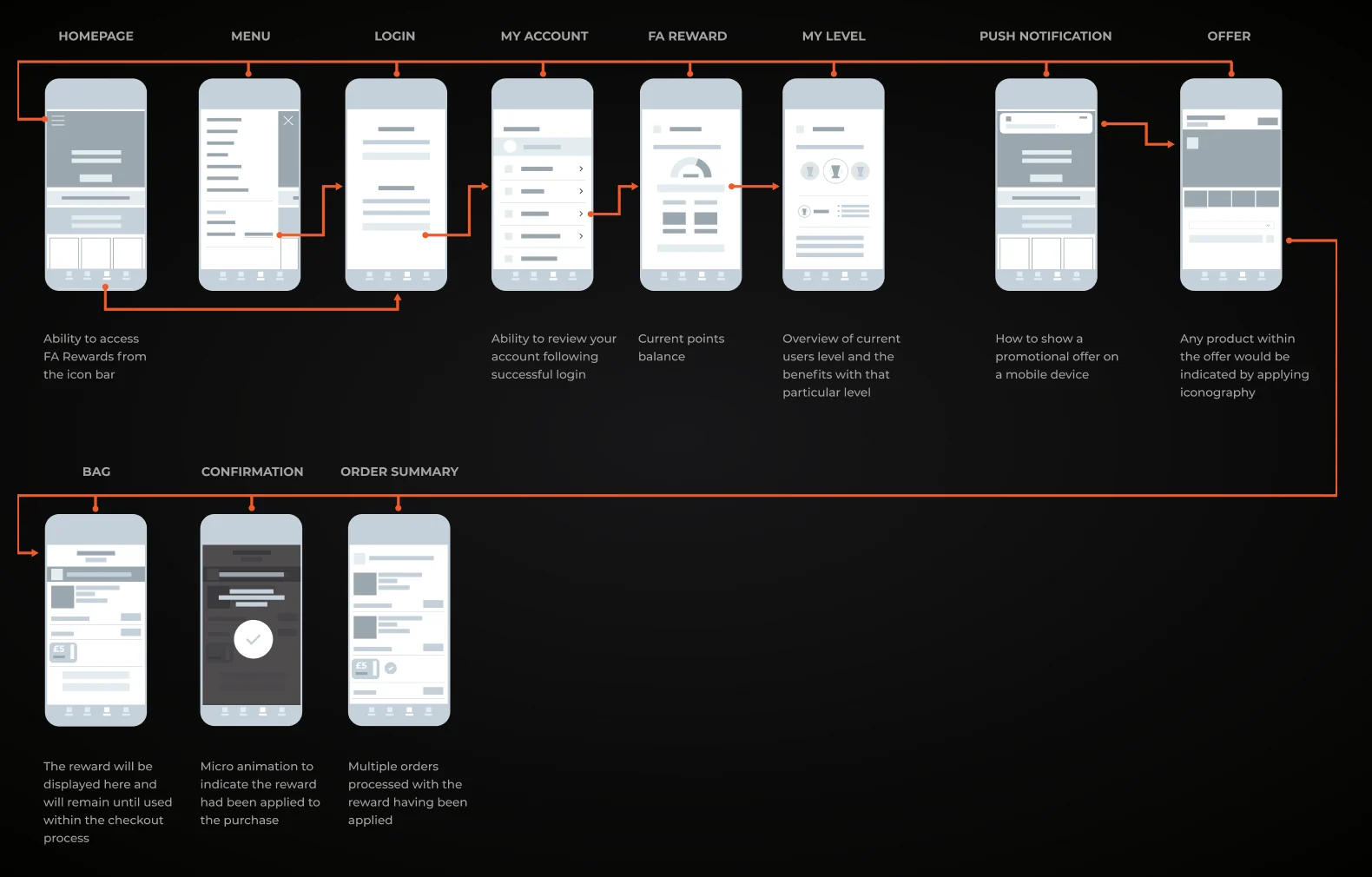
Tiered levels, vouchers you scan at the till and bonus days that give people a reason to come back, wherever they shop: in store, online or in the app.
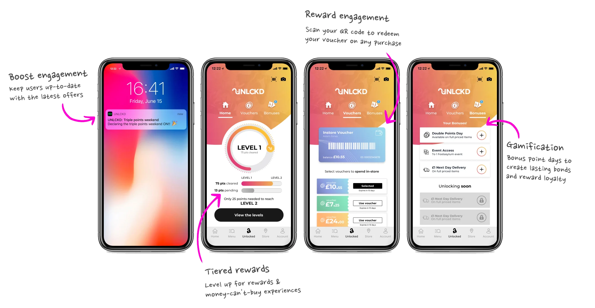
Then UNLCKD went on the road. I joined the nationwide battle bus launch through Manchester, Birmingham, Glasgow and Belfast.
App Store downloads after launch
online registrations
monthly in-store visits
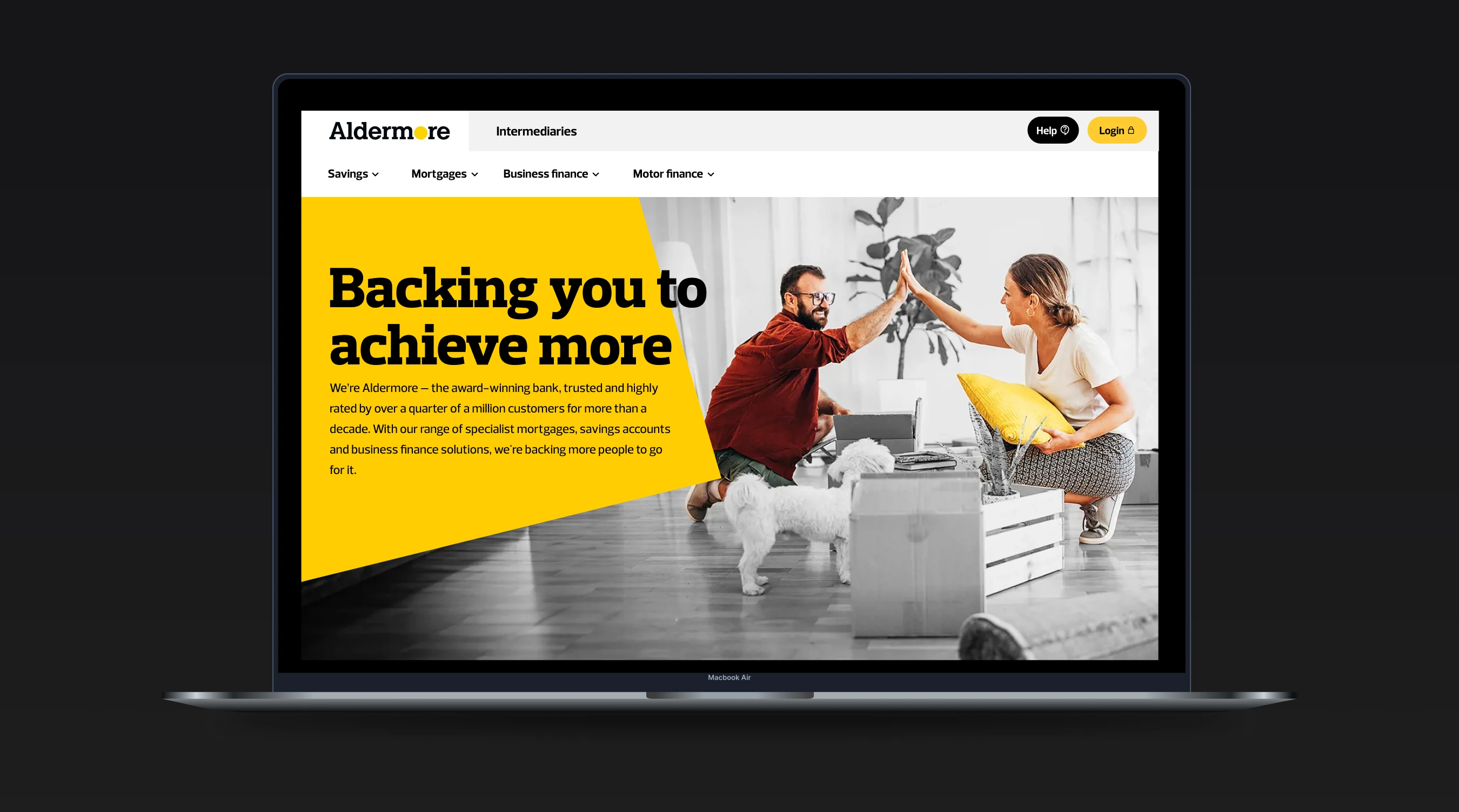
Brokers had to dig through menus to reach the deals they were tracking. I redesigned the header around what fifty of them told me.
01 · Quick links
Scroll
ALDERMORESpecialist bank
Mortgages, savings and business finance
Aldermore is a specialist bank, and much of its lending comes through intermediaries: the brokers who place mortgages and business finance on their clients’ behalf.
To check on a deal, they had to work through a series of drop-down menus before they reached their portal. My brief was to redesign the header so they could get there, and track progress, without the hunt.
I started with a discovery session where each stakeholder set out how they’d improve the intermediary experience. Then we asked the people who use it. Fifty intermediaries took part in interviews, and the same request kept coming back: get me to my portal, fast.
Direct access to the broker portal, so checking a deal’s progress takes one click.
Only the topics intermediaries actually cover, instead of every product the bank sells.
Help and Login always in the same place, findable at a glance.
I ran a design workshop with stakeholders and sketched header options in the room, refining them until each concept had sign-off. Four went forward, built with Aldermore’s design system so the test compared real options, not wireframes.
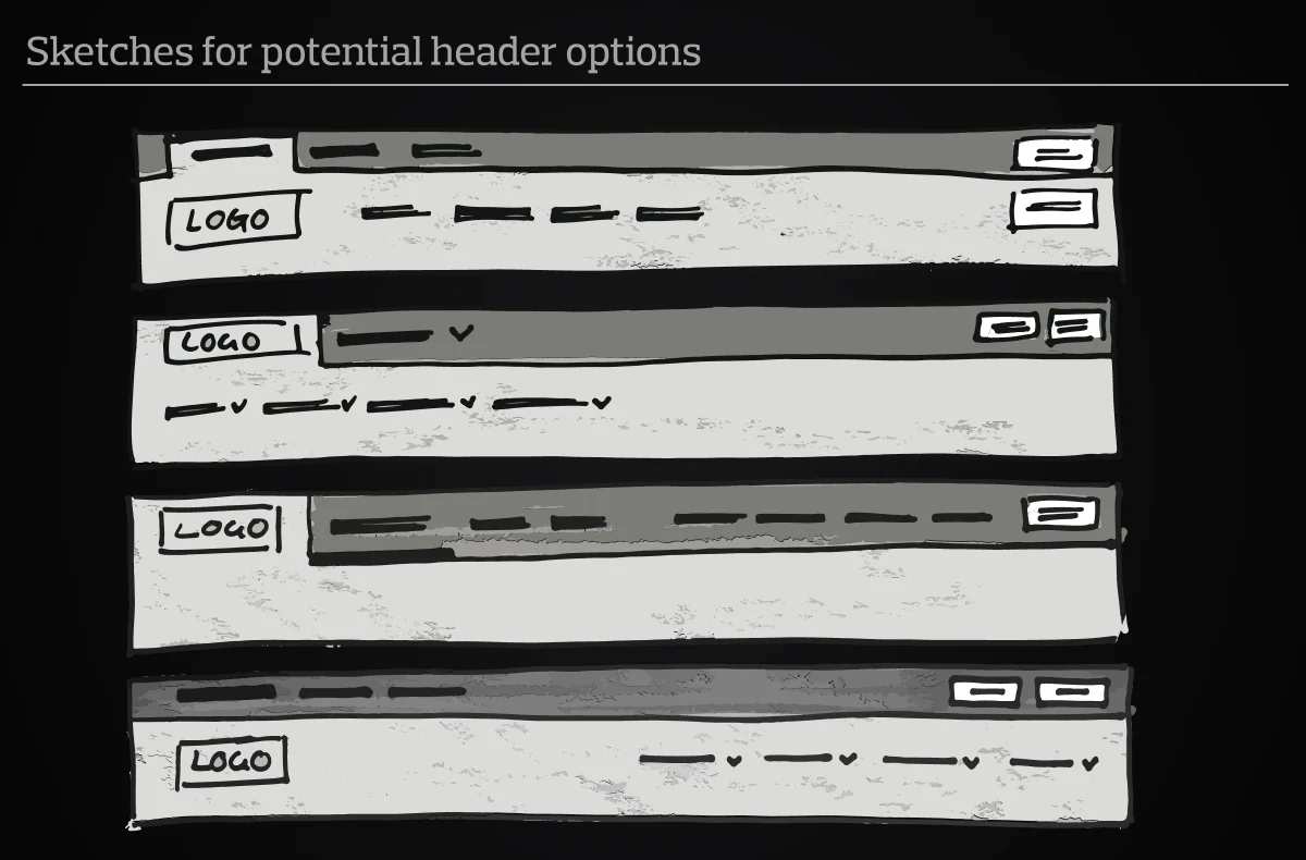
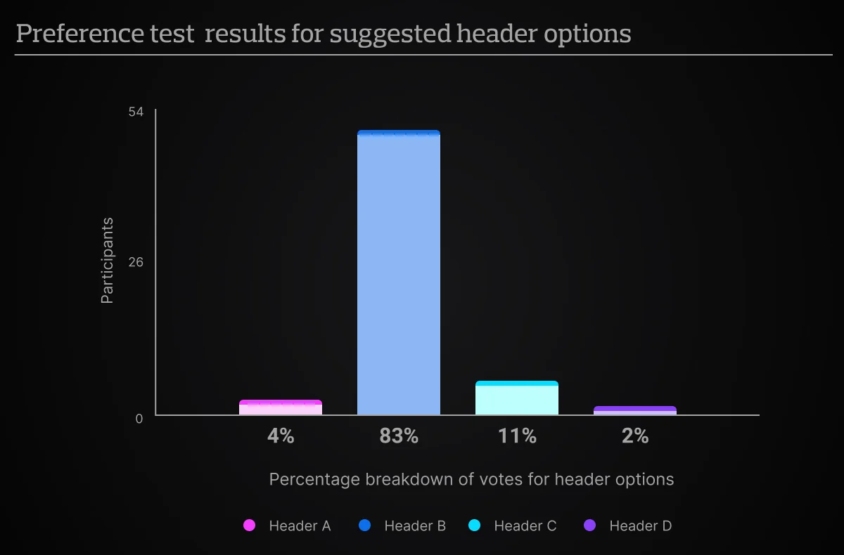
I put the four concepts through a five-second test, then asked which one people preferred. Header B won outright, so nobody had to win an argument about taste.
intermediaries interviewed
concepts in a five-second test
preferred Header B
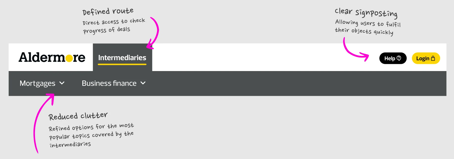
The winning concept gives intermediaries their own tab, cuts the menus from four to two, and keeps Help and Login in the same place on every page. Each change answers something brokers told me in interview.
I designed every asset within Aldermore’s design system rather than around it. Prelo Slab carries the headlines with weight; Prelo handles navigation, labels and forms. Golden Yellow is kept for the primary action and focus, so the next step is never in doubt.
#E7E8E9#CFD1D3#B7B9BC#9FA2A6#878B90#6F747A#575D64#3F454E#272E37#FFCD00#E5BB07#101820#41AF4A#ED3535Primary
Login#FFCD00Hover / press
Login#E5BB07Inactive
Login50% opacitySecondary
Edit3px keylineHover / press
Edit6px keylineHint
Email addressInactive
Focus
Valid
richard.jones@ntl.comError
richard.jones.ntl.comThis is not a valid email address.Golden Yellow for the action and the focus. Rich Black and its greys for structure. Green and red only for validation, so feedback always means something.
deal completion following the broker portal redesign
In a regulated bank, the safest design decision is the one users have already made. Interviews told me what brokers needed, and a quick test told me which design delivered it.
Plan selection for a subscription retailer, designed, researched and A/B tested. Premium plans rose from 12% to 32% of orders.
01 · Quick links
Scroll
Few customers were adding a SIM to their broadband order. The cards repeated the same content, so plans were hard to tell apart, and nothing helped people work out how much data they needed.
The hypothesis: make the content relatable, and more people will choose a SIM.
Outcome: premium plans rose from 12% to 32% of orders. Richer cards lifted plan mix but cost add-on uptake, and that learning shaped the next test.
Inside the full studyThree conceptsUser researchThe card, annotatedFull A/B results
I designed three directions, from stripped back to conversational, so we could weigh speed against guidance before committing to a test.
Only the essentials: data, price and a usage label, quick to scan and compare.
Usage examples, perks and future prices, so people know exactly what they’re getting.
A short chat about budget and usage that recommends a plan, taken as far as a working proof of concept.
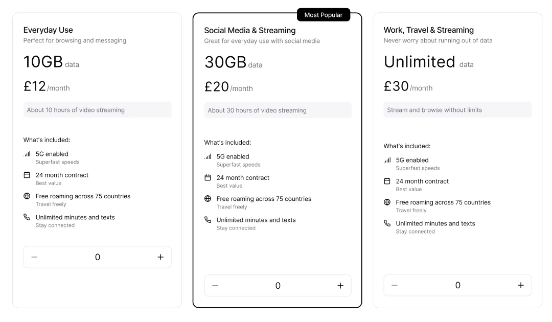
User testing compared the live cards with three variants on desktop and mobile. One variant stood out, and the feedback told us exactly what to fix next.
No one in testing found the strongest variant confusing.
Highest for visual appeal and clarity, on desktop and mobile.
Show future prices clearly, lift the contract length and label every plan by how people use it.
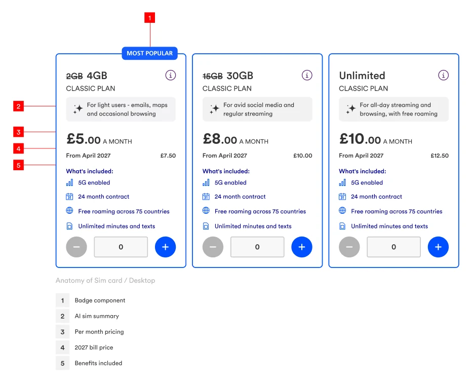
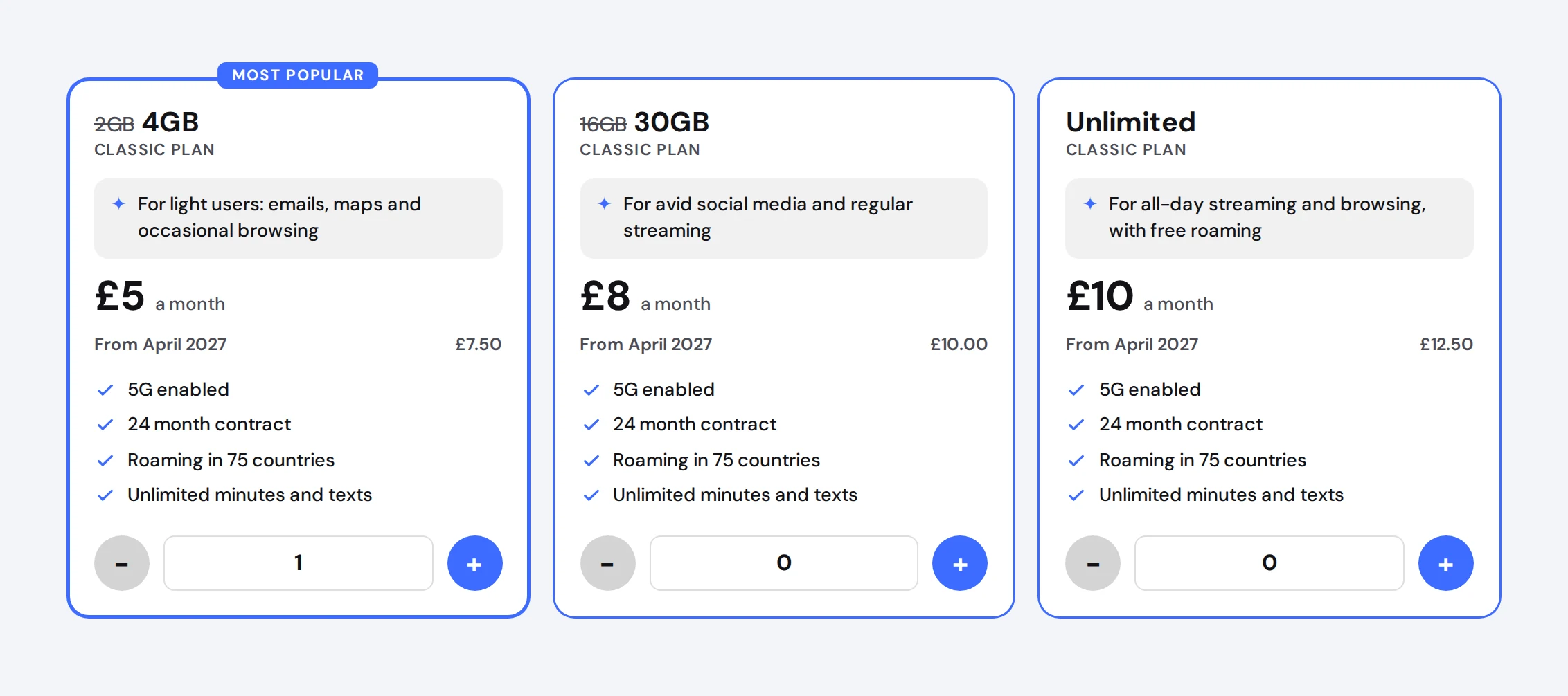
Each card leads with a plain usage summary, then the monthly price, the price after the next change and the benefits. On mobile, the benefits fold away until you ask for them. Try the card below.
Classic plan
For light users: emails, maps and occasional browsing
£5 a month
From April 2027£7.50
Classic plan
For avid social media and regular streaming
£8 a month
From April 2027£10.00
Classic plan
For all-day streaming and browsing, with free roaming
£10 a month
From April 2027£12.50
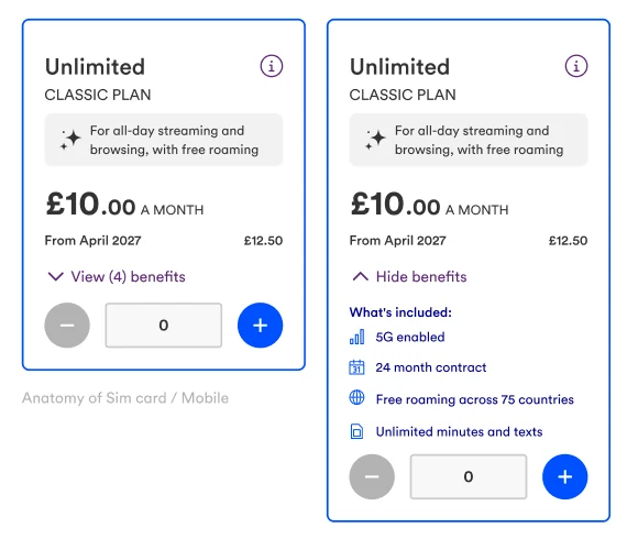
fewer customers reached the add SIM step
SIM purchase rate, down from 2.5%
of SIM orders were premium plans, up from 12%
A negative result is still a result. Richer cards helped people choose a bigger plan, but asked more of people who only wanted the cheapest SIM. The next test keeps the clarity and gives a faster route to the entry plan.
I’d rather learn fast and honestly than ship a guess.
Product pages rebuilt as a guided flow, after an 8.2% order uplift. Live A/B test from November 2026. Results to follow.
01 · Quick links
Scroll
An earlier test proved that tidying the phone pages lifted orders by 8.2%. But tidying only goes so far. The top of the page still asked shoppers to decode a hero banner, colour and capacity pickers, offer boxes, a plan toggle, a filter and three dense tariff cards before choosing a plan.
The brief: redesign the first third outright, mobile first, so customers reach tariffs faster and choose with confidence.
Outcome so far: built on an 8.2% order uplift. The guided five-step configurator goes into a 50/50 A/B test across 18 product pages.
Inside the full studyWhy it’s better than controlTry the live configuratorFive conceptsEdge cases and copy
My hypothesis: if the first third guides people through one decision at a time, in the order they naturally make them, more will reach a plan, the basket and a completed order, because the page stops asking them to work it all out alone.
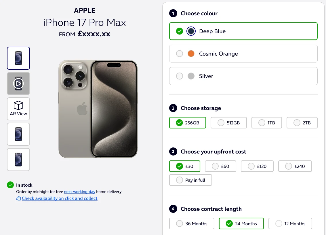
Colour, storage, upfront cost, contract length, then data. Each answer shapes the next question, so nothing is chosen blind.
The price updates with every choice, and a short summary sits right beside the call to action.
On desktop the product stays pinned until the steps are done. On mobile the steps stack in a single column.
An anonymised rebuild of my QA’d final design. Colour updates the phone, storage the device price, upfront cost the monthly payment, contract length the plans you can pick, and the data plan the final monthly price.
Why steps 1 to 4 are already chosen, and step 5 isn’t. Colour, storage, upfront cost and contract length start on the most common choices, so shoppers see a real price straight away and only change what matters to them. The data plan starts empty on purpose: it’s the biggest commitment in the order, so we never choose it for them. Choosing a data amount reveals three tariffs, none pre-selected, and the basket button stays inactive until one is picked. Nobody adds a phone to their basket without knowing exactly what they’re paying for.
Flagship phone Deep Blue · 256GB
In stock
I benchmarked UK networks and European retailers to see how leaders order device and plan choices, and how much they ask before showing a price. The brief asked for two or three options; I explored five, each annotated for plan comparability, price transparency, call-to-action context and reassurance. The configurator was the most logical and scannable of the set.
What each choice changes, and what has to come before it.
Show only what the current decision needs, and keep the price in view.
Out of stock, unavailable plans and a disabled basket, all specified for build.
A guided flow is only as good as its worst moment, so I specified what happens when stock runs out. An unavailable storage option stays selected and shifts to an error state, the product panel explains why, and the basket button is disabled.
The out-of-stock moment is tracked as its own event in the test, so friction can be measured, not guessed.
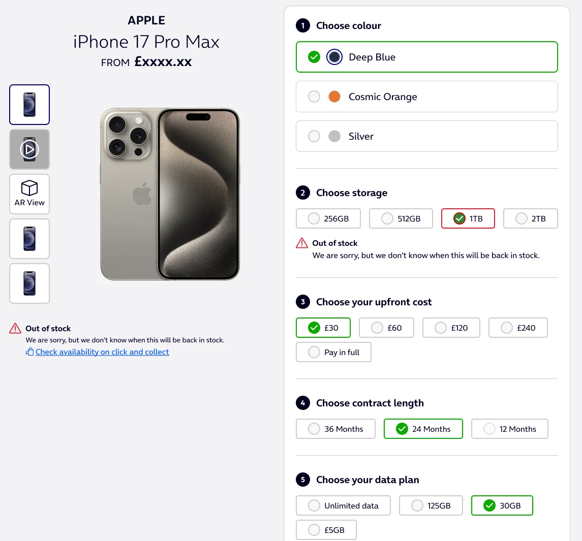
Step labels became short and action-led. “Choose your data plan” replaced a colder heading, “Unlimited data” replaced wording that invited doubt, and “Add to basket” stayed because it says exactly what happens next. Below the fold, the content now runs brand promise, then product proof, then reviews.
shoppers reaching configuration
shoppers reaching the basket
completed orders, the primary metric
A 50/50 split across 18 phone pages from Apple, Samsung and Google, for new and upgrading customers, over 14 days to cover two full weekly cycles. There are no results yet, and this page won’t pretend otherwise. They’ll land here once the test has run its full course, whichever way it goes.
A winning test earns the right to a bolder one. This one asks whether guidance outperforms compaction at the top of the page.
£1.8M in annual sales, 174% more app downloads, 168% more workouts.
Research-led UX that ships, with the numbers to prove it.
The follow-up to an 8.2% order uplift, now in live A/B test
Premium plans up from 12% to 32% of orders
A luxury brand and live store in 2 hours, directed through AI
£1.8M annual sales uplift from checkout
+168% completed workouts in three months
+174% app downloads after launch
+18% deal completion after the broker redesign
UX Designer, Manchester. I’ve worked across eCommerce, banking, insurance and telecoms, with teams that ship and teams that needed to. Open to Senior and Lead roles in Manchester, hybrid or on‑site. I usually reply within a day.
hello@geddevine.comEmailI design in Figma and build with Claude Code, Cursor, Git and Vercel, testing ideas in real code with MCP-based AI workflows. I never stop learning from the people I work with, and from our users.
Lead
Systems
Design
Validate
Build
Tooling
Virgin Media O2 Nov 2024 – Present · Manchester
Senior design voice across multiple acquisition squads, leading UX for conversion rate optimisation across homepage, configurator and checkout, and the escalation point for complex product decisions.
Distrelec Nov 2021 – Jun 2024 · Manchester
Led product design across concurrent workstreams for an electronics and industrial supplier trading across six EMEA regions.
JD Sports Jun 2021 – Oct 2021 · Bury
Partnered with product and analytics to optimise end-to-end purchase journeys.
IMS Tech Jan 2020 – May 2021 · Manchester
Customised the OneApp iOS and Android platform with external partners, aligning UX with client goals for major insurance brands.
Booking.com Nov 2018 – May 2019 · Manchester
Partnered with analysts on A/B tests that improved insurance attach rate and retention.
Footasylum Feb 2018 – Nov 2018 · Rochdale
Design lead for UNLCKD, Footasylum’s loyalty platform, unifying mobile, web and app to lift engagement and retention.
Aldermore Bank Sep 2016 – Jan 2018 · Manchester
Led design in regulated retail banking, balancing compliance, accessibility and customer experience across broker and internal platforms.
Earlier career 1999 – 2016 · Run2, Meditech Media, Concept4, Carcraft, Thomas Cook
Seventeen years across agency and in-house design, from digital and print to large-scale delivery.
Greater Manchester
Design and Visual Communications
Sheffield Hallam University
AI-crafted brand identity.
( Services )
Lucille London is fiction — it exists only as an AI-assembled portfolio work. The goal was to test whether a full luxury brand and storefront could hold credibility when strategy, visuals, narrative, and build all emerge from the same machine-led workflow. The bar stayed high: editorial and intimate on first impression, then consistent across navigation, merchandising, and reassurance (shipping, care, returns) without the spell breaking.
The constraint was deliberate: build the narrative, visual system, and product experience with AI as the primary creative accelerator — Cursor to structure and stress-test the experience end to end, Higgsfield for visual exploration, Claude Code for language architecture — so quality came from iteration, not volume.
Luxury e-commerce is judged in milliseconds: hierarchy, whitespace, and restraint either read as confidence — or as chaos. Every module had to earn its place: hero proposition, collections, edits that behave like a magazine, and product cards that carry craft without doubt.
The stack was the studio: snapshot passes, variants, microcopy generations — all AI-native. Discipline lived in direction — which prompts survived, which routes shipped, what still scans as intentional when you scroll at 2 a.m. on a phone.
The outcome is a coherent fiction on a live URL: one voice ("Lucille London"), a collection story that carries from landing to basket, and interaction patterns that respect hesitation in high-consideration categories — without the site reading as a thin brochure.
OVERVIEW
Lucille sits where Parisian romance meets London shopping culture: French lace and silk, a collection spine (La Belle Époque), and a retail story rooted in Kensington's boutique reality. The brief wasn't "make a pretty shop" — it was to make trust and desire occupy the same screen.
Strategy, design, and storytelling were shaped as one system — prompted, critiqued, and refined so the brand could repeat without sounding rehearsed. The goal was cohesion across every touchpoint: the promise in the hero, proof in product detail, and calm confidence through policy and care. Nothing ornamental. Everything accountable.
THE CHALLENGE
AI can generate abundance fast. Luxury reads as decision: what you omit, how you pace a page, the words you choose when the garment is tactile but the interface is glass. The challenge: anchor iteration in Cursor (IA, flows, build quality); use Higgsfield for visual direction and exploration; lean on Claude Code for narrative and UI microcopy — and keep the polish human-tight so nothing reads synthetic.
Every pass moved toward a single identity: editorial typography, warm minimal layout, and shopping paths that reward browsing (New Arrivals, Edits, collections, swim and nightwear) while keeping orientation obvious. Cohesion isn't repetition — it's a recognisable voice that scales from campaign headline to size and care.
BOUTIQUE EXPERIENCE
Luxury lingerie is bought with emotion first — confidence, intimacy, occasion — and justified with facts second: fabric, fit, service. The experience needed to evoke a refined, intimate space: unhurried, tactile language, and cues that mirror the Kensington boutique promise without pretending the screen is a fitting room.
I treated atmosphere as UX: spacious rhythm, restrained merchandising blocks, and a voice that whispers rather than sells. The outcome reads as effortless — even though the system underneath is deliberately structured for scan, compare, and return visits.
THE LAUNCH
Launch is where brand meets behaviour. Navigation and collection architecture were built to answer real journeys: discovering what's just arrived, moving between lingerie and nightwear, stepping into swim as a sibling category, and finding gift moments without breaking narrative flow.
Secondary reassurance — shipping, gift wrapping, returns — was placed to reduce cognitive load at decision time, not buried as legal footnotes at the end. The UI pattern is simple: elevate the collection story, make product evaluation calm, and let service proof support the leap to cart.
COLOUR PALETTE
The palette follows luxury digital conventions, tightened for clarity: deep base tones for drama and focus, off-white surfaces for textile and product truth, and restrained accent used sparingly so promotion and urgency never cheapen craft.
Colour hierarchy maps to intent — storytelling zones stay quiet so photography carries emotion; interactive states stay legible for accessibility and confidence at checkout. Every swatch earned its place on the page.
WORDMARK
The visual system leans on wordmark discipline — Lucille and LONDON in a composed lockup — rather than an illustrated logo zoo. Supporting iconography stays minimal and functional: wayfinding and service cues that disappear until needed.
The direction favours serif-forward headlines for editorial romance, paired with a clean sans-serif workhorse for wayfinding, pricing, and product metadata — so emotion lives in storytelling, and clarity lives in shopping.
CAMPAIGN
Campaign moments ("Fall in love with lace", "The art of doing nothing") function as chapter titles: they set tone for a collection and invite scroll without shouting discounts. The same voice carries into editorial Edits — culture, style, gifting — so content reads as part of the product world, not a bolt-on blog.
AI-assisted drafting produced breadth fast; curation produced the brand. The final lines were chosen for memorability, fit, and a house that sells intimacy with dignity.
BRAND PACKAGING
Packaging thinking surfaces where shoppers need reassurance: complimentary gift wrapping, clean delivery expectations, and a premium unboxing story implied by the brand language. Digital "packaging" is the order journey — confirmation, clarity, care instructions — so the experience feels complete when the box arrives.
The aim is continuity: the same quiet confidence on the PDP should carry through every post-purchase touchpoint, so the brand feels intact from first impression to hanger.
CONCLUSION
AI can accelerate the messy middle — options, variations, microcopy drafts, visual references — but design is still the arbiter of taste, truth, and friction. Lucille London is a case in disciplined iteration: fewer loud claims, more consistent signals, and a store that earns return visits because it feels considered.
The live site is the artifact — browse La Belle Époque, move through nightwear and swim, and watch how restraint does the selling.
Pick a tool and leave your mark. Only you can see what you make.