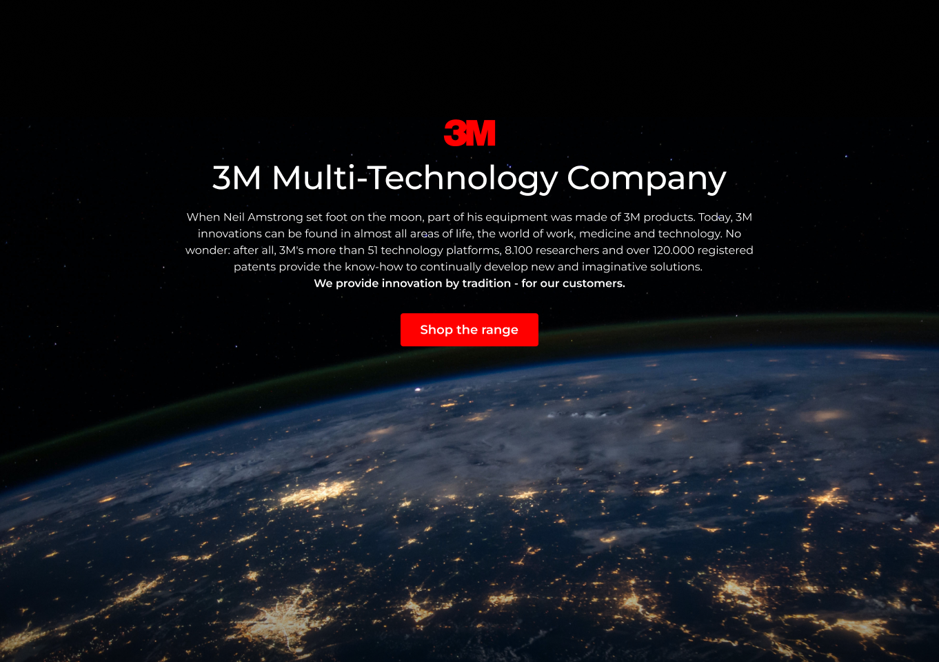
DISTRELEC EMEA
Registration built on evidence.
Distrelec runs components, tools, and infrastructure across six regions. Duplicate accounts skewed order history and drove up support load. I led registration UX from evidence — replay first, tested changes next — before anything was committed to the roadmap.
Shipped programme work: live constraints, not a deck. The test was whether registration could read as credible when research, UI, copy, and build moved through one disciplined pipeline. The bar held — calm on first read, then consistent through navigation, onboarding, and reassurance (invoices, contracts, returns) without trust snapping or the flow sounding like a retrofit.
The constraint was explicit: ship the registration story, field model, and product surface with research setting pace — Hotjar to expose failure modes, Useberry to validate flow calls, Claude for label and error drafts — so quality came from iteration, not volume.
Industrial e-commerce is judged in milliseconds: field order, spacing, and error copy either read as control — or noise. Every block had to earn its place: headline promise, territory capture, states that behave like a desk handoff, and rows that carry proof without theatre.
The working stack was replay, prototype, and script — evidence first, then design calls: which failure repeated, which route shipped, what still reads as intentional when someone files a ticket after hours.
What shipped is one coherent path on a live URL: a single voice for Distrelec, a registration thread from first entry to active account, and patterns that respect caution in slow buys — without the journey feeling like varnish.
OVERVIEW
Clarity before chrome.
Distrelec sits where catalogue depth meets procurement caution: parts, tools, infrastructure, with registration and checkout varying by region. Duplicate accounts made orders hard to track and support complaints climbed. The brief wasn't prettier chrome — it was fewer identities, clearer proof, and a flow finance can stand behind.
Strategy, UX, and UI moved in one lane — reviewed with stakeholders, revised against tickets and transcripts — so the voice could repeat without sounding canned. Same signal at landing, through the steps, and at service handoff. No ornament. Only accountable steps.
THE CHALLENGE
A B2B registration surface has to read as audit-ready.
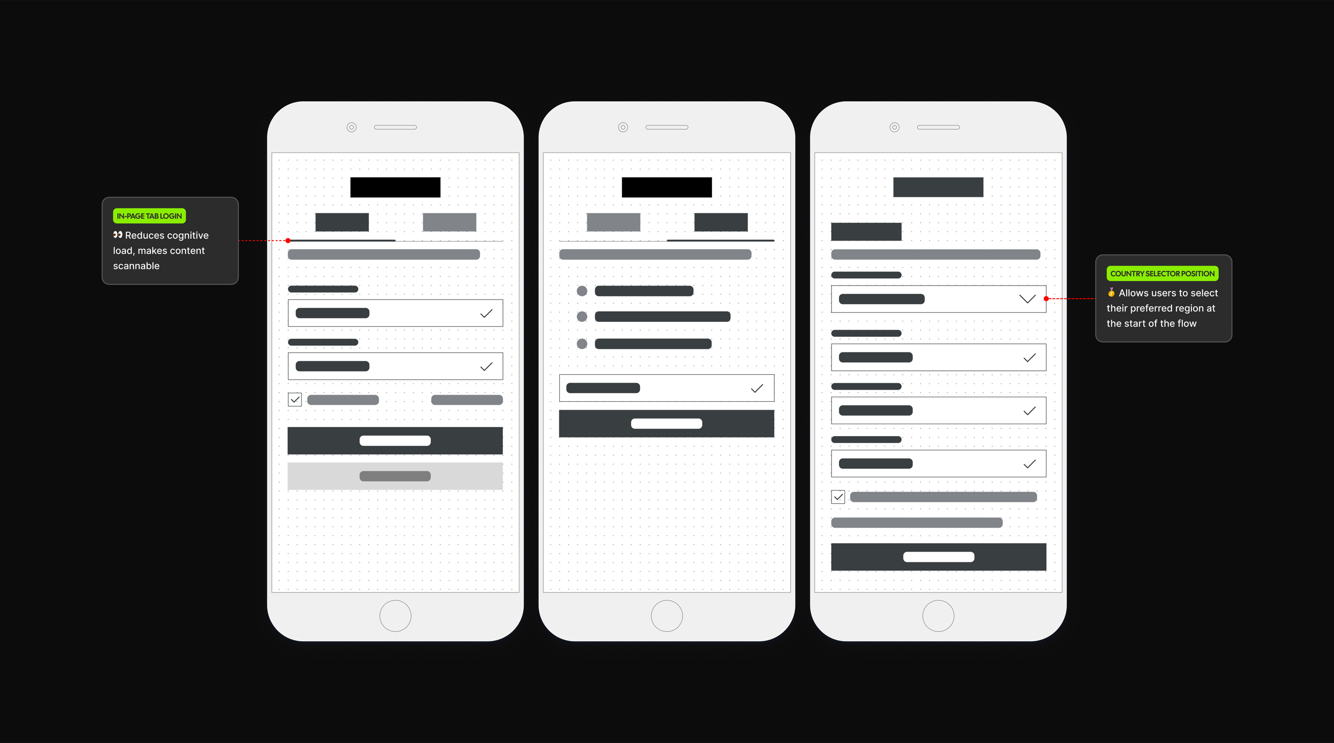
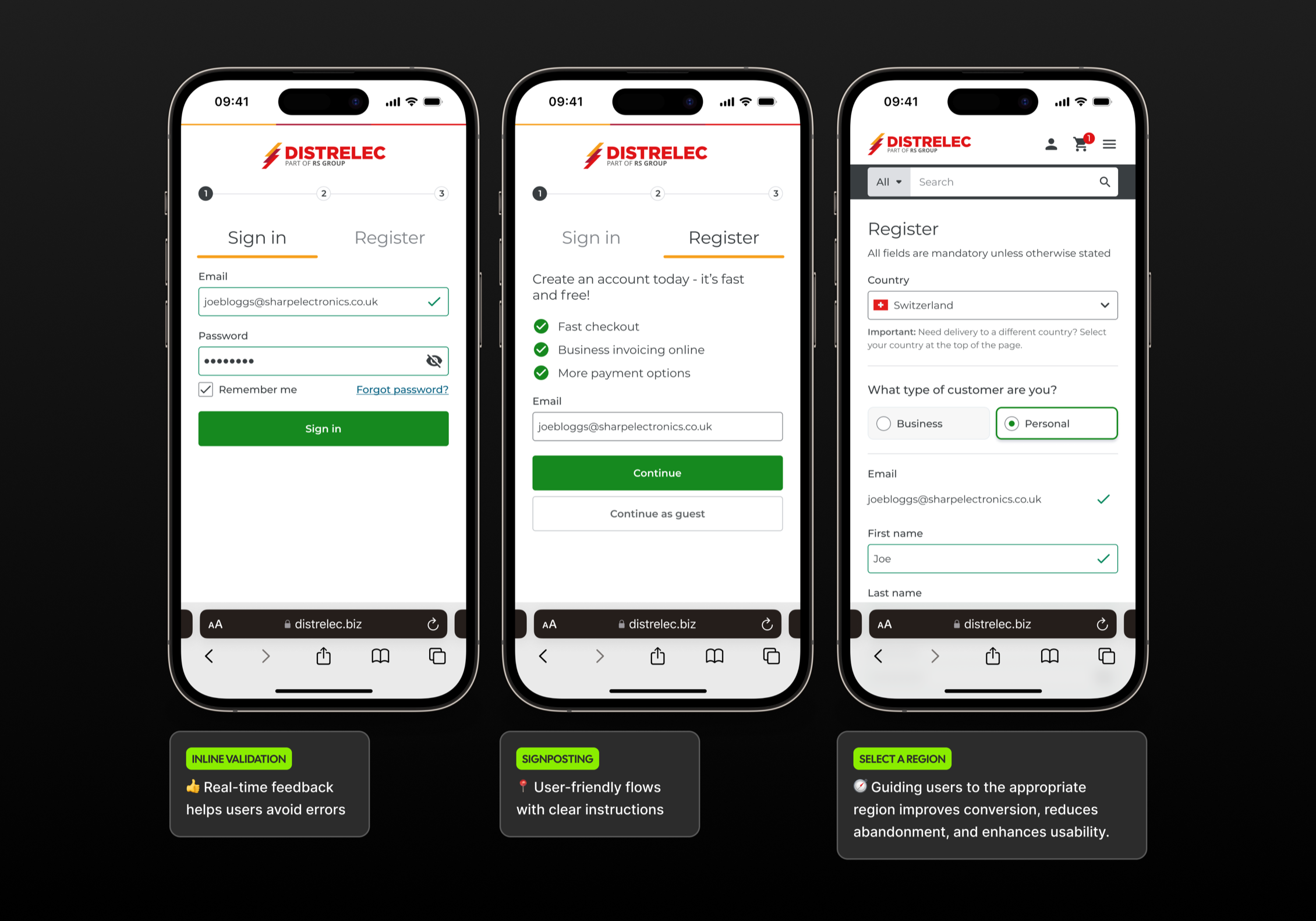
Research can pile up fast; trade UI is mostly editing: what you cut, how you stage fields, which words appear when the part number is real but the channel is glass. The discipline was anchoring loops in Hotjar (funnels, rage taps, form health), Useberry for flow checks, and light AI for microcopy only where it shortened recovery — with humans holding the final call so nothing reads synthetic. Hotjar identified the root cause clearly: the country selector and email input were positioned too late in the form, and failed email validation was the primary abandonment trigger.
Each pass narrowed to one voice — compact type, calm spacing, completion paths (email first, territory next, contracts, returns) with obvious orientation. Cohesion meant the same operational register from programme headline to invoice line, not copy-pasted repetition.
REASSURANCE UX
Proof is part of the product.
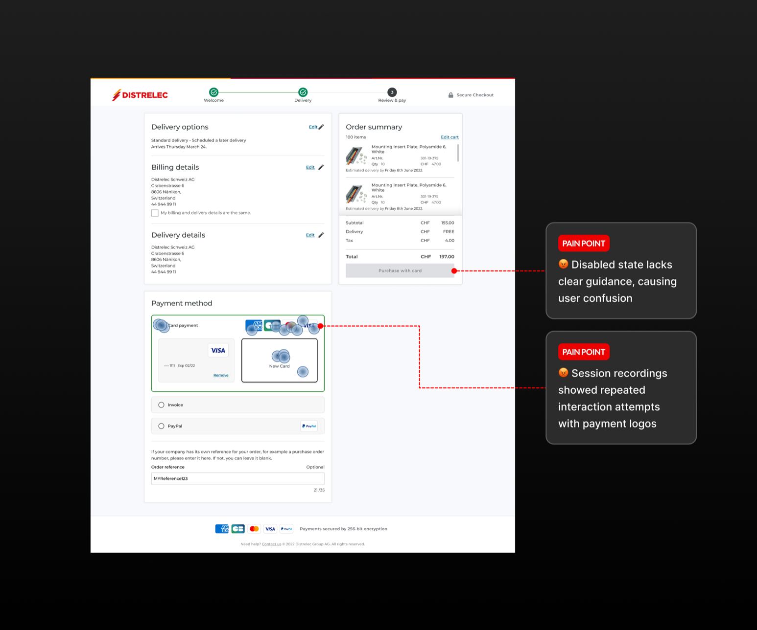
Industrial buyers weigh certainty first — lead times, compliance, traceability — then velocity. The UI needed to read like a counter people trust: scan-friendly hierarchy, labels that align with paperwork, prompts that sound like operations rather than retail charm.
I treated reassurance as a spacing problem: rhythm with room to read, grouped fields, microcopy that states facts. It should scan light — while territory, tax, and permission rules stay explicit enough for audit.
THE LAUNCH
Launch when the path matches the warehouse.
Launch is where promise meets backlog. Flows covered six regional programmes, consent acknowledgements where they matter, and recovery paths that don't live in a footer maze. The frame stayed blunt: state the registration story plainly, keep evaluation steady, and let service proof carry the move into an active account.
Secondary proof — invoices, contract routing, returns wording — sat at the point of commitment, not buried as annex copy. The UI stayed simple: one narrative spine, calm review, and service evidence supporting the next action.
COLOUR PALETTE
Neutral surfaces, deliberate state colour.
The palette borrows from catalogue UI practice: a dark shell for chrome, off-white for fields, colour reserved for error, success, or urgency — not decoration.
Neutrals carry SKU strings without dulling numerals; success and error states carry equal visual weight so no one hunts for feedback. Every swatch had a job.
WORDMARK
Type that stays out of the SKU's way.
The visual system leans on a controlled wordmark — Distrelec with regional treatment where needed — rather than extra marks. Icons stay practical: validation, wayfinding, and service cues that surface only when friction does.
Headlines stay sans for discovery; tabular styles carry prices, SKUs, and microcopy — so tone stays light and weight stays on legibility and count.
CAMPAIGN
Programme rhythm, not promotion noise.
Registration touchpoints ("Verify your email", "Choose your region") were written as programme beats — direct, plain, no discount theatre. The same lines fed internal scripts so sales, support, and procurement were all telling the same story.
AI widened the draft options; people chose the lines that fit a buyer who audits before they approve.
POST-REGISTER
After the form is still the product.
Confirmation and ticket language was placed where buyers need paper confidence: acknowledgements that match finance wording, next steps that mirror what support says on the phone, no surprise tone shifts.
Continuity was the measure: the same steady voice on the form should carry into emails and tickets, from credential check through to first PO.
CONCLUSION
What this proves.
AI can compress drafts, variants, and labels — but design still owns risk, tone, and truth. Distrelec is a case in tight, evidence-led passes: fewer claims, steadier signals, and a registration route people return to because it reads considered.
The live path is the proof: walk regions, permissions, and confirmation, and watch restraint carry the work.
( Services )
DISTRELEC EMEA
Registration built on evidence.
( Services )
Distrelec runs components, tools, and infrastructure across six regions. Duplicate accounts skewed order history and drove up support load. I led registration UX from evidence — replay first, tested changes next — before anything was committed to the roadmap.
Shipped programme work: live constraints, not a deck. The test was whether registration could read as credible when research, UI, copy, and build moved through one disciplined pipeline. The bar held — calm on first read, then consistent through navigation, onboarding, and reassurance (invoices, contracts, returns) without trust snapping or the flow sounding like a retrofit.
The constraint was explicit: ship the registration story, field model, and product surface with research setting pace — Hotjar to expose failure modes, Useberry to validate flow calls, Claude for label and error drafts — so quality came from iteration, not volume.
Industrial e-commerce is judged in milliseconds: field order, spacing, and error copy either read as control — or noise. Every block had to earn its place: headline promise, territory capture, states that behave like a desk handoff, and rows that carry proof without theatre.
The working stack was replay, prototype, and script — evidence first, then design calls: which failure repeated, which route shipped, what still reads as intentional when someone files a ticket after hours.
What shipped is one coherent path on a live URL: a single voice for Distrelec, a registration thread from first entry to active account, and patterns that respect caution in slow buys — without the journey feeling like varnish.


OVERVIEW
Clarity before chrome.
Distrelec sits where catalogue depth meets procurement caution: parts, tools, infrastructure, with registration and checkout varying by region. Duplicate accounts made orders hard to track and support complaints climbed. The brief wasn't prettier chrome — it was fewer identities, clearer proof, and a flow finance can stand behind.
Strategy, UX, and UI moved in one lane — reviewed with stakeholders, revised against tickets and transcripts — so the voice could repeat without sounding canned. Same signal at landing, through the steps, and at service handoff. No ornament. Only accountable steps.

THE CHALLENGE
A B2B registration surface has to read as audit-ready.
Research can pile up fast; trade UI is mostly editing: what you cut, how you stage fields, which words appear when the part number is real but the channel is glass. The discipline was anchoring loops in Hotjar (funnels, rage taps, form health), Useberry for flow checks, and light AI for microcopy only where it shortened recovery — with humans holding the final call so nothing reads synthetic. Hotjar identified the root cause clearly: the country selector and email input were positioned too late in the form, and failed email validation was the primary abandonment trigger.
Each pass narrowed to one voice — compact type, calm spacing, completion paths (email first, territory next, contracts, returns) with obvious orientation. Cohesion meant the same operational register from programme headline to invoice line, not copy-pasted repetition.
REASSURANCE UX
Proof is part of the product.
Industrial buyers weigh certainty first — lead times, compliance, traceability — then velocity. The UI needed to read like a counter people trust: scan-friendly hierarchy, labels that align with paperwork, prompts that sound like operations rather than retail charm.
I treated reassurance as a spacing problem: rhythm with room to read, grouped fields, microcopy that states facts. It should scan light — while territory, tax, and permission rules stay explicit enough for audit.
THE LAUNCH
Launch when the path matches the warehouse.
Launch is where promise meets backlog. Flows covered six regional programmes, consent acknowledgements where they matter, and recovery paths that don't live in a footer maze. The frame stayed blunt: state the registration story plainly, keep evaluation steady, and let service proof carry the move into an active account.
Secondary proof — invoices, contract routing, returns wording — sat at the point of commitment, not buried as annex copy. The UI stayed simple: one narrative spine, calm review, and service evidence supporting the next action.

COLOUR PALETTE
Neutral surfaces, deliberate state colour.
The palette borrows from catalogue UI practice: a dark shell for chrome, off-white for fields, colour reserved for error, success, or urgency — not decoration.
Neutrals carry SKU strings without dulling numerals; success and error states carry equal visual weight so no one hunts for feedback. Every swatch had a job.
WORDMARK
Type that stays out of the SKU's way.
The visual system leans on a controlled wordmark — Distrelec with regional treatment where needed — rather than extra marks. Icons stay practical: validation, wayfinding, and service cues that surface only when friction does.
Headlines stay sans for discovery; tabular styles carry prices, SKUs, and microcopy — so tone stays light and weight stays on legibility and count.
CAMPAIGN
Programme rhythm, not promotion noise.
Registration touchpoints ("Verify your email", "Choose your region") were written as programme beats — direct, plain, no discount theatre. The same lines fed internal scripts so sales, support, and procurement were all telling the same story.
AI widened the draft options; people chose the lines that fit a buyer who audits before they approve.

POST-REGISTER
After the form is still the product.
Confirmation and ticket language was placed where buyers need paper confidence: acknowledgements that match finance wording, next steps that mirror what support says on the phone, no surprise tone shifts.
Continuity was the measure: the same steady voice on the form should carry into emails and tickets, from credential check through to first PO.
CONCLUSION
What this proves.
AI can compress drafts, variants, and labels — but design still owns risk, tone, and truth. Distrelec is a case in tight, evidence-led passes: fewer claims, steadier signals, and a registration route people return to because it reads considered.
The live path is the proof: walk regions, permissions, and confirmation, and watch restraint carry the work.
