KINETIK
Disruptor fitness experience.
KINETIK is a fitness experience built for ambition — no gap between splash promise and dashboard proof. Goals, streaks, shared achievements, and progress clarity were designed together, then sharpened with AI until every touchpoint felt fast, social, and earned.
Kinetik sits where wearable brands connect aspiration with readable data. The work called for stronger journey traction across real training weeks and tighter IA inside the product shell. Stakes were clear: hero clarity, confident thumb ergonomics, and consistency across onboarding, diagnostics, leaderboard, pairing, and recovery — credibility at every step.
The constraint was deliberate: use AI as the primary creative accelerator — models to compress research and sharpen narrative, generative passes for mood and variants, Cursor with Claude Code for flows and microcopy — so quality came from iteration, not volume.
Fitness software is judged in milliseconds — hierarchy, restraint, and spacing either read as confidence, or as noise. Every module had to earn its place: hero promise, proof in product detail, quiet states and failure paths, and dashboards that answer what matters right now.
The stack was the studio: snapshot variants, prompt loops, microcopy drafts — all AI-native. Discipline lived in direction — which routes shipped, which metaphors held, what still reads as intentional when someone opens the app before their first rep.
The outcome is a coherent product story in layouts and handover: one voice ("KINETIK"), journeys from landing through daily ritual, and interaction patterns that respect hesitation in high-stakes analytics — without the experience reading like a campaign poster wrapped around an empty shell.
OVERVIEW
Design language that carries from story to telemetry.
Kinetik serves two audiences inside one product: fluent analysts and newcomers who feel effort before they read a chart. The brief wasn't “more hype” — it was to make trust and momentum sit in the same screen.
Strategy, UX, and storytelling moved as one system — challenged, revised, and refined until the voice could repeat without sounding rehearsed. The goal was cohesion: the promise in the hero, proof in KPI detail, calm orientation through onboarding, and reassurance exactly where confidence dips.
THE CHALLENGE
A considered fitness product has to earn trust now.
This was never a dashboard template exercise. Discovery defined the brief: what people need to see, when they need it, and how fast they can act under pressure. The approach was Figma-first — clear IA and a component kit before Cursor and Claude-assisted flows were used to sharpen language and tighten the final experience.
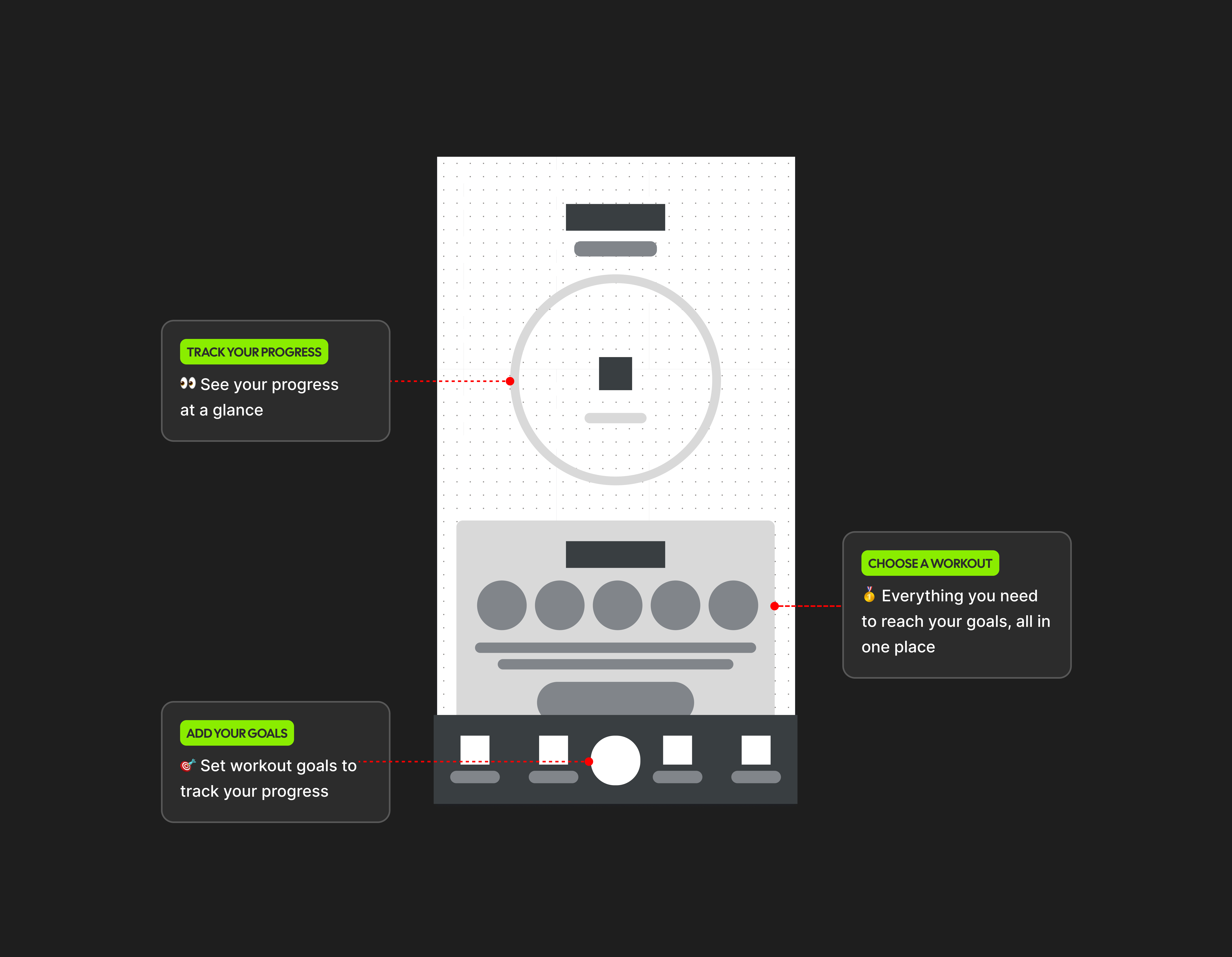
Every pass was anchored in client direction: calm motion for legibility, modules for leaderboard, session, recovery, and onboarding — with plain language locked only after user testing confirmed it landed.
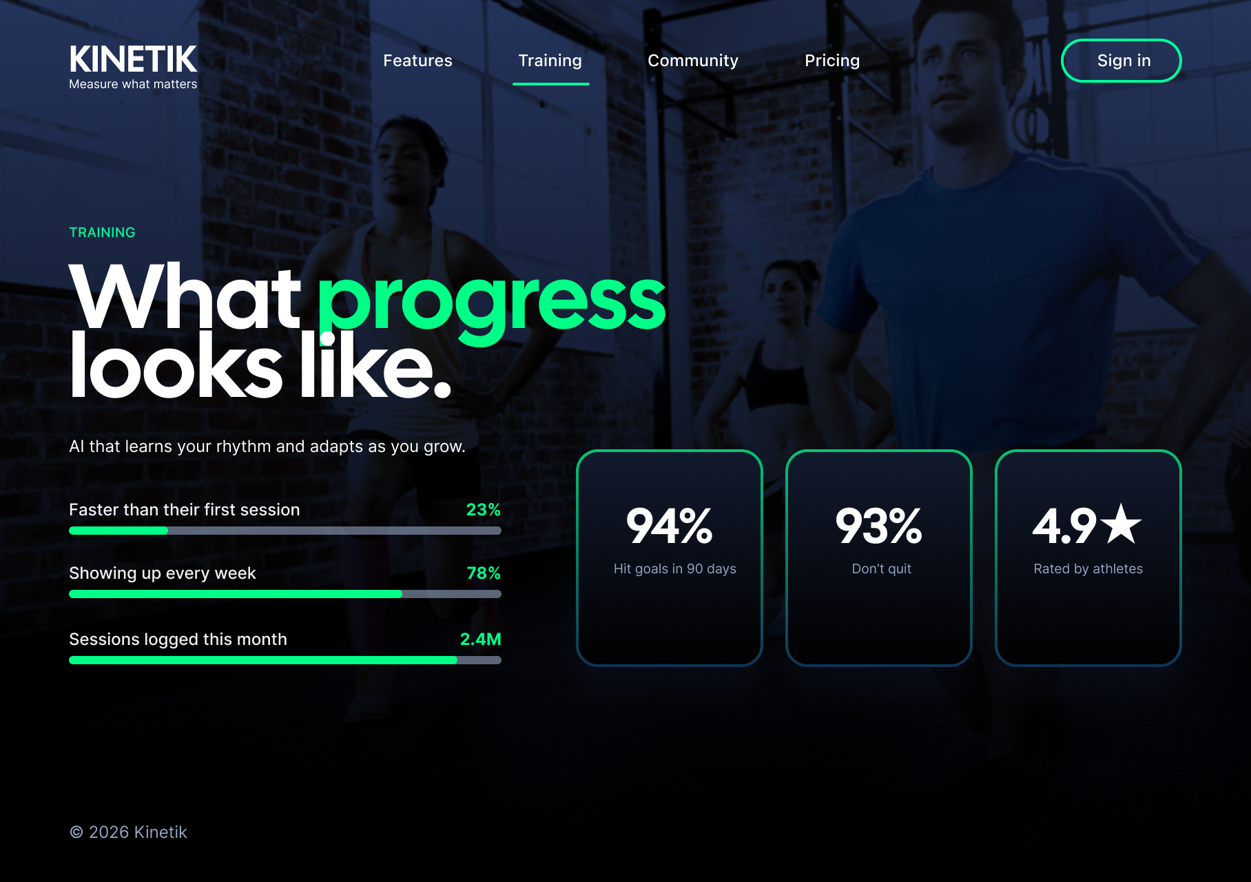
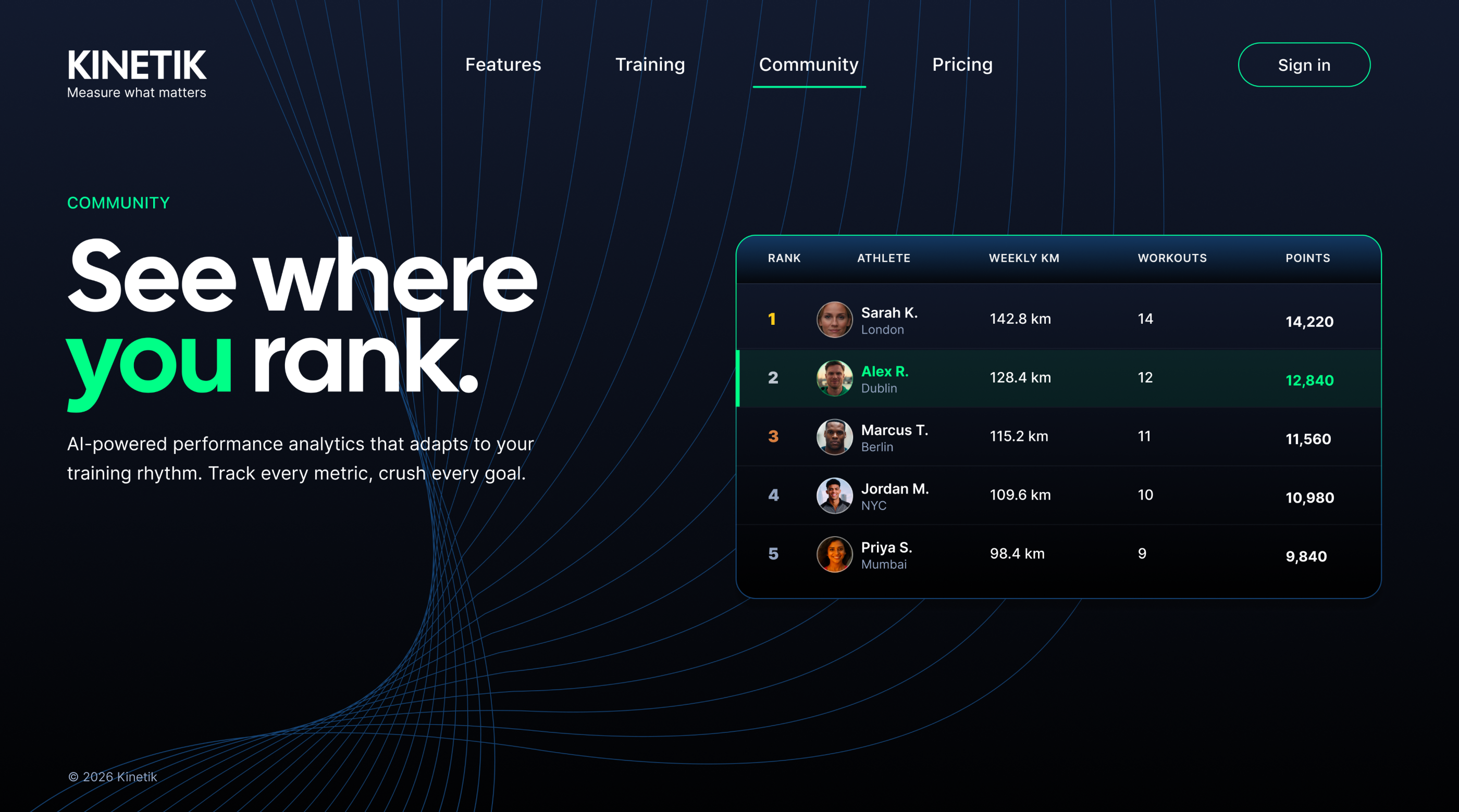
SPEED & PRECISION
Instrumentation with clarity, before focus slips.
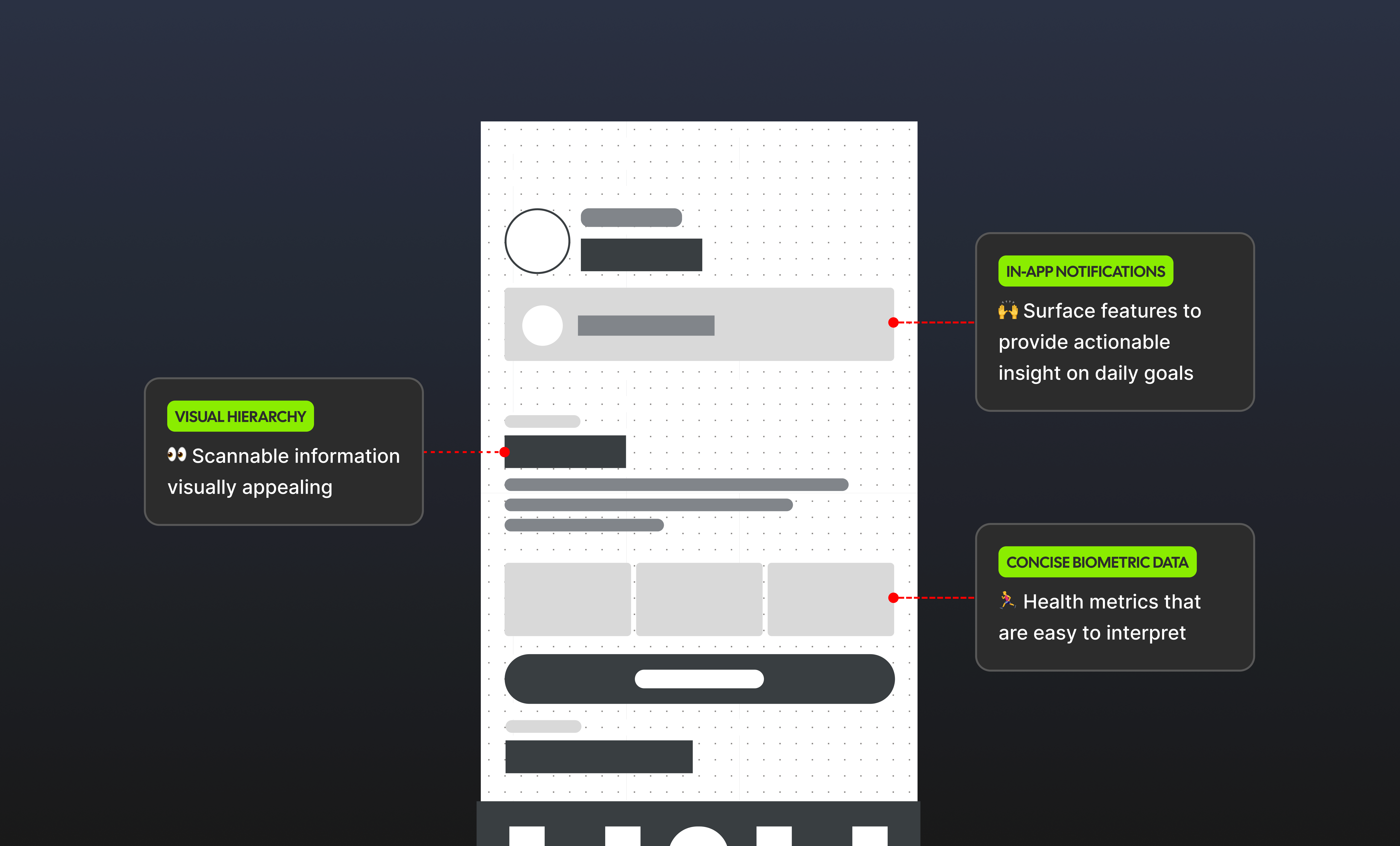
Training analytics is judged with emotion first — pride, rivalry, doubt — then validated with numbers: pacing, deltas, anomalies. The experience needed breathing room: typography and spacing tuned for early-morning skim, terminology that sounds spoken rather than lifted from a datasheet.
I treated scoreboard pacing as UX: restrained motion, generous space around ranked scores until dense data earns its place. Density stayed opt-in — one voice carrying momentum from marketing heat through to forensic drill-downs.
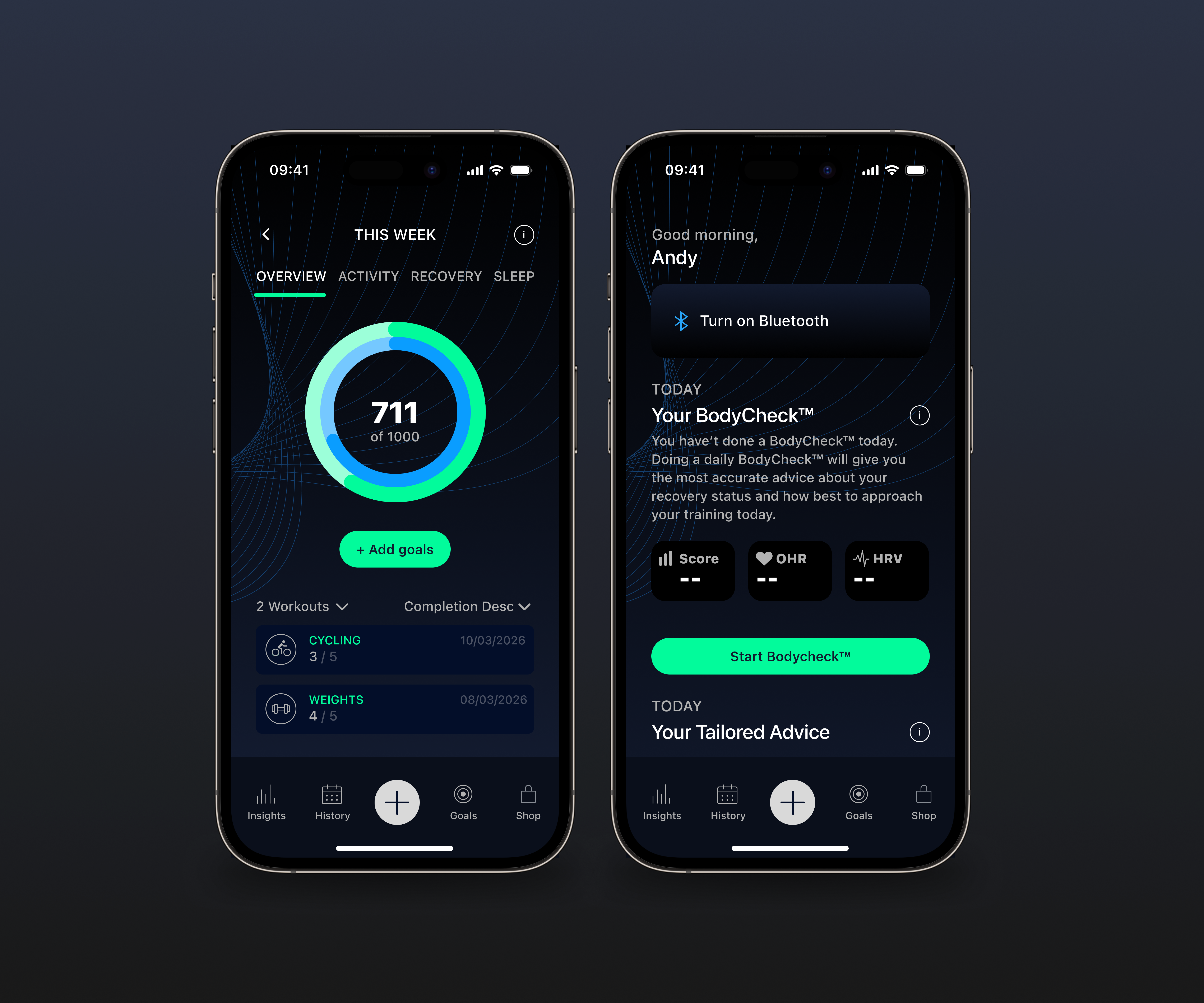
THE LAUNCH
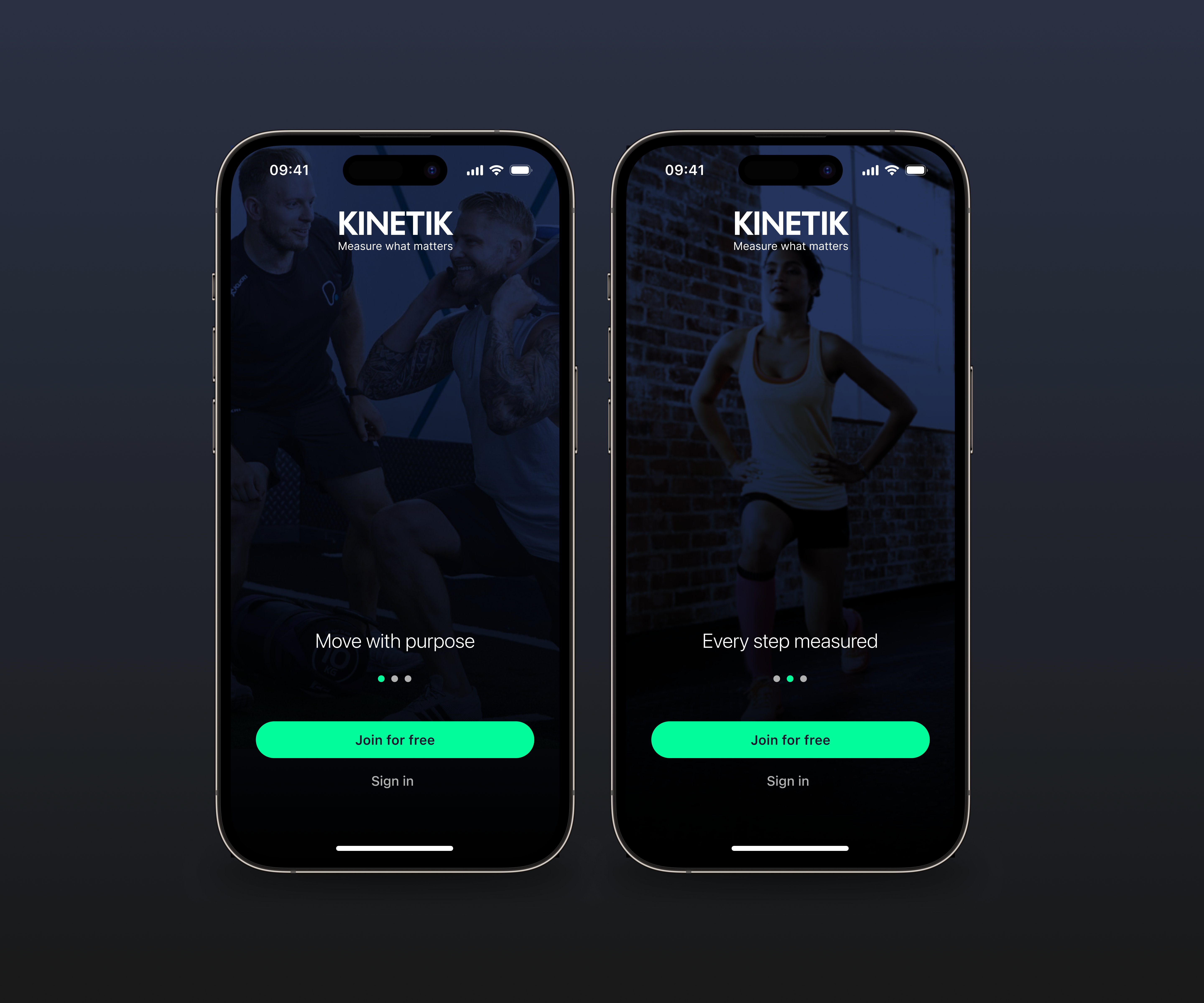
Hardware realities, calm onboarding, repeat visits.
Launch is where ambition meets the real world. Flows were designed for first-week onboarding, rusty returners, flaky Bluetooth firmware, and leaderboard comparisons at thumb speed — all without collapsing into legal footnotes at the scroll's edge.
Secondary reassurance sits where confidence dips — permissions, retries, restores. Documentation captured component boundaries so intent survives the build, not a zipped mystery file. Elevate the narrative, calm the evaluation, and let proof steer the next action.
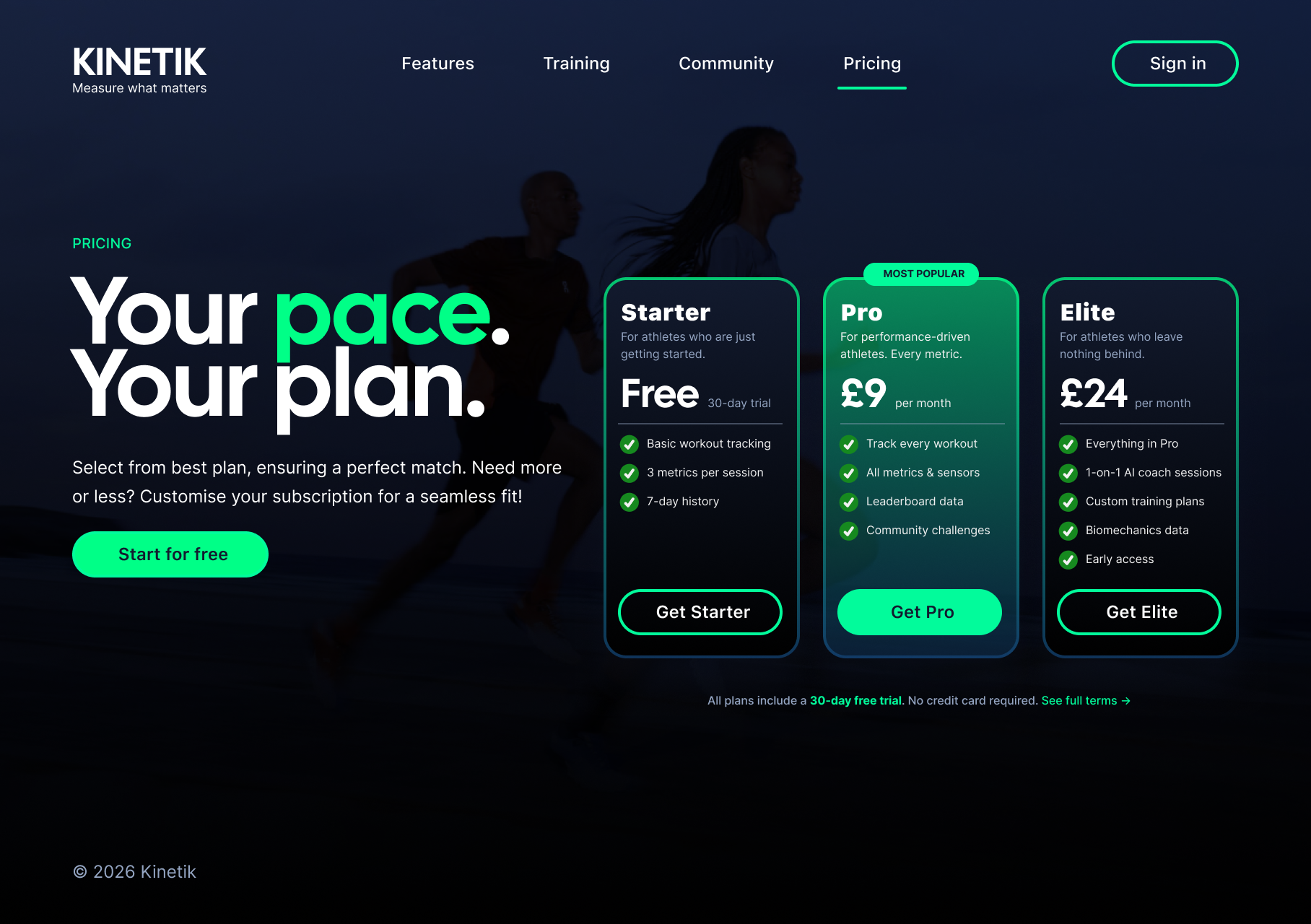
COLOUR PALETTE
Navy-steady. Emerald-electric — with Sky, Sunrise, and Pulse.
The primary stack follows Kinetik's design tokens: Emerald (#02FB9B) for uplift and KPI wins, Navy (#121A2E) anchoring typography and dashboards, neutral greys bridging density without washing out numerals — the same discipline as reading performance data on a midnight UI.
Secondary accents bring in Sky (#29A4F6), Sunrise (#FEC053), and Pulse (#FC5862) for alerts, rivalry moments, and coachable hotspots — controlled voltage, never confetti.
WORDMARK
Typographic velocity over decorative badges.
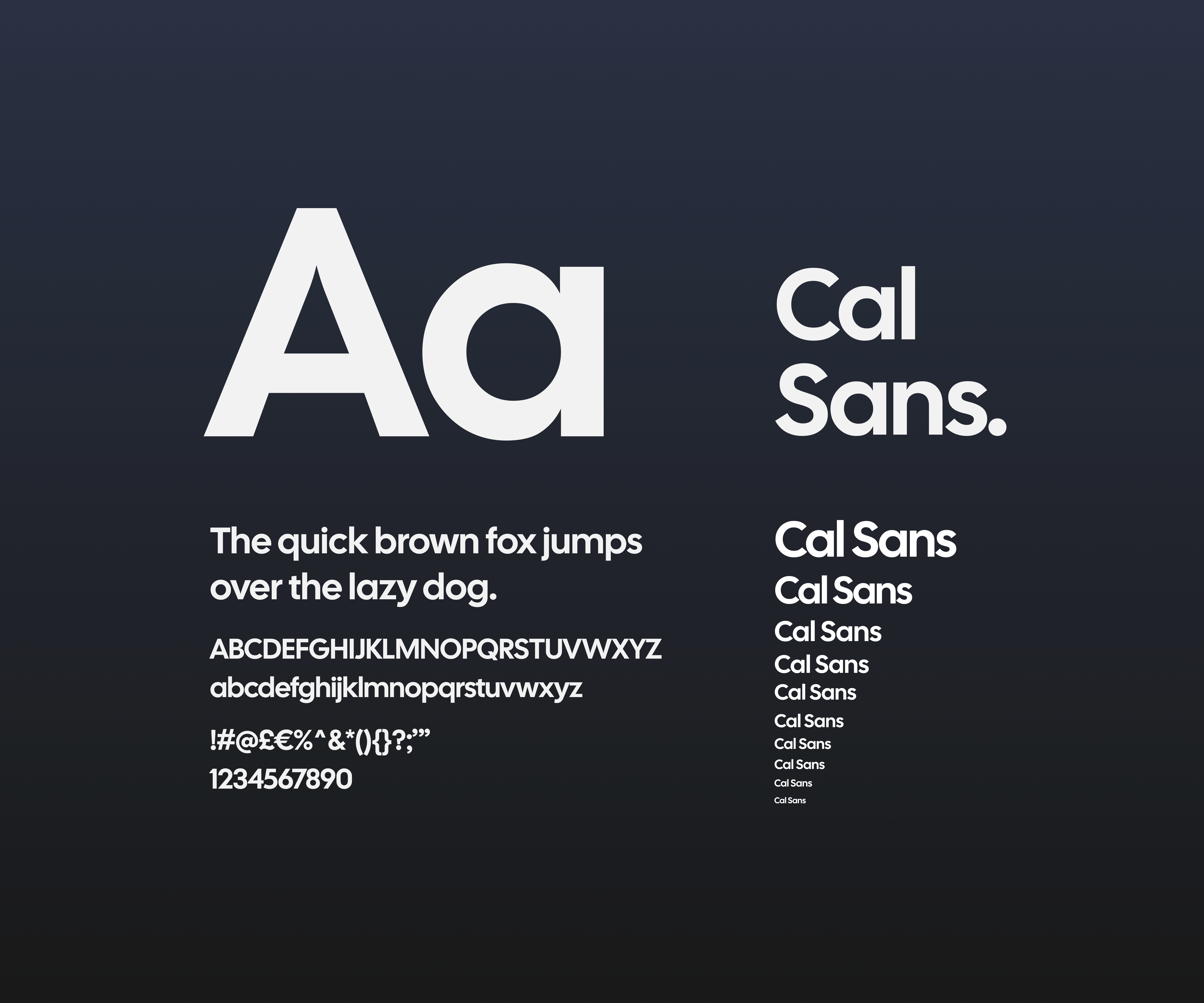
The identity leans on wordmark discipline — KINETIK set in heavy Inter black — rather than an illustrated logo zoo. Supporting marks stay functional: stat callouts, rank chips, and wayfinding cues that surface only when motion or data needs emphasis.
Headlines carry energy in uppercase blocks; the neutral sans family handles numerals, micro-labels, and dense analytics — so emotion lives in the marketing layer while clarity lives in the training data.
OUTCOMES
Fewer narratives, sharper comprehension.
Research sessions converged around one clear value story — not competing decks. Participants moved faster through onboarding and weekly check-ins once hierarchy was tightened and jargon was cut. In the first three months post-launch, completed workouts increased by 168% and new users rose by 16%.
Product and engineering left with the same grounded picture of what ships next — component boundaries annotated, anomalies documented — so roadmap conversations skipped the theatre.
COLLABORATION
Documentation that mirrors the live promise.
Decisions lived in critiques, paired working sessions, and written specs — not surprise files. Build partners could implement without reverse-engineering intent; brand partners could see the same language applied across marketing and inside the product shell.
Continuity from first touch to daily dashboard matters — when those promises align, trust holds in performance categories.
CONCLUSION
What this proves.
AI accelerates the messy middle — research synthesis, variants, KPI copy drafts, motion studies — but design still owns tone, friction, and truth. Kinetik is a case in disciplined iteration: fewer loud claims, more consistent signals, and a product world that earns return visits because it feels considered.
The live site and extended screens are the artifact — motion, campaign detail, and deeper narrative continue on the Kinetik website.
( Services )
KINETIK
Disruptor fitness experience.
( Services )
KINETIK is a fitness experience built for ambition — no gap between splash promise and dashboard proof. Goals, streaks, shared achievements, and progress clarity were designed together, then sharpened with AI until every touchpoint felt fast, social, and earned.
Kinetik sits where wearable brands connect aspiration with readable data. The work called for stronger journey traction across real training weeks and tighter IA inside the product shell. Stakes were clear: hero clarity, confident thumb ergonomics, and consistency across onboarding, diagnostics, leaderboard, pairing, and recovery — credibility at every step.
The constraint was deliberate: use AI as the primary creative accelerator — models to compress research and sharpen narrative, generative passes for mood and variants, Cursor with Claude Code for flows and microcopy — so quality came from iteration, not volume.
Fitness software is judged in milliseconds — hierarchy, restraint, and spacing either read as confidence, or as noise. Every module had to earn its place: hero promise, proof in product detail, quiet states and failure paths, and dashboards that answer what matters right now.
The stack was the studio: snapshot variants, prompt loops, microcopy drafts — all AI-native. Discipline lived in direction — which routes shipped, which metaphors held, what still reads as intentional when someone opens the app before their first rep.
The outcome is a coherent product story in layouts and handover: one voice ("KINETIK"), journeys from landing through daily ritual, and interaction patterns that respect hesitation in high-stakes analytics — without the experience reading like a campaign poster wrapped around an empty shell.
OVERVIEW
Design language that carries from story to telemetry.
Kinetik serves two audiences inside one product: fluent analysts and newcomers who feel effort before they read a chart. The brief wasn't “more hype” — it was to make trust and momentum sit in the same screen.
Strategy, UX, and storytelling moved as one system — challenged, revised, and refined until the voice could repeat without sounding rehearsed. The goal was cohesion: the promise in the hero, proof in KPI detail, calm orientation through onboarding, and reassurance exactly where confidence dips.
THE CHALLENGE
A considered fitness product has to earn trust now.
This was never a dashboard template exercise. Discovery defined the brief: what people need to see, when they need it, and how fast they can act under pressure. The approach was Figma-first — clear IA and a component kit before Cursor and Claude-assisted flows were used to sharpen language and tighten the final experience.
Every pass was anchored in client direction: calm motion for legibility, modules for leaderboard, session, recovery, and onboarding — with plain language locked only after user testing confirmed it landed.
SPEED & PRECISION
Instrumentation with clarity, before focus slips.
Training analytics is judged with emotion first — pride, rivalry, doubt — then validated with numbers: pacing, deltas, anomalies. The experience needed breathing room: typography and spacing tuned for early-morning skim, terminology that sounds spoken rather than lifted from a datasheet.
I treated scoreboard pacing as UX: restrained motion, generous space around ranked scores until dense data earns its place. Density stayed opt-in — one voice carrying momentum from marketing heat through to forensic drill-downs.
THE LAUNCH
Hardware realities, calm onboarding, repeat visits.
Launch is where ambition meets the real world. Flows were designed for first-week onboarding, rusty returners, flaky Bluetooth firmware, and leaderboard comparisons at thumb speed — all without collapsing into legal footnotes at the scroll's edge.
Secondary reassurance sits where confidence dips — permissions, retries, restores. Documentation captured component boundaries so intent survives the build, not a zipped mystery file. Elevate the narrative, calm the evaluation, and let proof steer the next action.
COLOUR PALETTE
Navy-steady. Emerald-electric — with Sky, Sunrise, and Pulse.
The primary stack follows Kinetik's design tokens: Emerald (#02FB9B) for uplift and KPI wins, Navy (#121A2E) anchoring typography and dashboards, neutral greys bridging density without washing out numerals — the same discipline as reading performance data on a midnight UI.
Secondary accents bring in Sky (#29A4F6), Sunrise (#FEC053), and Pulse (#FC5862) for alerts, rivalry moments, and coachable hotspots — controlled voltage, never confetti.
WORDMARK
Typographic velocity over decorative badges.
The identity leans on wordmark discipline — KINETIK set in heavy Inter black — rather than an illustrated logo zoo. Supporting marks stay functional: stat callouts, rank chips, and wayfinding cues that surface only when motion or data needs emphasis.
Headlines carry energy in uppercase blocks; the neutral sans family handles numerals, micro-labels, and dense analytics — so emotion lives in the marketing layer while clarity lives in the training data.
OUTCOMES
Fewer narratives, sharper comprehension.
Research sessions converged around one clear value story — not competing decks. Participants moved faster through onboarding and weekly check-ins once hierarchy was tightened and jargon was cut. In the first three months post-launch, completed workouts increased by 168% and new users rose by 16%.
Product and engineering left with the same grounded picture of what ships next — component boundaries annotated, anomalies documented — so roadmap conversations skipped the theatre.

COLLABORATION
Documentation that mirrors the live promise.
Decisions lived in critiques, paired working sessions, and written specs — not surprise files. Build partners could implement without reverse-engineering intent; brand partners could see the same language applied across marketing and inside the product shell.
Continuity from first touch to daily dashboard matters — when those promises align, trust holds in performance categories.

CONCLUSION
What this proves.
AI accelerates the messy middle — research synthesis, variants, KPI copy drafts, motion studies — but design still owns tone, friction, and truth. Kinetik is a case in disciplined iteration: fewer loud claims, more consistent signals, and a product world that earns return visits because it feels considered.
The live site and extended screens are the artifact — motion, campaign detail, and deeper narrative continue on the Kinetik website.