LUCILLE LONDON
AI-crafted brand identity.
A speculative fine lingerie and nightwear brand — invented for this project, with no traditional creative pipeline. Strategy, design language, commerce UX, and the deployed site were built with AI, then iterated until they cleared a believable luxury shelf.
Lucille London is fiction — it exists only as an AI-assembled portfolio work. The goal was to test whether a full luxury brand and storefront could hold credibility when strategy, visuals, narrative, and build all emerge from the same machine-led workflow. The bar stayed high: editorial and intimate on first impression, then consistent across navigation, merchandising, and reassurance (shipping, care, returns) without the spell breaking.
The constraint was deliberate: build the narrative, visual system, and product experience with AI as the primary creative accelerator — Cursor to structure and stress-test the experience end to end, Higgsfield for visual exploration, Claude Code for language architecture — so quality came from iteration, not volume.
Luxury e-commerce is judged in milliseconds: hierarchy, whitespace, and restraint either read as confidence — or as chaos. Every module had to earn its place: hero proposition, collections, edits that behave like a magazine, and product cards that carry craft without doubt.
The stack was the studio: snapshot passes, variants, microcopy generations — all AI-native. Discipline lived in direction — which prompts survived, which routes shipped, what still scans as intentional when you scroll at 2 a.m. on a phone.
The outcome is a coherent fiction on a live URL: one voice ("Lucille London"), a collection story that carries from landing to basket, and interaction patterns that respect hesitation in high-consideration categories — without the site reading as a thin brochure.
Visit the Lucille London website here
See the siteOVERVIEW
Design language that reads as craft, not template.
Lucille sits where Parisian romance meets London shopping culture: French lace and silk, a collection spine (La Belle Époque), and a retail story rooted in Kensington's boutique reality. The brief wasn't "make a pretty shop" — it was to make trust and desire occupy the same screen.
Strategy, design, and storytelling were shaped as one system — prompted, critiqued, and refined so the brand could repeat without sounding rehearsed. The goal was cohesion across every touchpoint: the promise in the hero, proof in product detail, and calm confidence through policy and care. Nothing ornamental. Everything accountable.
THE CHALLENGE
An AI-crafted luxury shelf has to pass the squint test.
AI can generate abundance fast. Luxury reads as decision: what you omit, how you pace a page, the words you choose when the garment is tactile but the interface is glass. The challenge: anchor iteration in Cursor (IA, flows, build quality); use Higgsfield for visual direction and exploration; lean on Claude Code for narrative and UI microcopy — and keep the polish human-tight so nothing reads synthetic.
Every pass moved toward a single identity: editorial typography, warm minimal layout, and shopping paths that reward browsing (New Arrivals, Edits, collections, swim and nightwear) while keeping orientation obvious. Cohesion isn't repetition — it's a recognisable voice that scales from campaign headline to size and care.
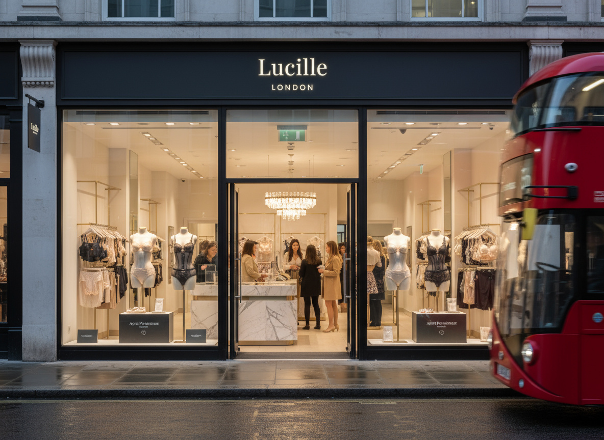
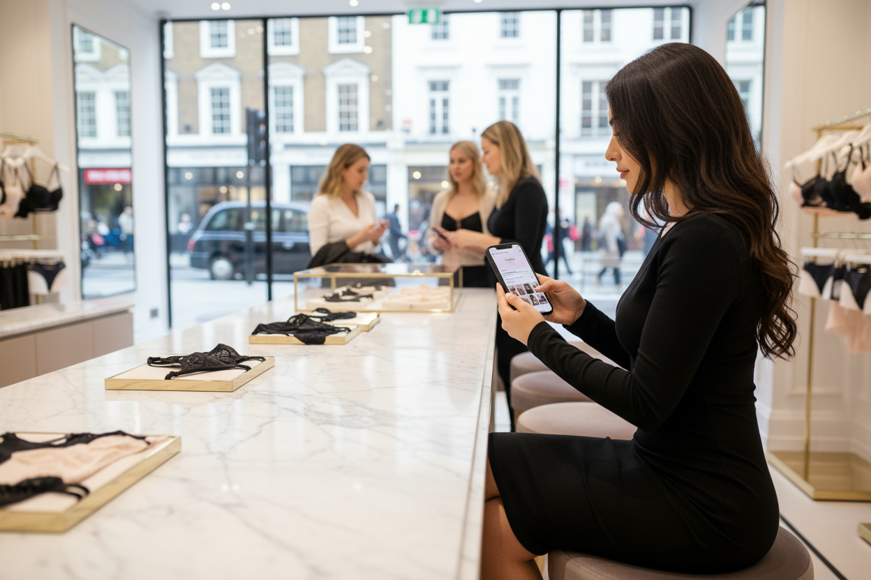
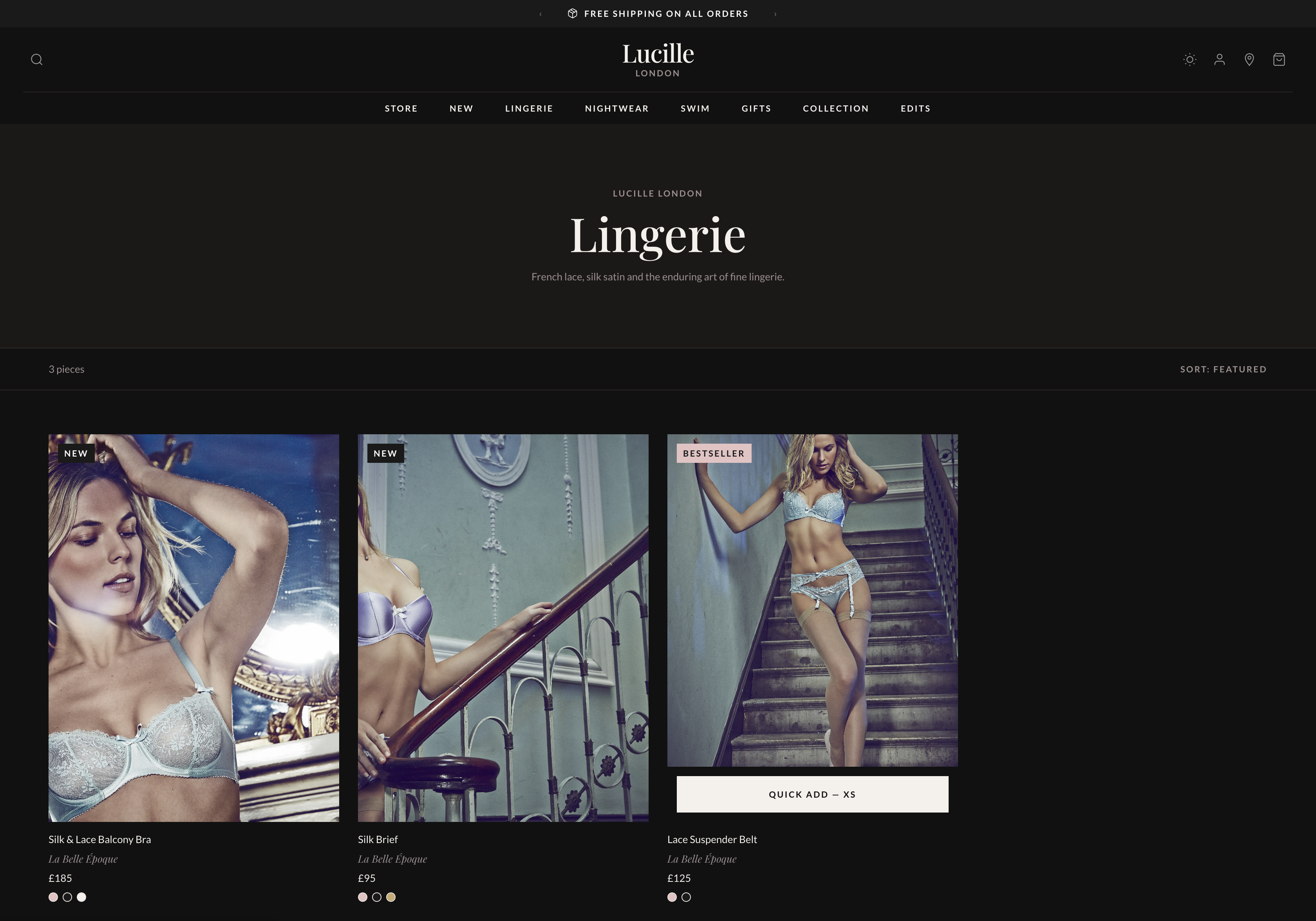
BOUTIQUE EXPERIENCE
Mood as a product requirement.
Luxury lingerie is bought with emotion first — confidence, intimacy, occasion — and justified with facts second: fabric, fit, service. The experience needed to evoke a refined, intimate space: unhurried, tactile language, and cues that mirror the Kensington boutique promise without pretending the screen is a fitting room.
I treated atmosphere as UX: spacious rhythm, restrained merchandising blocks, and a voice that whispers rather than sells. The outcome reads as effortless — even though the system underneath is deliberately structured for scan, compare, and return visits.
THE LAUNCH
Commerce designed around intent, clarity, and momentum.
Launch is where brand meets behaviour. Navigation and collection architecture were built to answer real journeys: discovering what's just arrived, moving between lingerie and nightwear, stepping into swim as a sibling category, and finding gift moments without breaking narrative flow.
Secondary reassurance — shipping, gift wrapping, returns — was placed to reduce cognitive load at decision time, not buried as legal footnotes at the end. The UI pattern is simple: elevate the collection story, make product evaluation calm, and let service proof support the leap to cart.
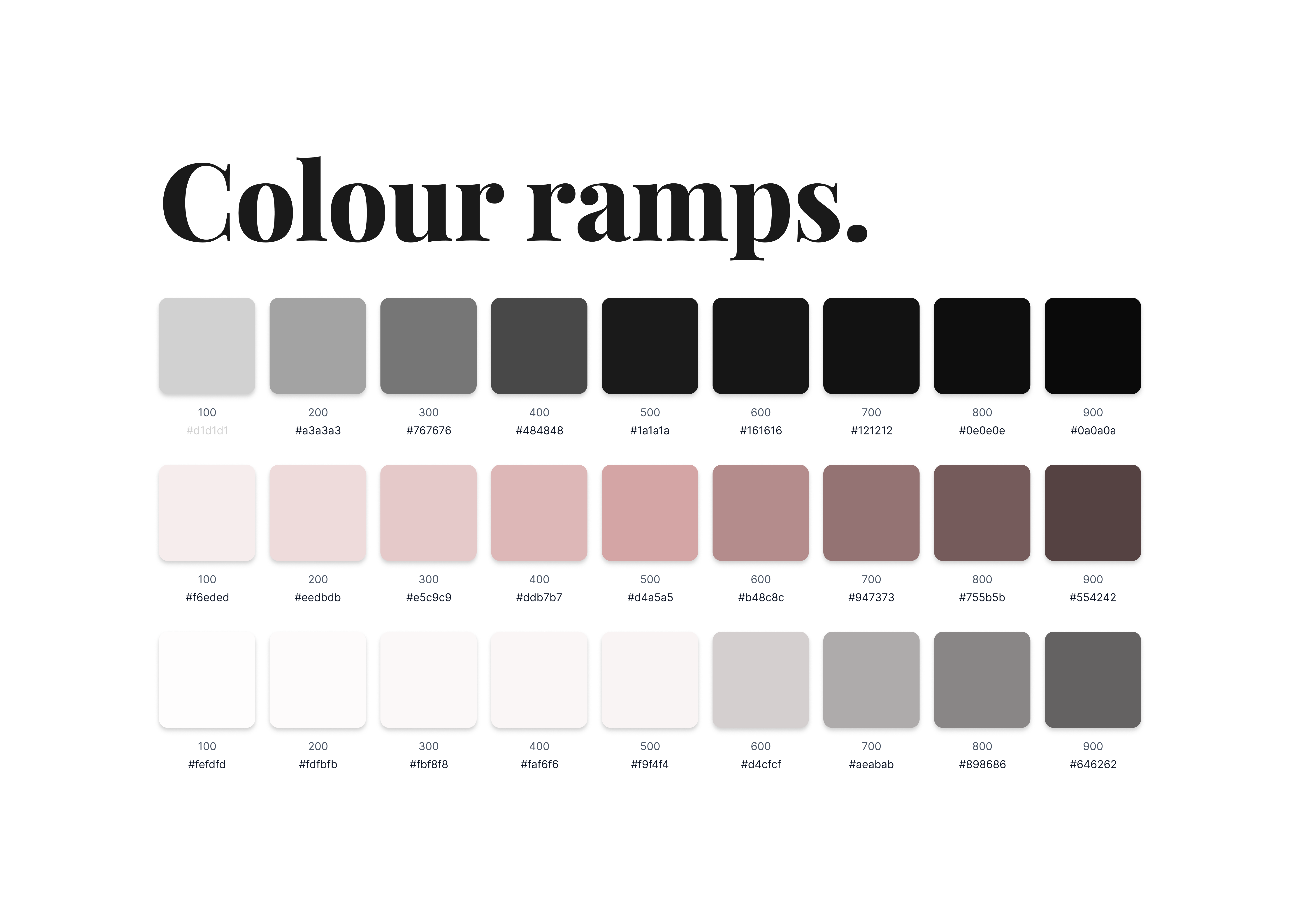
COLOUR PALETTE
A near-noir canvas with warm neutrals and romantic contrast.
The palette follows luxury digital conventions, tightened for clarity: deep base tones for drama and focus, off-white surfaces for textile and product truth, and restrained accent used sparingly so promotion and urgency never cheapen craft.
Colour hierarchy maps to intent — storytelling zones stay quiet so photography carries emotion; interactive states stay legible for accessibility and confidence at checkout. Every swatch earned its place on the page.
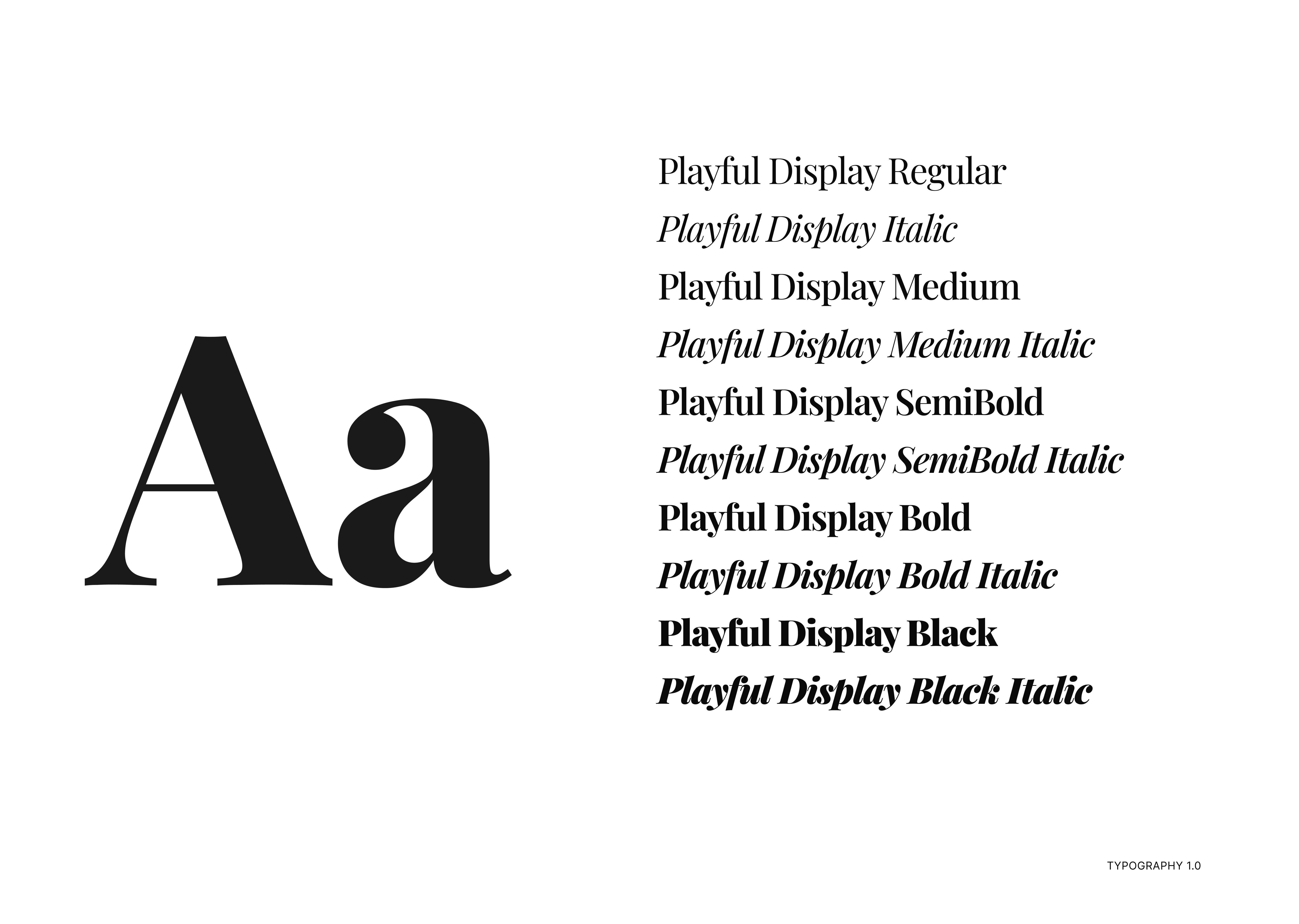
WORDMARK
Typographic identity over decorative marks.
The visual system leans on wordmark discipline — Lucille and LONDON in a composed lockup — rather than an illustrated logo zoo. Supporting iconography stays minimal and functional: wayfinding and service cues that disappear until needed.
The direction favours serif-forward headlines for editorial romance, paired with a clean sans-serif workhorse for wayfinding, pricing, and product metadata — so emotion lives in storytelling, and clarity lives in shopping.
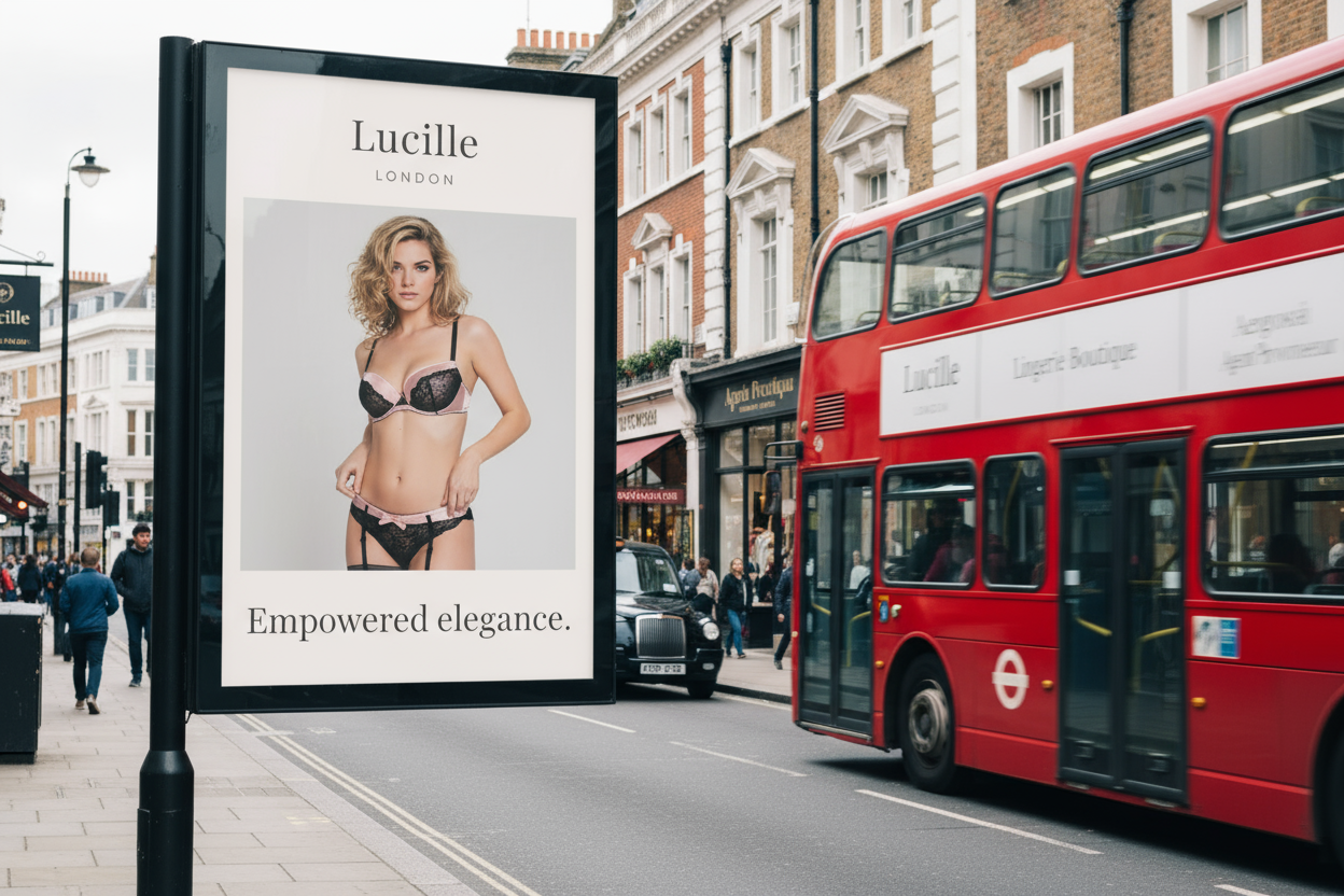
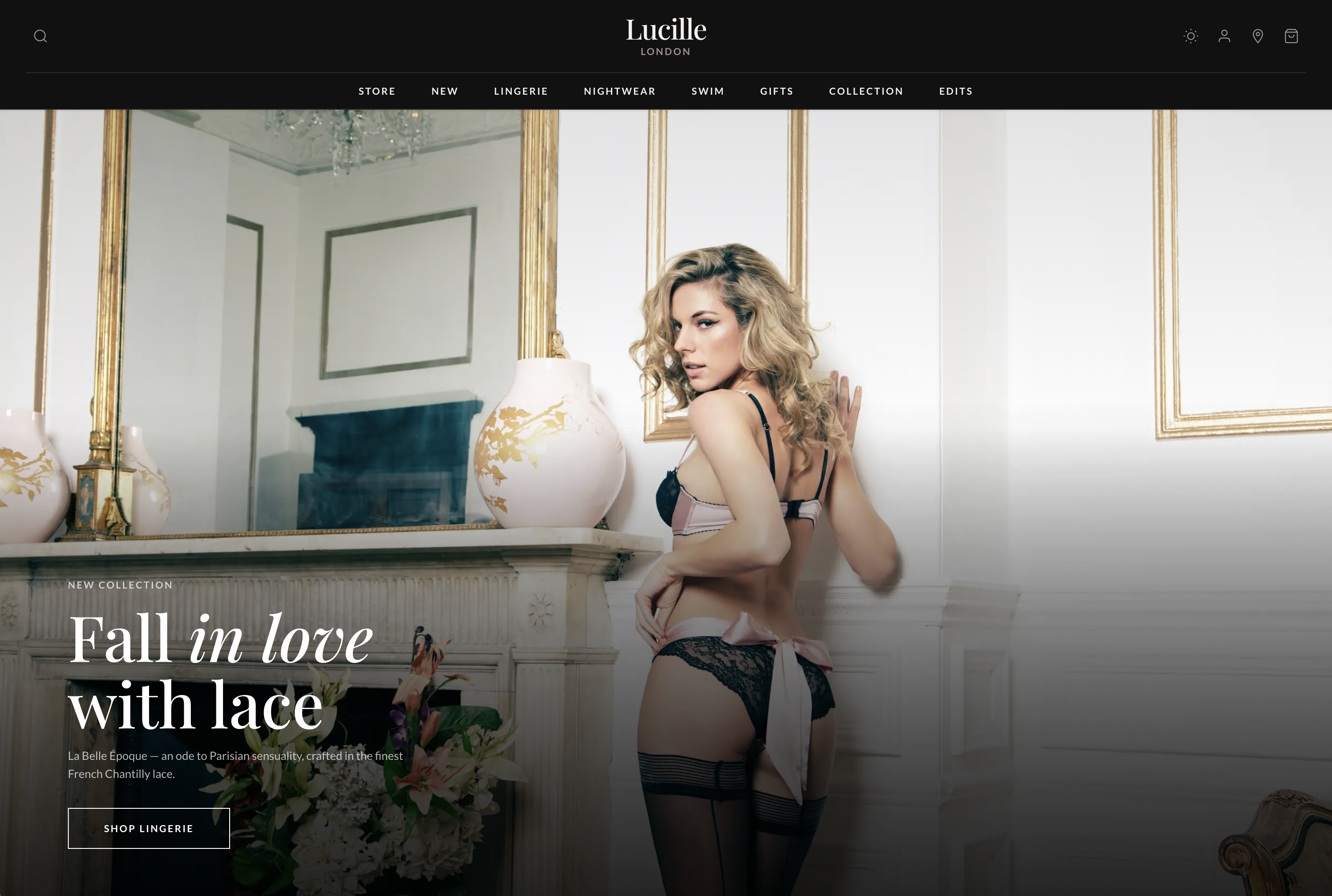
CAMPAIGN
Headlines that behave like covers, not banners.
Campaign moments ("Fall in love with lace", "The art of doing nothing") function as chapter titles: they set tone for a collection and invite scroll without shouting discounts. The same voice carries into editorial Edits — culture, style, gifting — so content reads as part of the product world, not a bolt-on blog.
AI-assisted drafting produced breadth fast; curation produced the brand. The final lines were chosen for memorability, fit, and a house that sells intimacy with dignity.
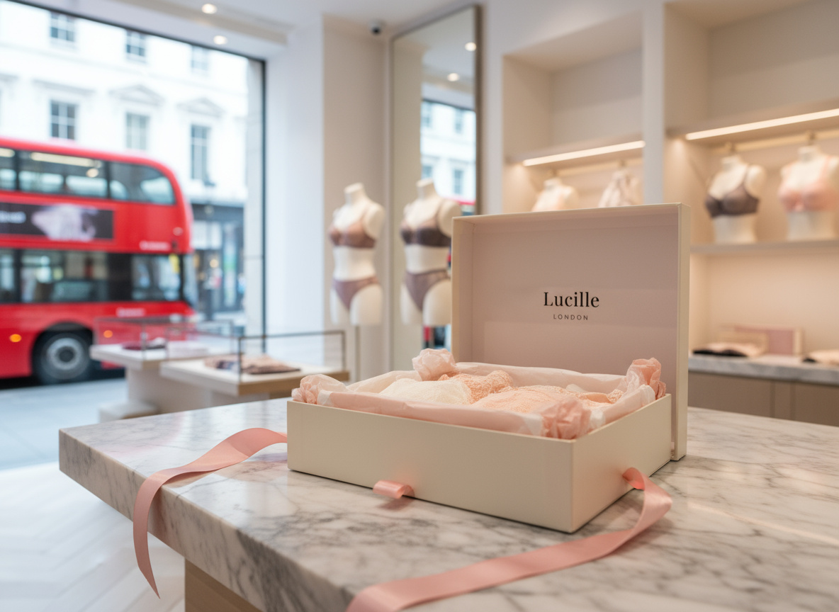
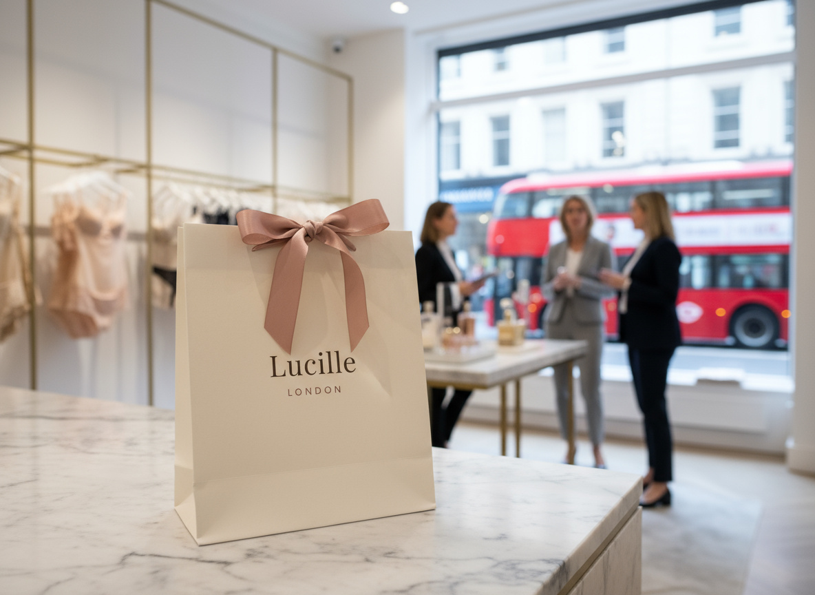
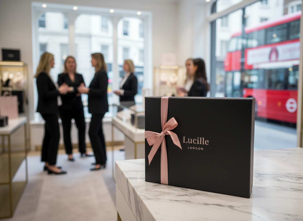
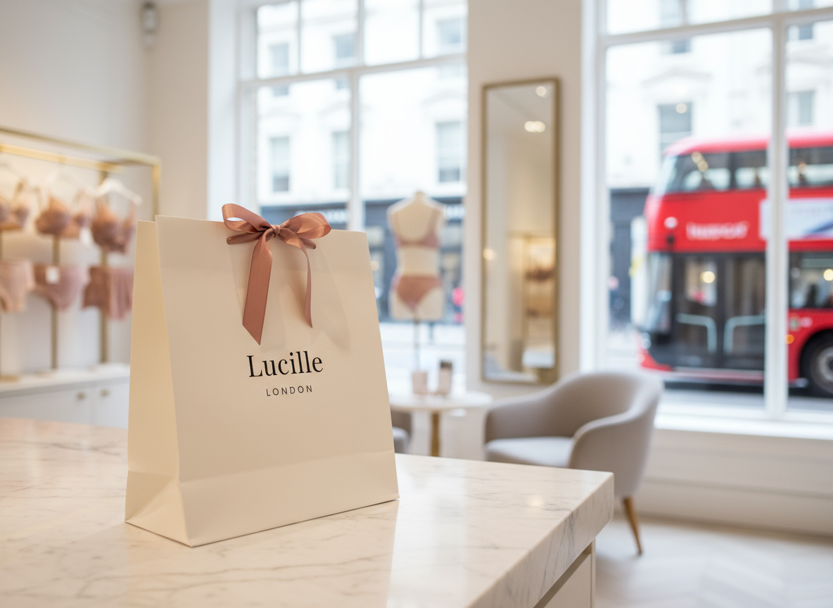
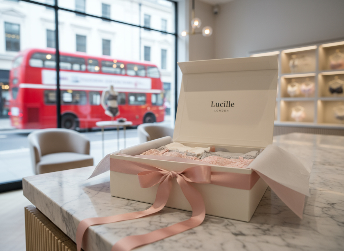
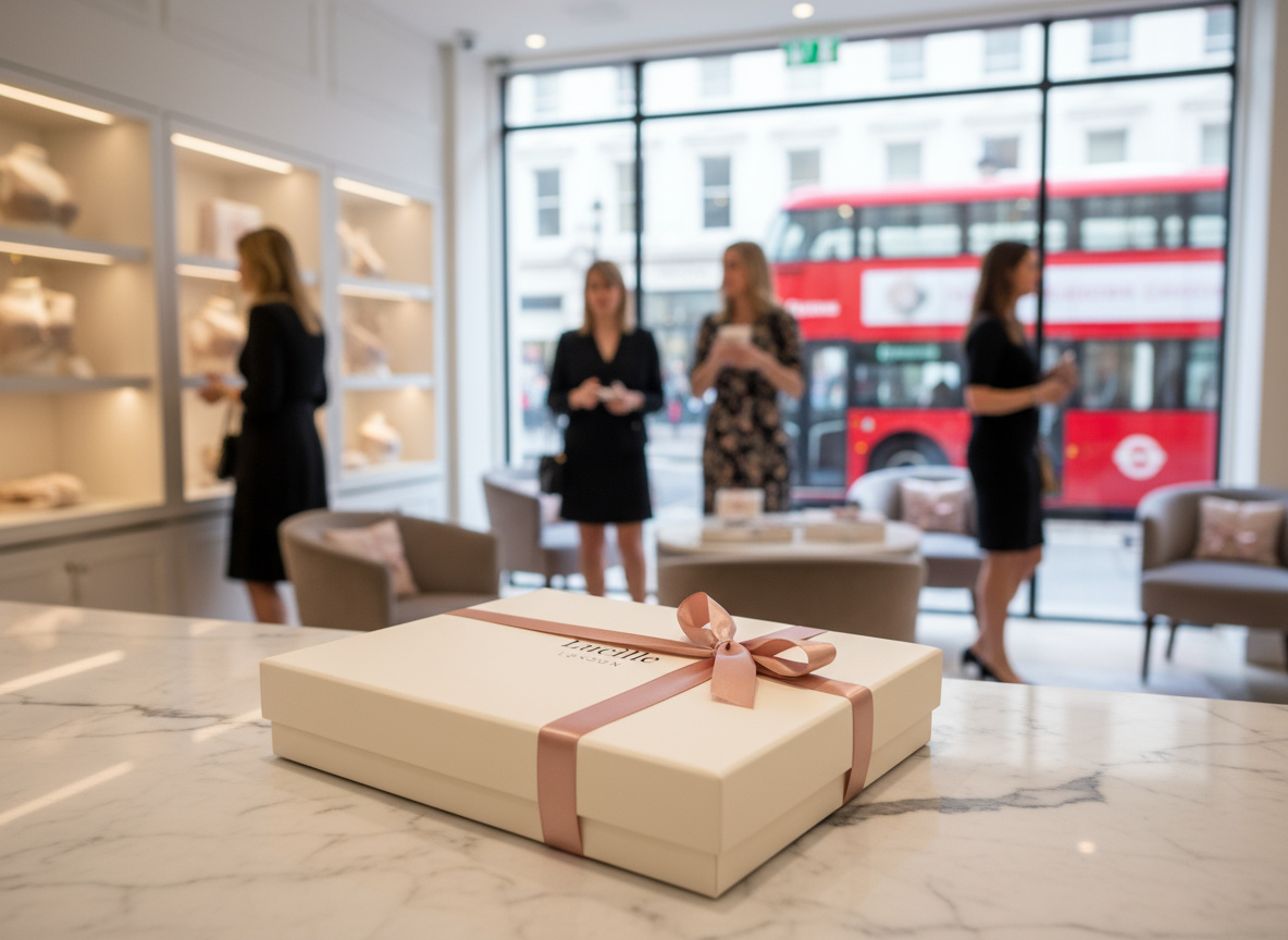
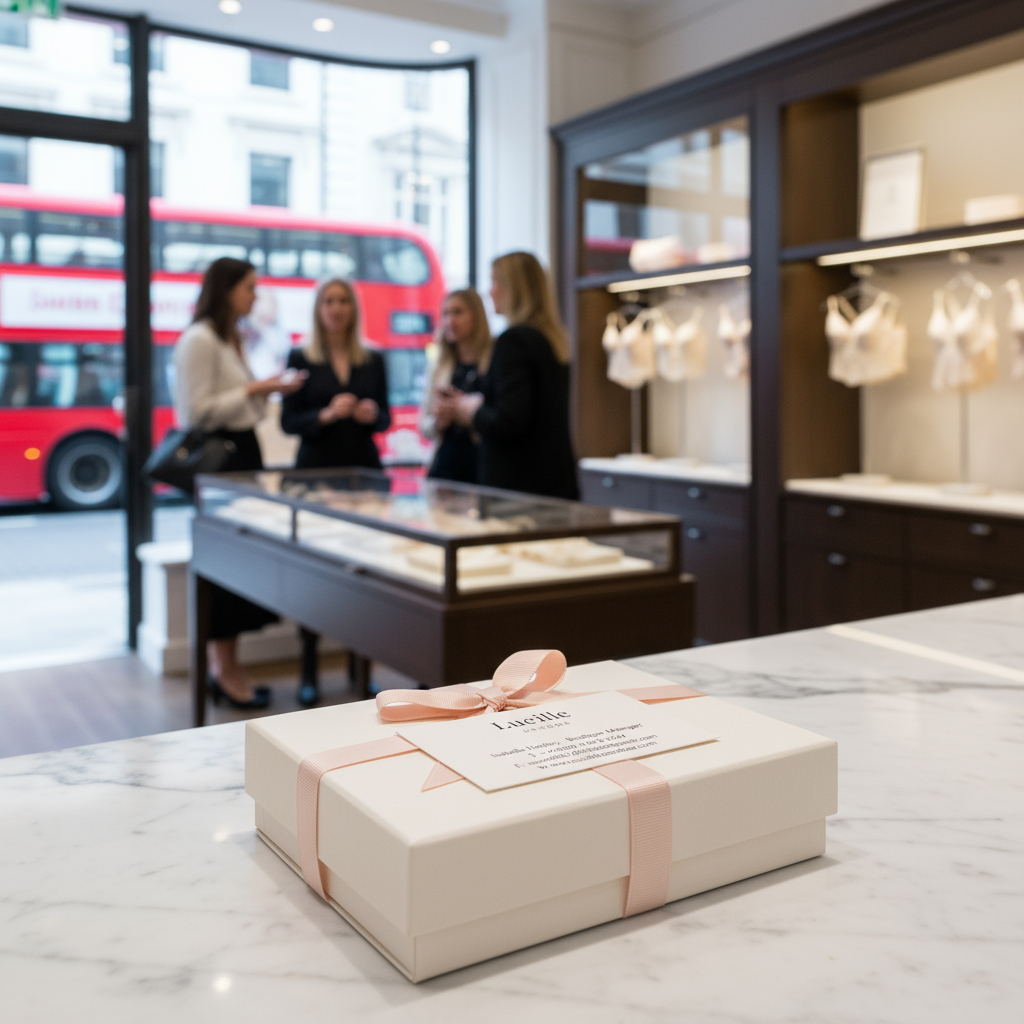
BRAND PACKAGING
Gifting is part of the product — online and in hand.
Packaging thinking surfaces where shoppers need reassurance: complimentary gift wrapping, clean delivery expectations, and a premium unboxing story implied by the brand language. Digital "packaging" is the order journey — confirmation, clarity, care instructions — so the experience feels complete when the box arrives.
The aim is continuity: the same quiet confidence on the PDP should carry through every post-purchase touchpoint, so the brand feels intact from first impression to hanger.
CONCLUSION
What this proves.
AI can accelerate the messy middle — options, variations, microcopy drafts, visual references — but design is still the arbiter of taste, truth, and friction. Lucille London is a case in disciplined iteration: fewer loud claims, more consistent signals, and a store that earns return visits because it feels considered.
The live site is the artifact — browse La Belle Époque, move through nightwear and swim, and watch how restraint does the selling.
( Services )
LUCILLE LONDON
AI-crafted brand identity.

( Services )
A speculative fine lingerie and nightwear brand — invented for this project, with no traditional creative pipeline. Strategy, design language, commerce UX, and the deployed site were built with AI, then iterated until they cleared a believable luxury shelf.
Lucille London is fiction — it exists only as an AI-assembled portfolio work. The goal was to test whether a full luxury brand and storefront could hold credibility when strategy, visuals, narrative, and build all emerge from the same machine-led workflow. The bar stayed high: editorial and intimate on first impression, then consistent across navigation, merchandising, and reassurance (shipping, care, returns) without the spell breaking.
The constraint was deliberate: build the narrative, visual system, and product experience with AI as the primary creative accelerator — Cursor to structure and stress-test the experience end to end, Higgsfield for visual exploration, Claude Code for language architecture — so quality came from iteration, not volume.
Luxury e-commerce is judged in milliseconds: hierarchy, whitespace, and restraint either read as confidence — or as chaos. Every module had to earn its place: hero proposition, collections, edits that behave like a magazine, and product cards that carry craft without doubt.
The stack was the studio: snapshot passes, variants, microcopy generations — all AI-native. Discipline lived in direction — which prompts survived, which routes shipped, what still scans as intentional when you scroll at 2 a.m. on a phone.
The outcome is a coherent fiction on a live URL: one voice ("Lucille London"), a collection story that carries from landing to basket, and interaction patterns that respect hesitation in high-consideration categories — without the site reading as a thin brochure.

OVERVIEW
Design language that reads as craft, not template.
Lucille sits where Parisian romance meets London shopping culture: French lace and silk, a collection spine (La Belle Époque), and a retail story rooted in Kensington's boutique reality. The brief wasn't "make a pretty shop" — it was to make trust and desire occupy the same screen.
Strategy, design, and storytelling were shaped as one system — prompted, critiqued, and refined so the brand could repeat without sounding rehearsed. The goal was cohesion across every touchpoint: the promise in the hero, proof in product detail, and calm confidence through policy and care. Nothing ornamental. Everything accountable.
THE CHALLENGE
An AI-crafted luxury shelf has to pass the squint test.
AI can generate abundance fast. Luxury reads as decision: what you omit, how you pace a page, the words you choose when the garment is tactile but the interface is glass. The challenge: anchor iteration in Cursor (IA, flows, build quality); use Higgsfield for visual direction and exploration; lean on Claude Code for narrative and UI microcopy — and keep the polish human-tight so nothing reads synthetic.
Every pass moved toward a single identity: editorial typography, warm minimal layout, and shopping paths that reward browsing (New Arrivals, Edits, collections, swim and nightwear) while keeping orientation obvious. Cohesion isn't repetition — it's a recognisable voice that scales from campaign headline to size and care.
BOUTIQUE EXPERIENCE
Mood as a product requirement.
Luxury lingerie is bought with emotion first — confidence, intimacy, occasion — and justified with facts second: fabric, fit, service. The experience needed to evoke a refined, intimate space: unhurried, tactile language, and cues that mirror the Kensington boutique promise without pretending the screen is a fitting room.
I treated atmosphere as UX: spacious rhythm, restrained merchandising blocks, and a voice that whispers rather than sells. The outcome reads as effortless — even though the system underneath is deliberately structured for scan, compare, and return visits.
THE LAUNCH
Commerce designed around intent, clarity, and momentum.
Launch is where brand meets behaviour. Navigation and collection architecture were built to answer real journeys: discovering what's just arrived, moving between lingerie and nightwear, stepping into swim as a sibling category, and finding gift moments without breaking narrative flow.
Secondary reassurance — shipping, gift wrapping, returns — was placed to reduce cognitive load at decision time, not buried as legal footnotes at the end. The UI pattern is simple: elevate the collection story, make product evaluation calm, and let service proof support the leap to cart.
COLOUR PALETTE
A near-noir canvas with warm neutrals and romantic contrast.
The palette follows luxury digital conventions, tightened for clarity: deep base tones for drama and focus, off-white surfaces for textile and product truth, and restrained accent used sparingly so promotion and urgency never cheapen craft.
Colour hierarchy maps to intent — storytelling zones stay quiet so photography carries emotion; interactive states stay legible for accessibility and confidence at checkout. Every swatch earned its place on the page.
WORDMARK
Typographic identity over decorative marks.
The visual system leans on wordmark discipline — Lucille and LONDON in a composed lockup — rather than an illustrated logo zoo. Supporting iconography stays minimal and functional: wayfinding and service cues that disappear until needed.
The direction favours serif-forward headlines for editorial romance, paired with a clean sans-serif workhorse for wayfinding, pricing, and product metadata — so emotion lives in storytelling, and clarity lives in shopping.
CAMPAIGN
Headlines that behave like covers, not banners.
Campaign moments ("Fall in love with lace", "The art of doing nothing") function as chapter titles: they set tone for a collection and invite scroll without shouting discounts. The same voice carries into editorial Edits — culture, style, gifting — so content reads as part of the product world, not a bolt-on blog.
AI-assisted drafting produced breadth fast; curation produced the brand. The final lines were chosen for memorability, fit, and a house that sells intimacy with dignity.

BRAND PACKAGING
Gifting is part of the product — online and in hand.
Packaging thinking surfaces where shoppers need reassurance: complimentary gift wrapping, clean delivery expectations, and a premium unboxing story implied by the brand language. Digital "packaging" is the order journey — confirmation, clarity, care instructions — so the experience feels complete when the box arrives.
The aim is continuity: the same quiet confidence on the PDP should carry through every post-purchase touchpoint, so the brand feels intact from first impression to hanger.
CONCLUSION
What this proves.
AI can accelerate the messy middle — options, variations, microcopy drafts, visual references — but design is still the arbiter of taste, truth, and friction. Lucille London is a case in disciplined iteration: fewer loud claims, more consistent signals, and a store that earns return visits because it feels considered.
The live site is the artifact — browse La Belle Époque, move through nightwear and swim, and watch how restraint does the selling.
